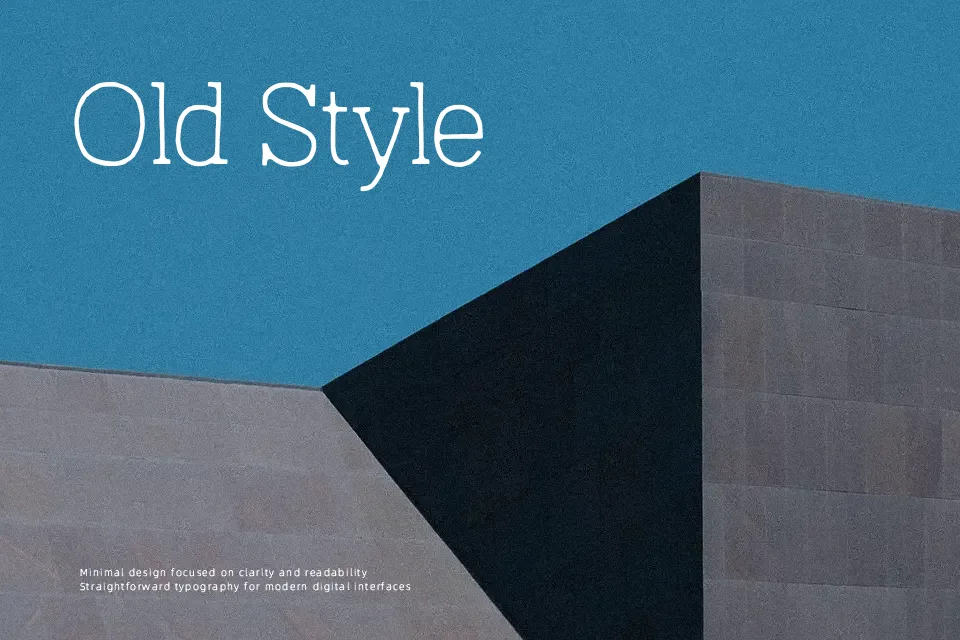
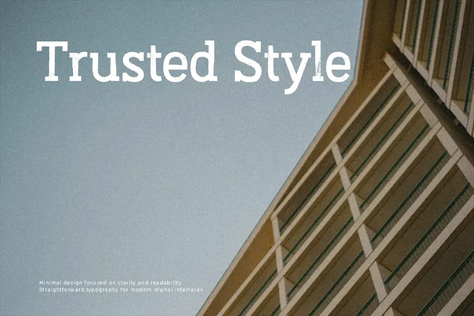
Austral Slab Font
Free for personal useAbout
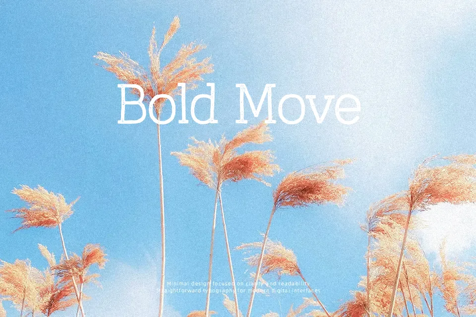
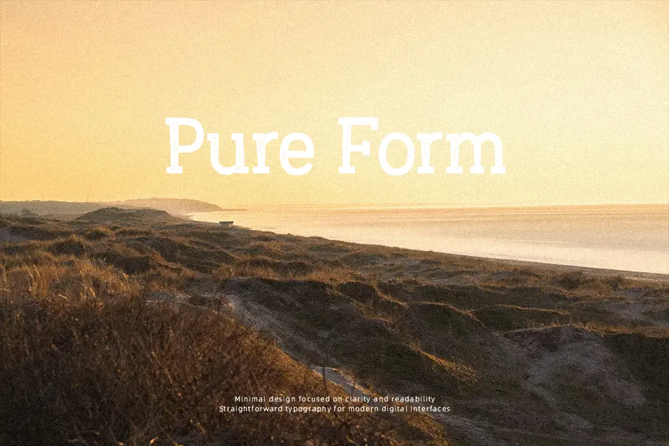
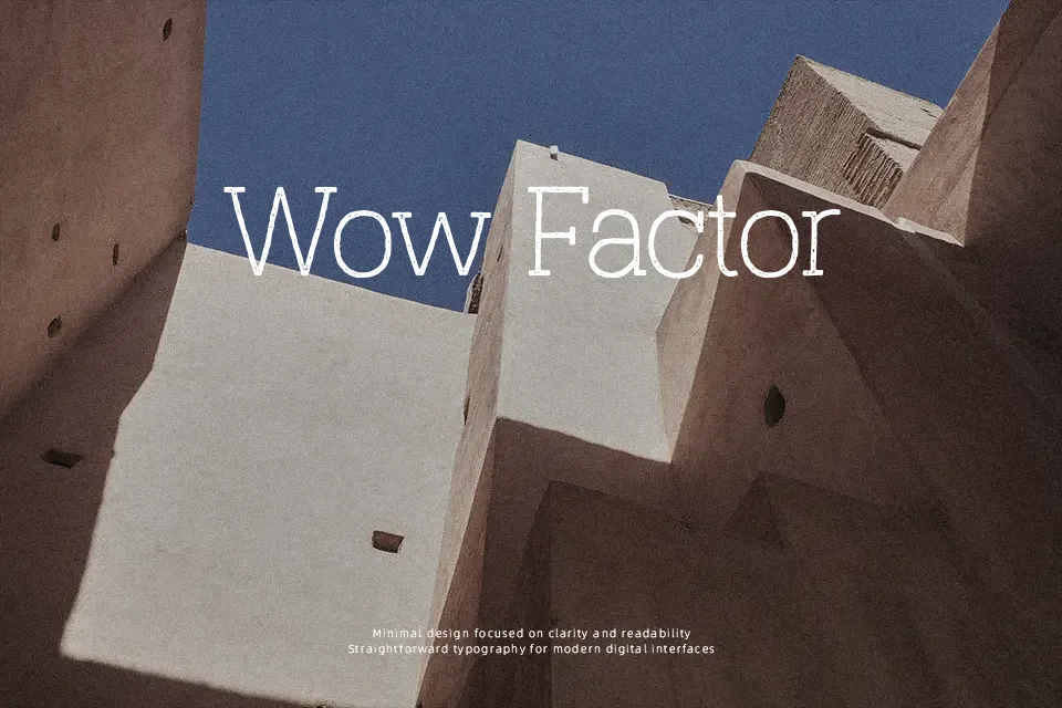
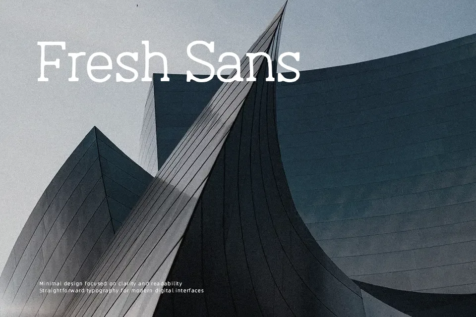
Rough around the edges — intentionally so. Austral Slab’s letterforms are built on a monolinear slab serif skeleton, but what sets it apart is the hand-drawn inconsistency: strokes bend slightly, outlines break irregularly, and the overall structure carries an organic, pressed-ink feel. Available in textured variants including Blur, Rough, Rust, Stamp, and Maplines, the font adapts from soft and worn to boldly eroded depending on the weight chosen. It works well on packaging, vintage branding, and bold editorial headers where tactile imperfection reads as craftsmanship. That said, the irregular outlines make it a poor fit for small-size usage or extended body text — legibility suffers fast below 18pt. Designers who need a clean workhorse slab should look elsewhere, but for display use where character matters, Austral Slab earns its place.
Best For:- Craft beverage labels and artisan packaging
– Vintage poster and music event headlines
– Logo lettering with a handcrafted aesthetic
– Book cover or magazine display headers
Not Ideal For:- Body text or long-form reading
– Small-scale print such as footnotes or captions
– Corporate identity requiring clean, neutral tone
– Digital UI components needing consistent stroke weight
Perfect for branding, headline, and logo, with a bold and display style.
License
Gallery