Arlequin Font
Free for personal useAbout
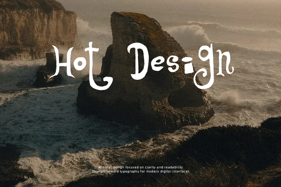
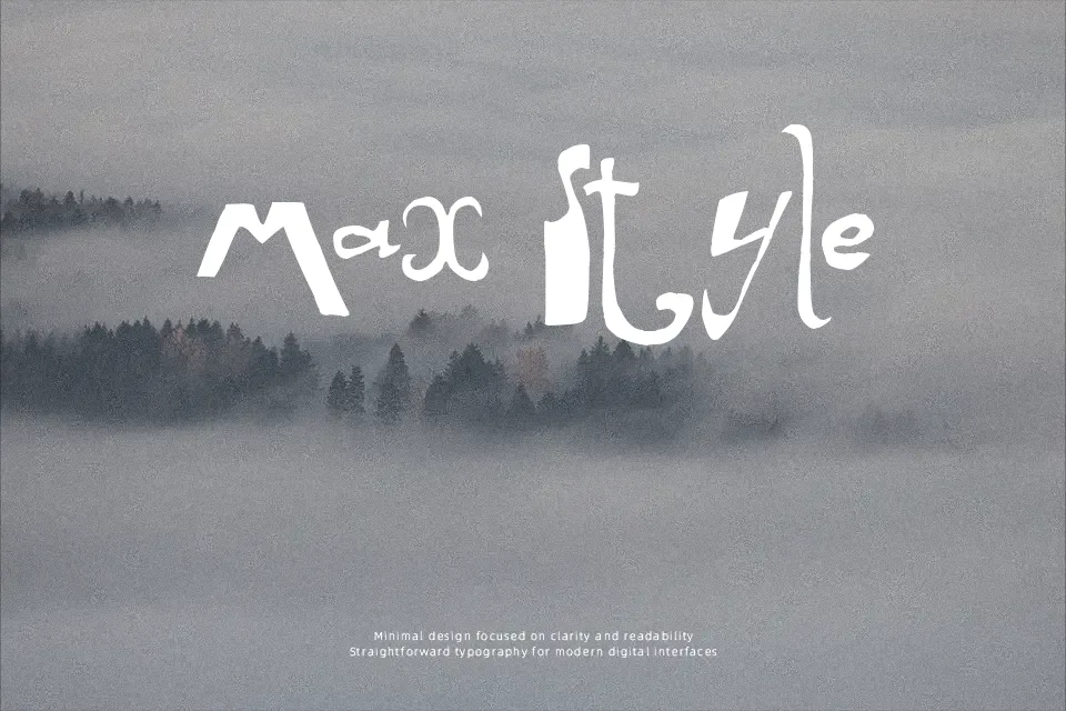
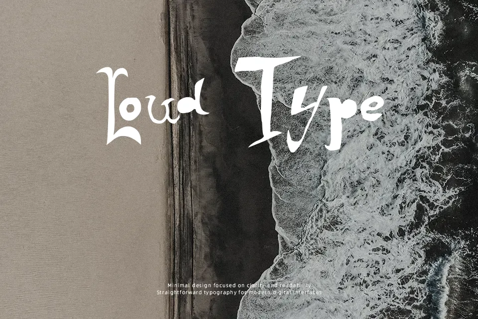
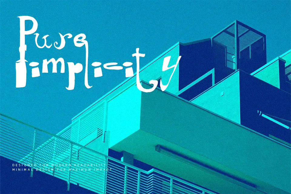
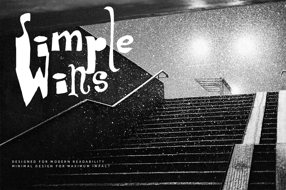
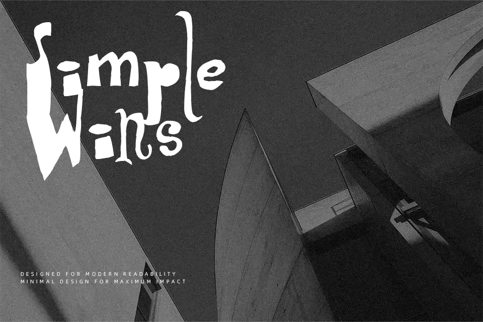
What immediately catches the eye in Arlequin is the tension between its thick angular strokes and the whisper-thin curves threading through its lowercase letters — a high-contrast clash that reads more like graphic art than conventional type. Designed by Ramiz Guseynov under TipografiaRamis, this decorative sans serif carries a theatrical, almost avant-garde personality that suits short-burst display copy far better than extended text. Think editorial poster titles, striking logo lockups, or chapter headers in a design-forward publication. Where it falls short is predictable: push it below 18pt and the fine strokes break down fast, losing the contrast that defines its character entirely. It also resists body copy — the dramatic weight variance becomes tiring over multiple lines.
Best For:- Poster and editorial headline design
– Artistic logo wordmarks
– Theater or event promotional materials
– Design-forward book or magazine covers
Not Ideal For:- Body text or long-form reading
– Small-size applications (web labels, footnotes)
– Corporate or formal professional documents
– Beginner designers unfamiliar with contrast-heavy typefaces
Perfect for branding, editorial, and headline, with a artistic and decorative style.
License
Gallery