Aristotle Punk Font
Free for personal useAbout
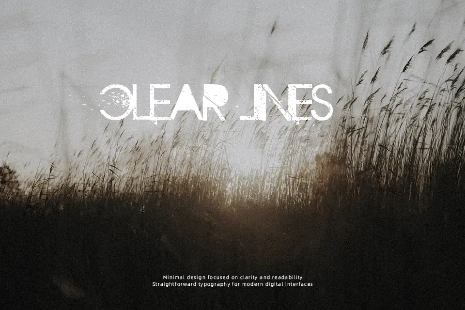
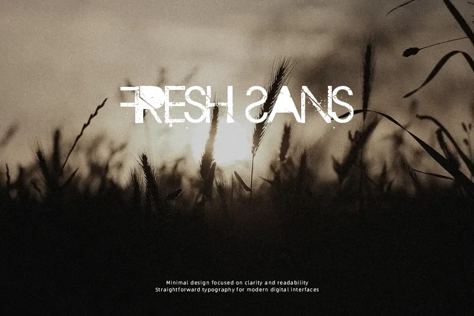
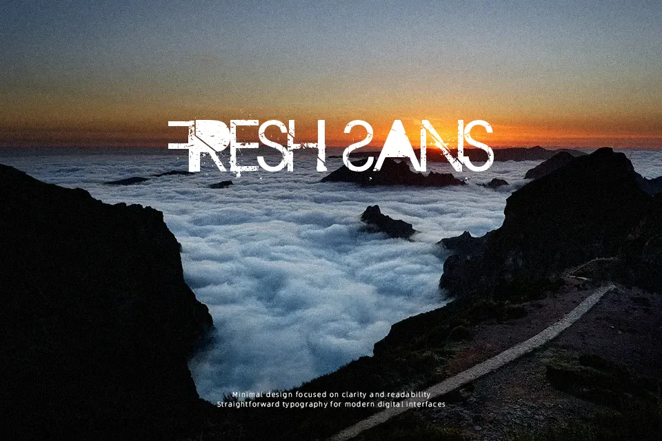
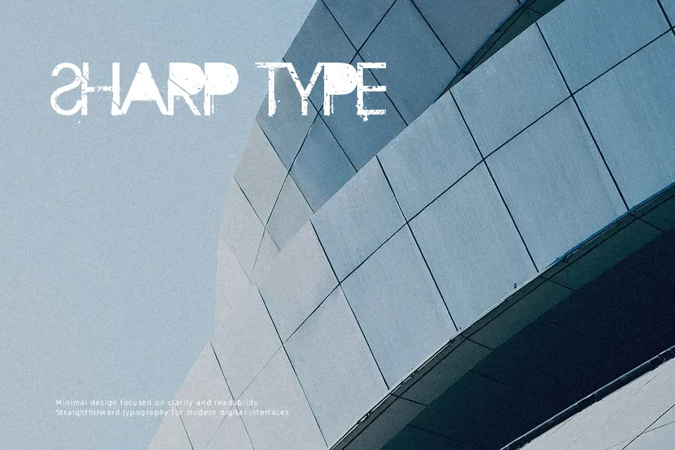
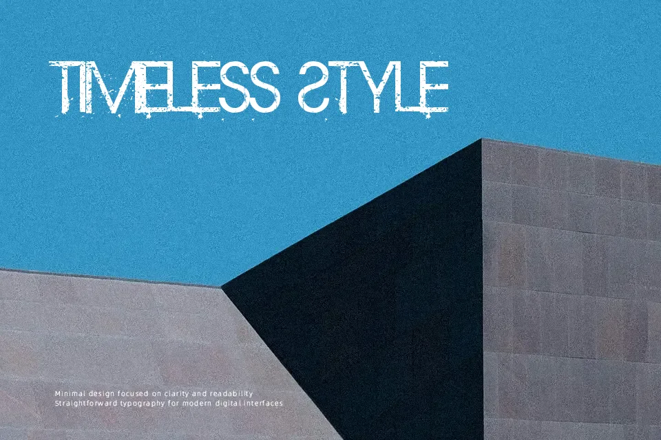
At first glance, Aristotle Punk reads like a typeface raised on fanzines and concert flyers — the strokes are deliberately rough, with an uneven, worn-down quality that feels hand-cut rather than digitally polished. The letterforms lean into a distressed, blocky structure that sits somewhere between stencil and grunge display, with tight spacing that gives headlines a compressed, punchy rhythm. It suits band logo treatments, underground event graphics, or streetwear apparel prints where rough edges are a feature, not a flaw. That said, the distressed texture makes it a poor fit for small sizes — detail gets lost below 24pt, and extended text becomes fatiguing fast. If your project needs both impact and body copy, you’ll need a companion typeface to carry the load.
Best For:- Band merchandise and album artwork headers
– Underground event or concert posters
– Streetwear apparel graphic treatments
– Halloween or horror-themed social media visuals
Not Ideal For:- Body text or extended reading copy
– Corporate branding or professional reports
– Small-size usage below 24pt (detail degrades)
– Formal editorial layouts requiring clean typographic hierarchy
Perfect for branding, logo, and music, with a bold and display style.
License
Gallery