Arcade Quest Font
Free for personal useAbout
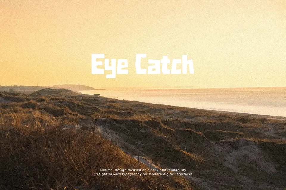
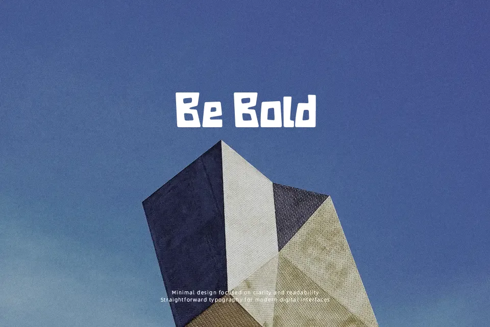
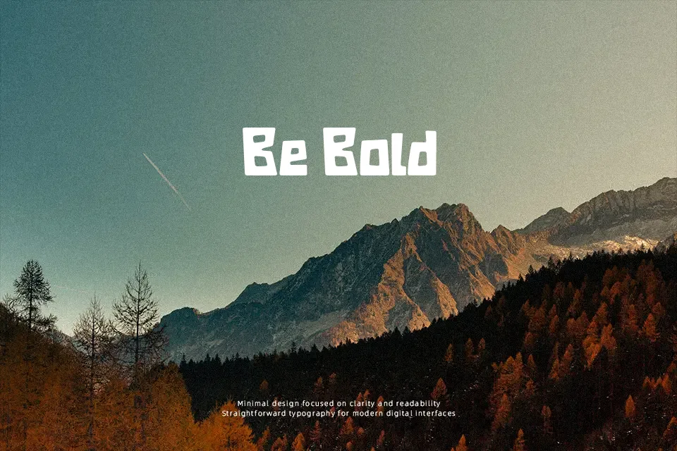
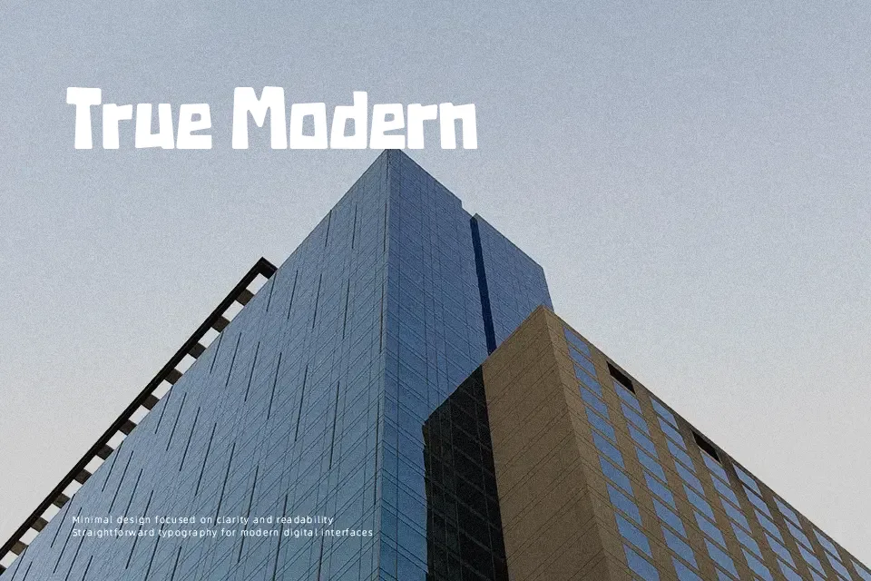
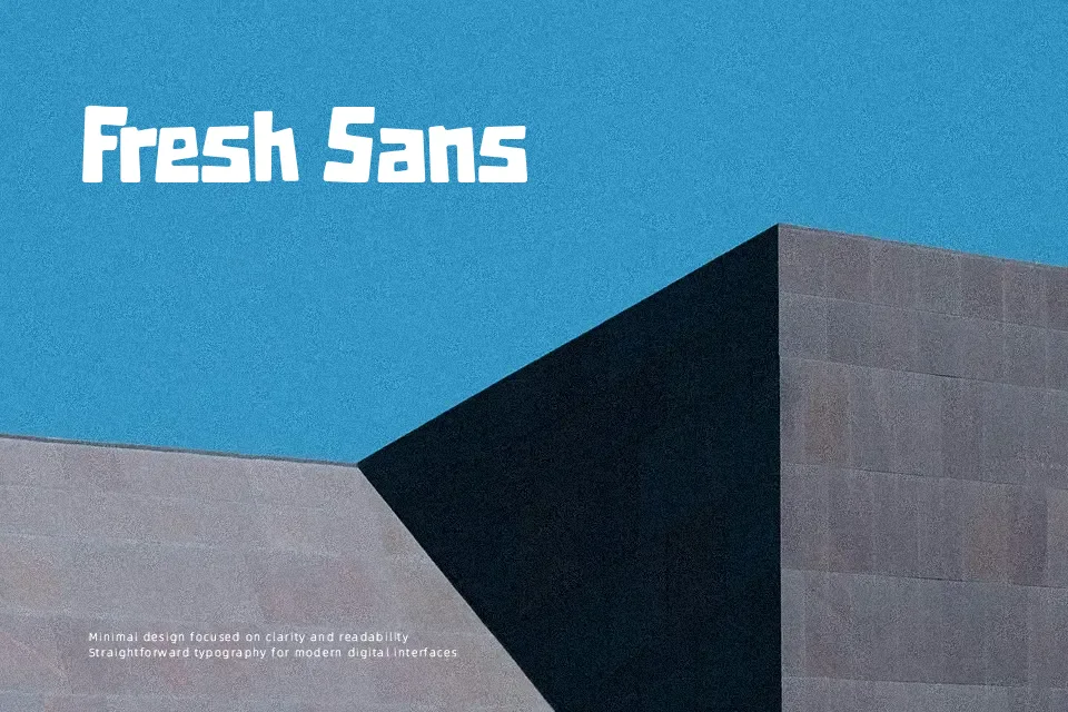
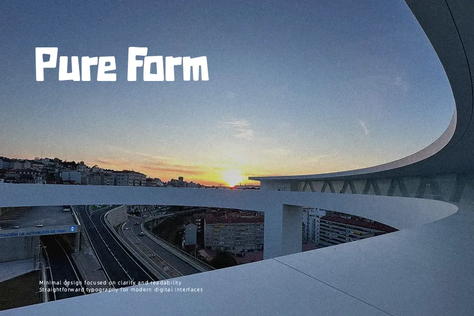
Thick strokes, softened corners, and slightly uneven character widths — Arcade Quest carries the kind of visual weight you’d expect from stickers on a vintage cabinet door. The letterforms feel hand-cut rather than constructed, giving headlines a spontaneous, joystick-era punch without tipping into pure pixel territory. It fits naturally in gaming event promotions, children’s book covers, and entertainment branding where playfulness matters more than polish. Where it breaks down is in small sizes — the irregular edges blur and lose definition below 18pt, making it a poor fit for captions or UI labels. Designers who need a structured, repeatable aesthetic may also find its deliberate inconsistency hard to control across multi-item layouts.
Best For:- Retro gaming event posters and flyers
– Entertainment or kids’ brand logos
– Game title screen mockups
– Carnival or arcade-themed packaging headers
Not Ideal For:- Body text or long-form copy
– Corporate or professional identity systems
– Small-size UI labels or captions
– Designs requiring strict typographic consistency
Perfect for branding, gaming, and kids, with a bold and cartoon style.
License
Gallery