Anarchy Font
Free for Commercial UseAbout
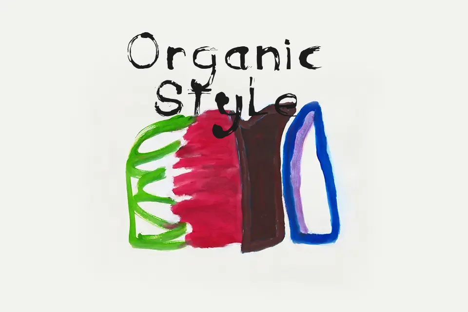
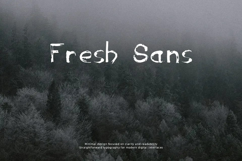
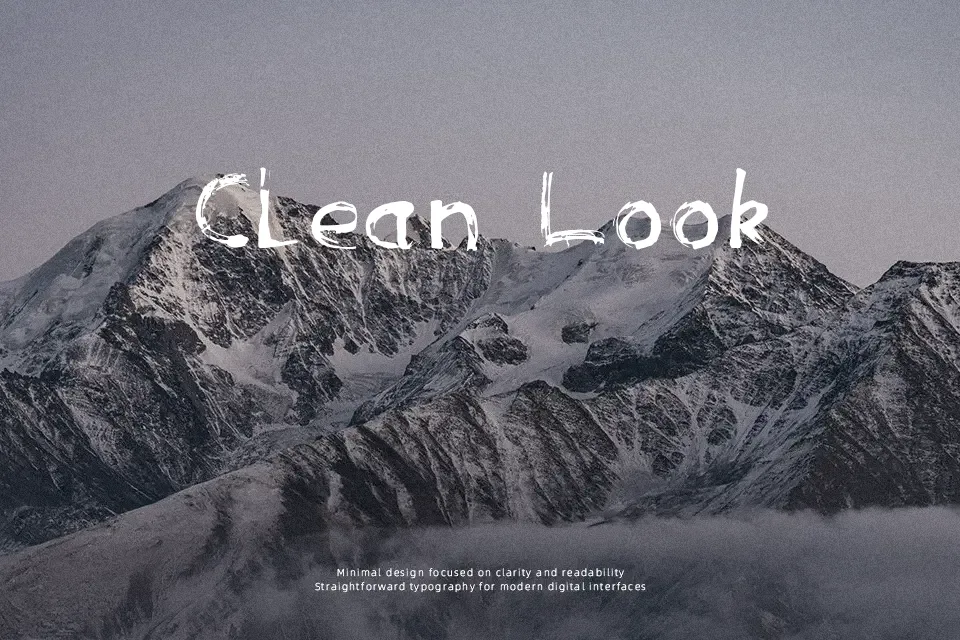
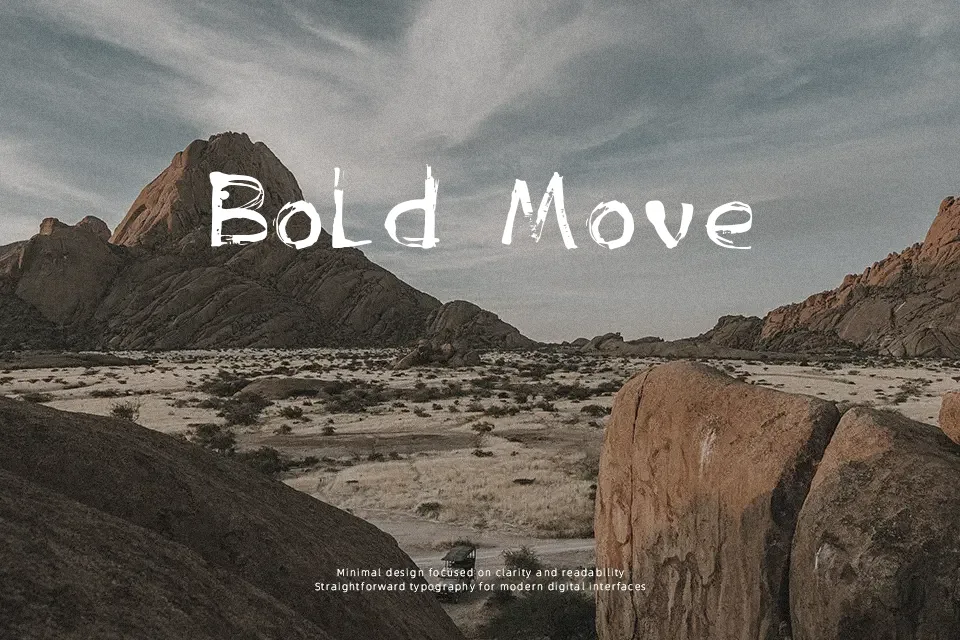
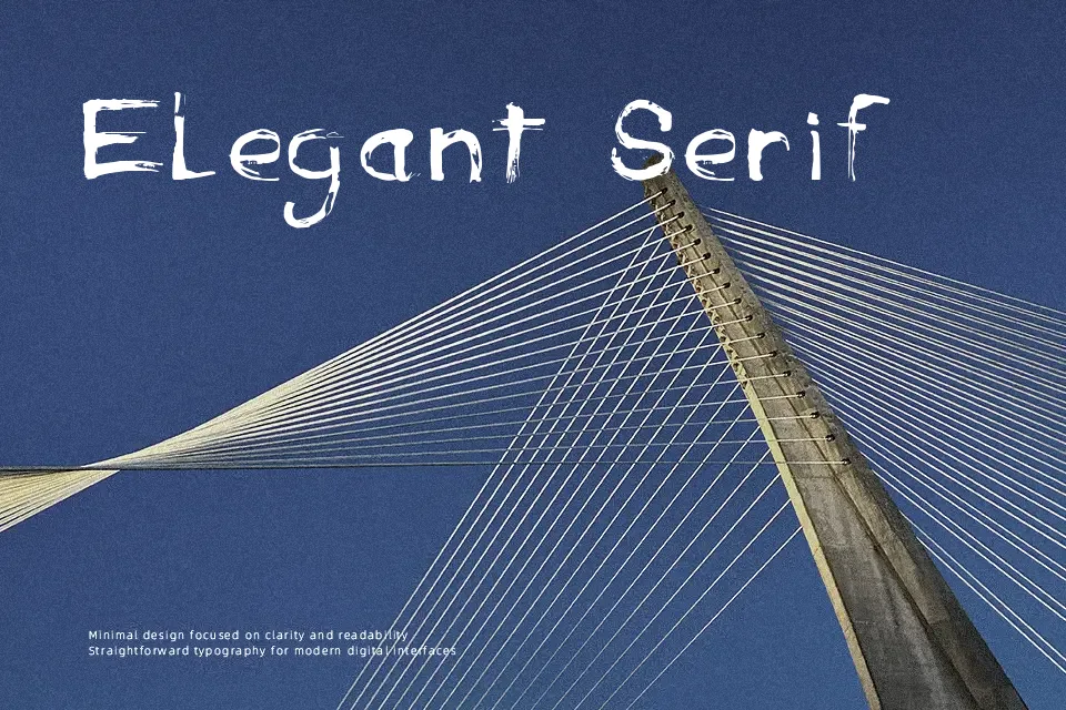
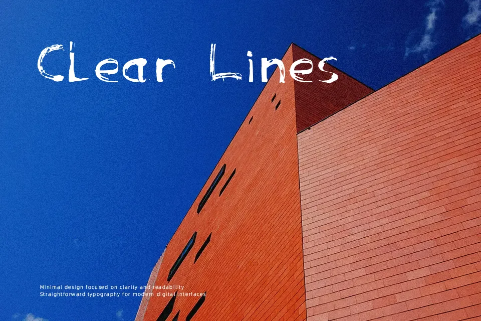
If you are looking to create a design that looks like it was scratched onto a brick wall, Anarchy Font does the heavy lifting. The creator actually fashioned a custom pen out of a soda can to draw these letters, resulting in an unpredictable, frayed texture with inconsistent stroke weights. The aesthetic is loud, aggressive, and decidedly unpolished. It excels when used for large, impactful headlines where its rough edges can be fully appreciated—like a metal band’s tour merchandise or a gritty horror movie title. However, the chaotic nature of the letters means it completely fails if you try to use it for body paragraphs or anything that requires quick, effortless reading.
Best For:
– Streetwear brand logos
– Punk rock album covers
– Underground event flyers
Not Ideal For:
– Body text in magazines
– Clean corporate branding
– User interface menus
Perfect for headline, music, and poster, with a bold and decorative style.
License
Gallery