AnAkronism Font
Free for Commercial UseAbout
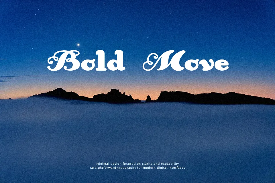
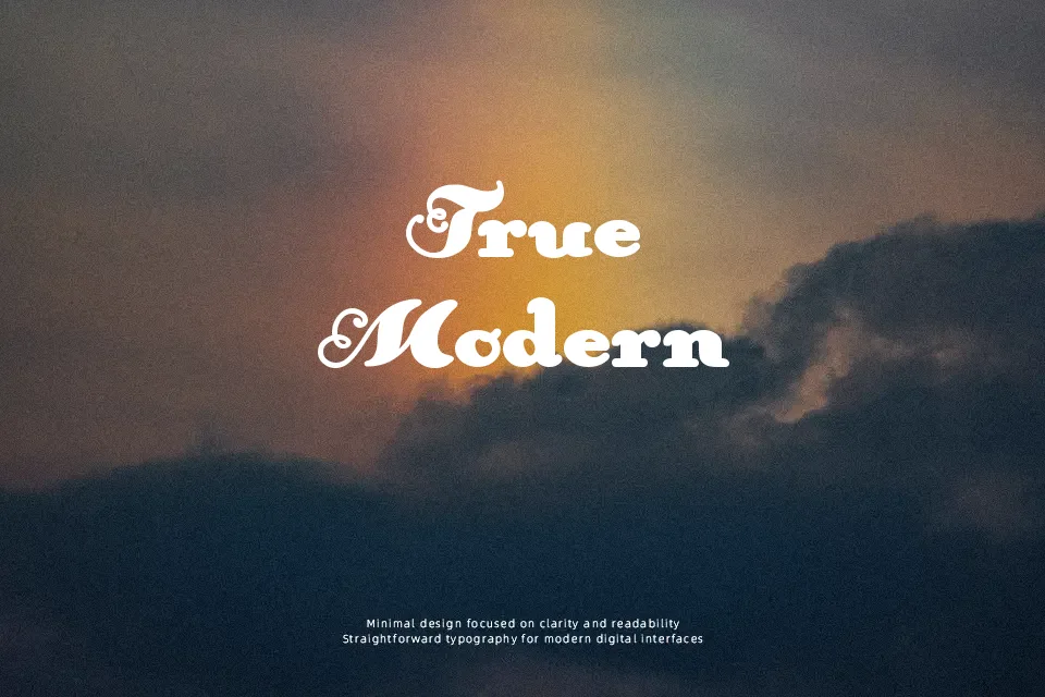
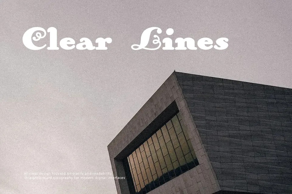
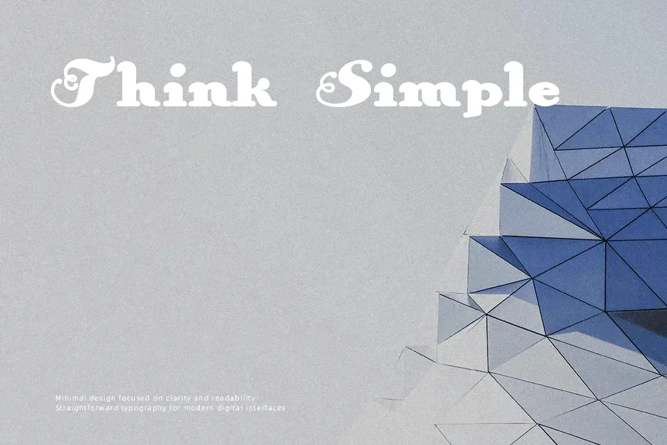
AnAkronism opens with a tonal split that feels almost argumentative — the “An” portion leans into decorative, script-influenced strokes, while “Akronism” snaps back into semi-bold condensed sans-serif territory. That internal contrast is the font’s most defining trait: it gives layouts a sense of layered era, somewhere between old-school typography and mid-century graphic design. The weight sits at semi-bold, and the spacing feels tight enough to anchor a headline without sprawling across the canvas. It works well when you need a single display line to carry both attitude and legibility — think vinyl album covers, retro event posters, or logo lockups for vintage-style brands. Where it falls apart is in any context requiring more than a few words: the stylistic tension that makes one line interesting becomes visually tiring at length or small sizes.
Best For:- Retro music event posters and album cover titles
– Vintage-style brand logos and wordmarks
– Editorial headline treatments with a nostalgic tone
– Merchandise and apparel graphic headers
Not Ideal For:- Body text or any multi-line paragraph setting
– Corporate or professional business documents
– Small-size usage such as captions or footnotes
– Digital UI labels where neutral legibility is required
Perfect for branding, fashion, and headline, with a bold and condensed style.
License
Gallery