Alvater Rough Font
Free for personal useAbout
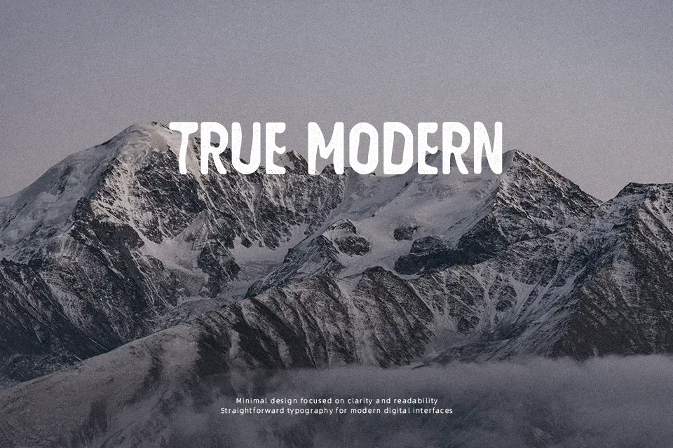
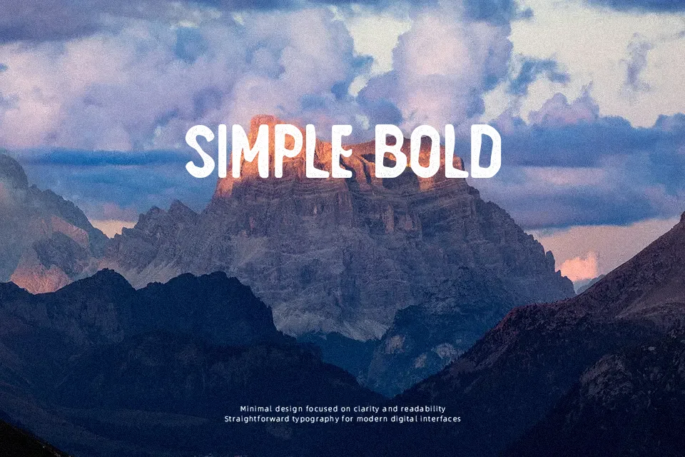
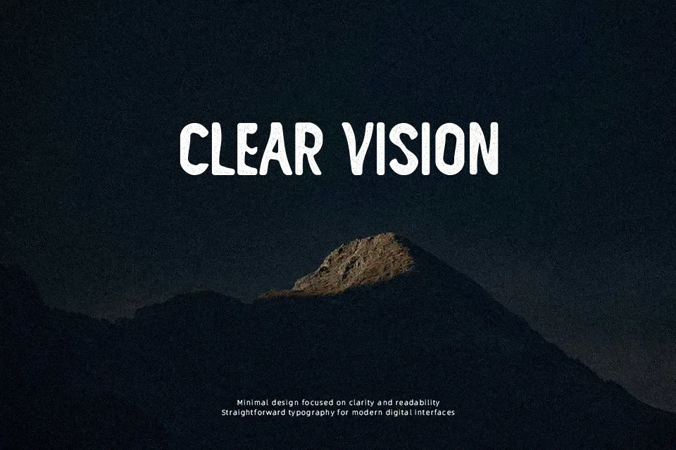
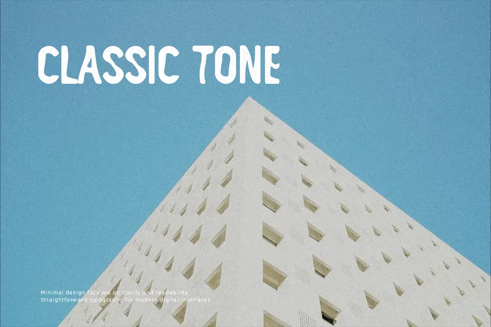
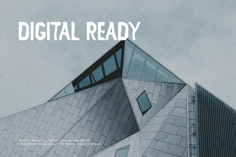
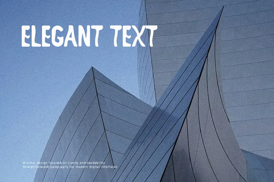
The letterforms show deliberate distortion and uneven texture throughout, creating a rough hand-drawn appearance that feels intentionally worn. Stroke weight varies irregularly, with edges that appear weathered or eroded, giving each character a raw, unrefined quality. This casual yet slightly chaotic structure works effectively when you need typography that rejects polish and embraces imperfection—think skateboard graphics, underground music event flyers, or streetwear labels where grit enhances the message. The distorted nature makes it memorable at display sizes but quickly becomes problematic below 18pt, where the irregular edges blur together and readability collapses. It performs best when paired with clean sans serif body text that provides visual relief. Not suited for contexts requiring professionalism or clarity, as the roughness reads as deliberately anti-corporate and works against formal tone.
Best For:
– alternative music posters and album artwork
– streetwear brand logos and apparel graphics
– craft brewery labels and packaging
– skateboard company branding
Not Ideal For:
– body text or paragraphs below 16pt
– corporate presentations or business materials
– children’s books or educational content
– formal invitations or elegant designs
Perfect for branding, headline, and logo, with a bold and decorative style.
License
Gallery