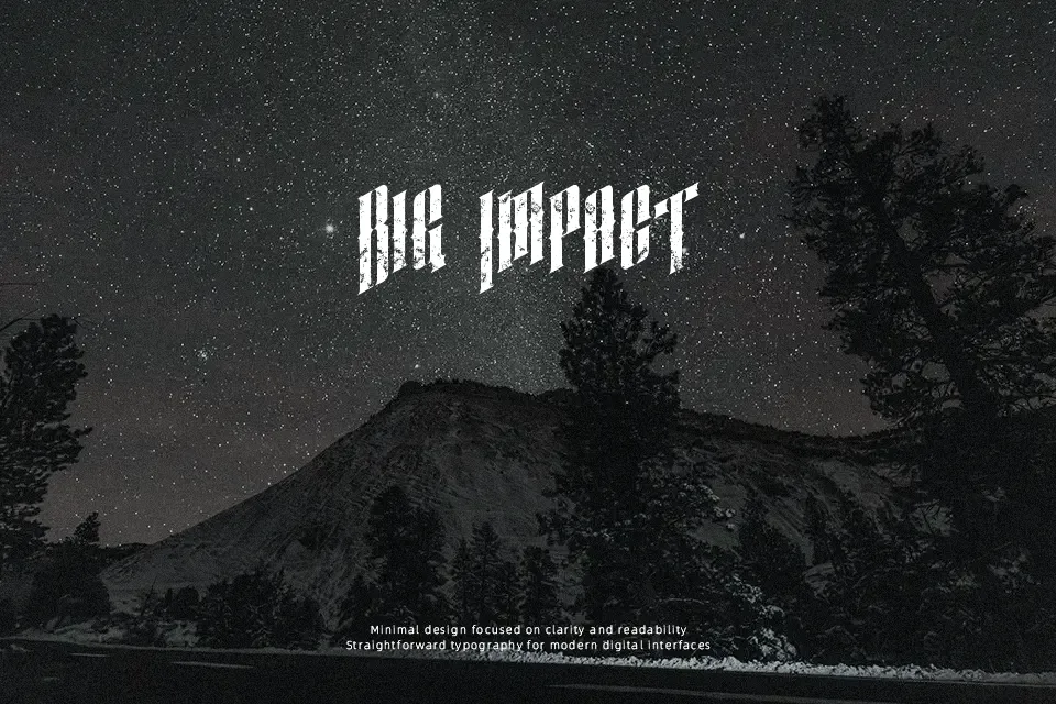
Almanac Font
Free for Commercial UseAbout
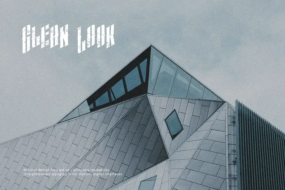
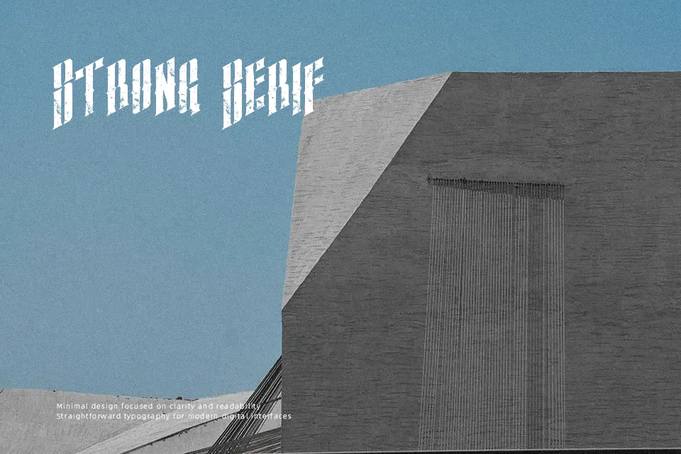
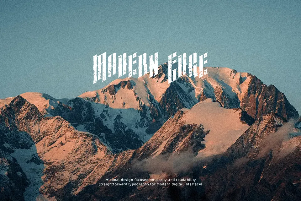
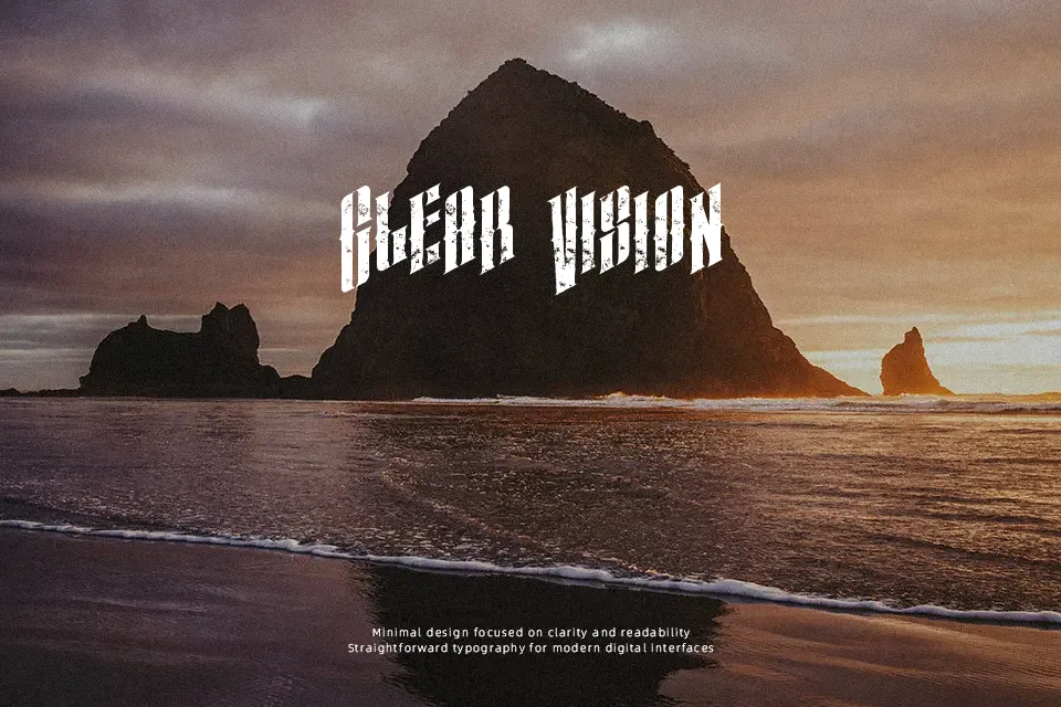
Almanac leans hard into distressed letterforms — every stroke carries intentional erosion, giving it the feel of aged ink on rough paper. The italic-only construction amplifies momentum, making it read with urgency rather than stillness. It works best in large, bold headline applications where the grungy texture can breathe: think concert posters, zine covers, or retro merchandise labels. The eroded edges and uneven weight distribution create mood fast, but that same quality becomes a liability at small sizes — readability drops sharply below 24pt. Not a versatile workhorse; this is a font you reach for when atmosphere matters more than precision.
Best For:- Vintage music concert posters and event flyers
– Grunge or punk band logos and merchandise
– Retro-themed editorial headlines
– Zine covers and underground publication titles
Not Ideal For:- Body text or long-form reading
– Corporate identity systems or professional reports
– Digital UI elements requiring clarity at small sizes
– Clean, minimal design aesthetics
Perfect for branding, editorial, and headline, with a dark and display style.
License
Gallery