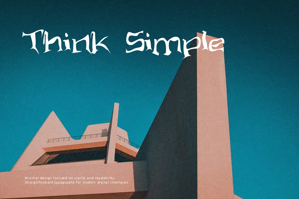
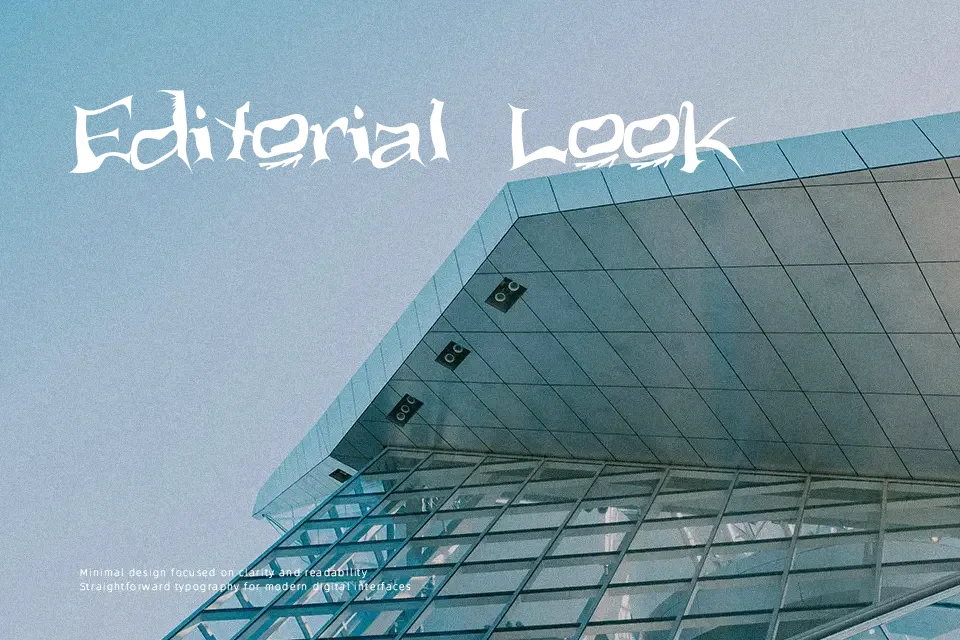
Aliens ate my mum Font
Free for Commercial UseAbout
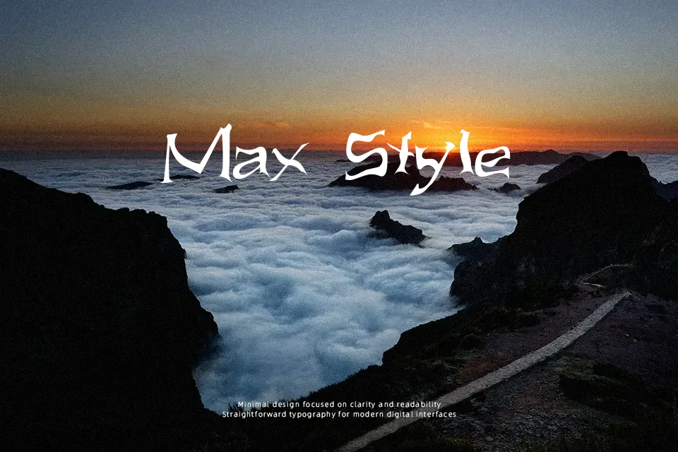
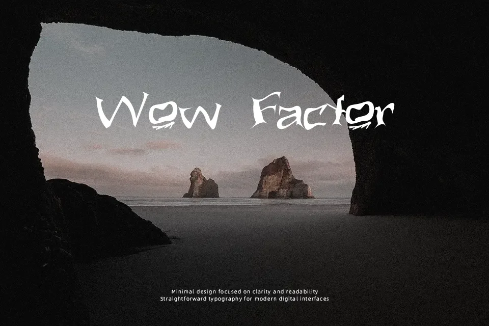
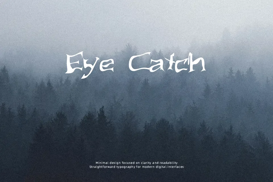
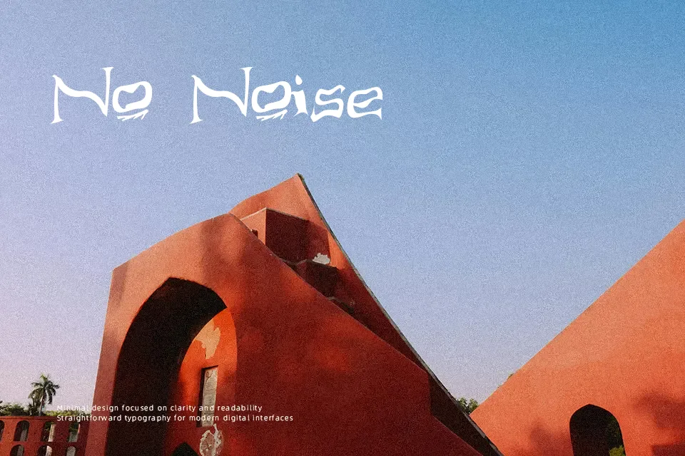
Aliens ate my mum is a highly distressed display typeface with fractured strokes, uneven curves, and irregular spacing that makes every word look scratched into a wall or scrawled in panic. The shapes lean toward blocky, uppercase forms that feel experimental rather than clean, giving it a raw, chaotic personality. It works well for horror movie posters, Halloween flyers, sci‑fi zine covers, or band artwork where legibility can take a back seat to mood. However, the distortion and tight spacing make it hard to read in small sizes or long text, so it quickly becomes tiring in paragraphs. Use it sparingly as a headline accent when you want a noisy, damaged look, but avoid interfaces or professional documents that require clarity and polish.
Best For:
horror movie posters
halloween party flyers
sci-fi zine or comic titles
band or album artwork
Not Ideal For:
long paragraph text
formal corporate documents
ui interfaces and apps
small captions or legal text
Perfect for halloween, headline, and logo, with a creative and decorative style.
License
Gallery