Aksara Komik Font
Free for personal useAbout
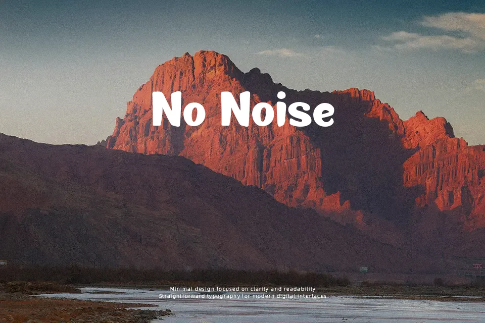
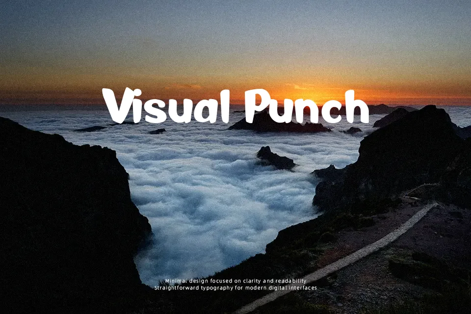
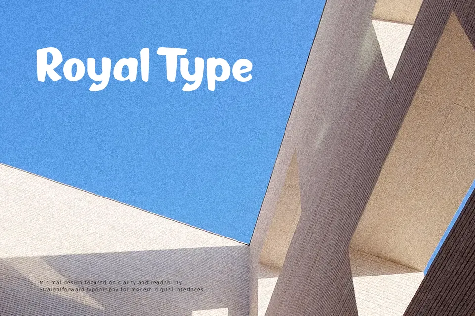
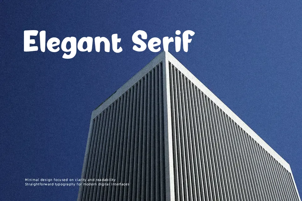
There’s a looseness to Aksara Komik that feels genuinely drawn rather than digitally constructed — the strokes are thick, slightly wobbly, and carry the kind of ink-heavy weight you’d find in Indonesian comic lettering. Letterforms are rounded and compact, with low stroke contrast and generous visual mass that makes text pop at headline sizes. This font earns its place on children’s event posters, YouTube thumbnail titles, game intro screens, and webcomic chapter headers. Where it falls short is predictable: drop it into paragraph text and the bouncy rhythm becomes visual noise fast. It also lacks multilingual character coverage beyond basic Latin, which limits its scope for international projects. Use it large, use it sparingly, and it delivers exactly the casual, story-driven energy it promises.
Best For:- Children’s book and activity sheet headers
– Webcomic and manga-style title cards
– Gaming UI labels and indie game covers
– YouTube thumbnails and social media post headers
Not Ideal For:- Body text or extended reading copy
– Corporate or professional branding
– Multilingual or accent-heavy designs
– Formal print documents
Perfect for gaming, headline, and kids, with a bold and cartoon style.
License
Gallery