Akick Stone Font
Free for personal useAbout
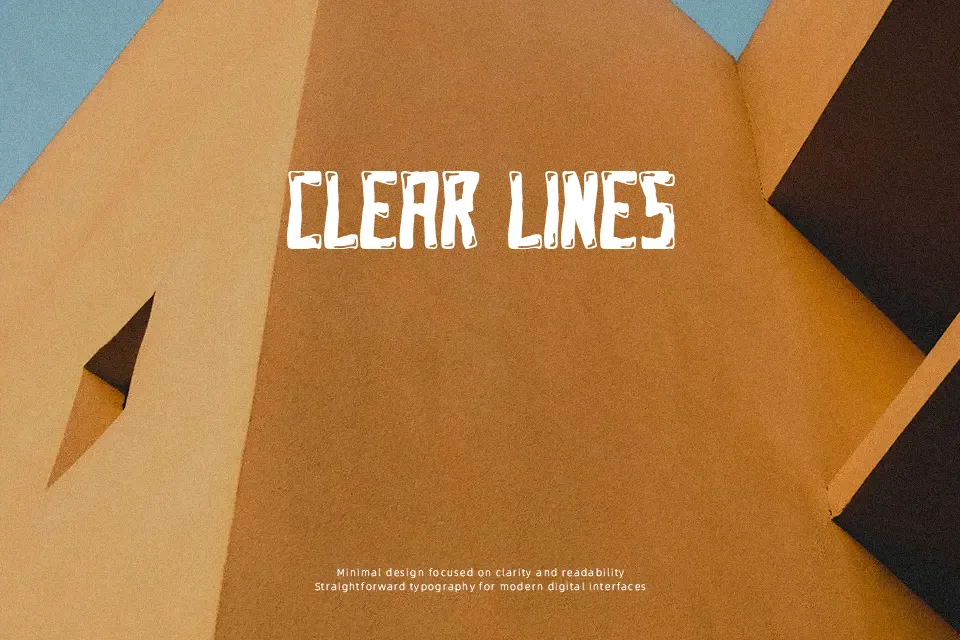
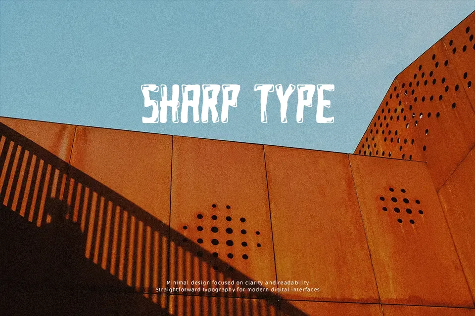
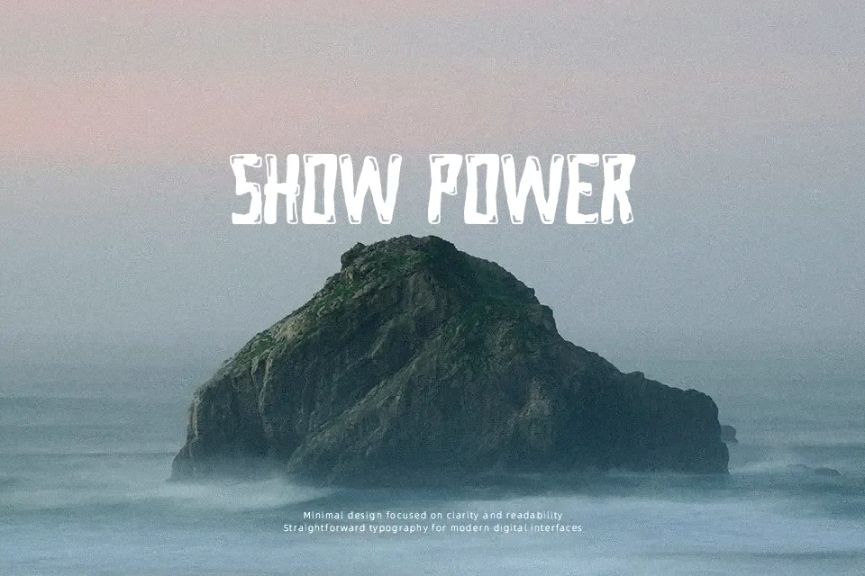
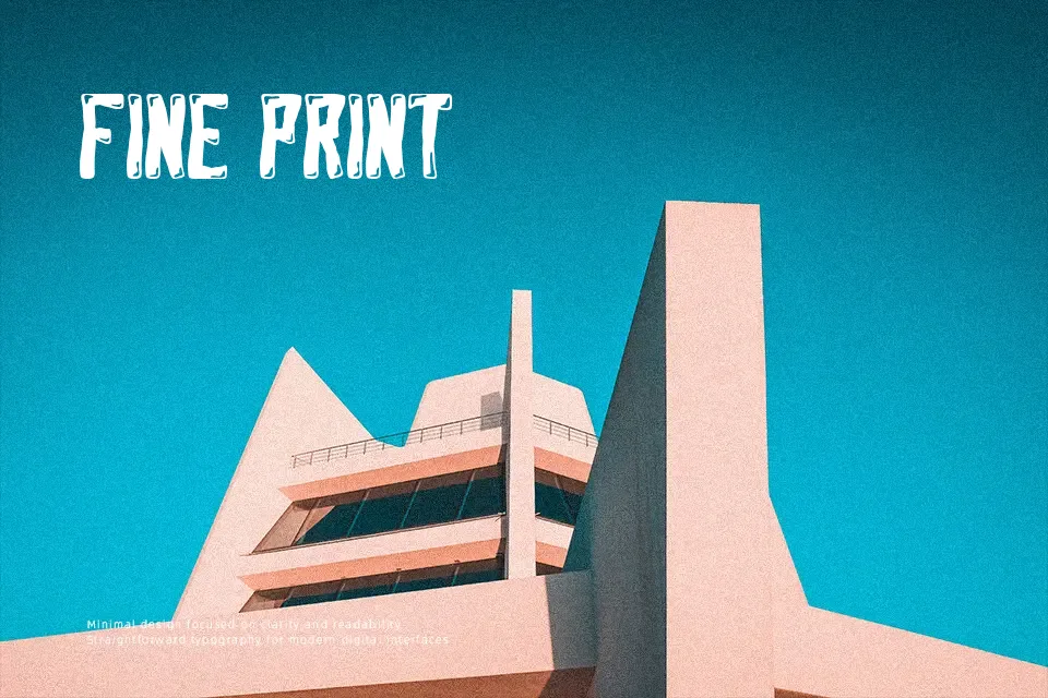
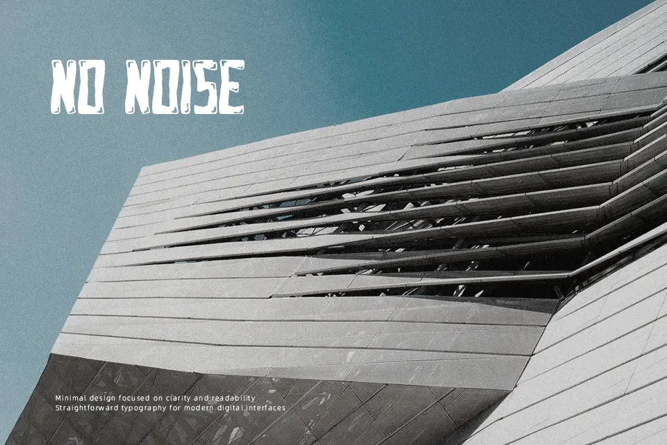
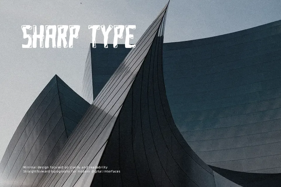
Rough edges define Akick Stone. The strokes are thick and deliberately uneven, carrying a hand-drawn, distressed quality that lands somewhere between graffiti and cartoonish aggression. Uppercase characters dominate with a commanding presence, while lowercase letters hold the same visual weight — giving the font a consistent, in-your-face texture across settings. It suits short-burst contexts well: band logos, streetwear labels, game title screens, and urban-themed poster headers. Where it struggles is anything requiring readability at length — running body text, formal layouts, or corporate identities would expose its intentional roughness as a liability rather than an asset. Think of it as a display tool with a loud personality; it earns its place in high-energy visuals but overstays its welcome in refined or minimal design work.
Best For:- Streetwear brand logos and apparel graphics
– Music album covers or band poster headlines
– Urban-themed game title screens or event flyers
– Social media graphics targeting youth/alternative culture audiences
Not Ideal For:- Body text or extended reading passages
– Corporate branding or professional business materials
– Elegant, minimal, or luxury design contexts
– Small-size usage where stroke irregularities become visual noise
Perfect for advertising, branding, and gaming, with a bold and cartoon style.
License
Gallery