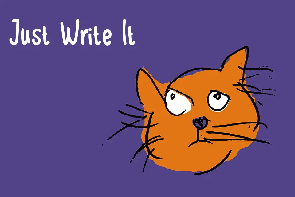
Akabiluru Style Handwritten Font
Free for personal useAbout
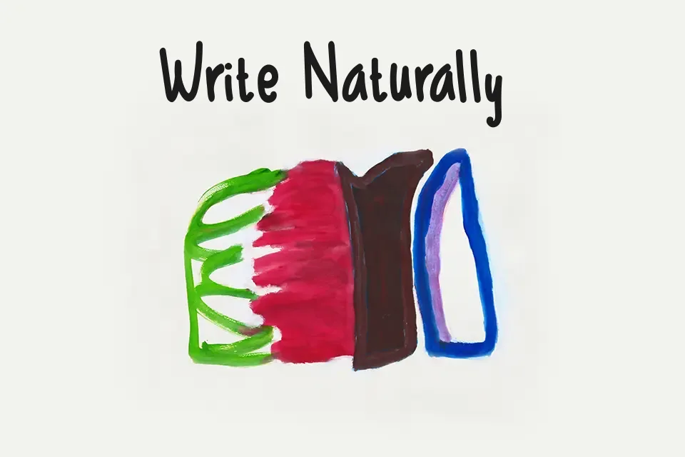
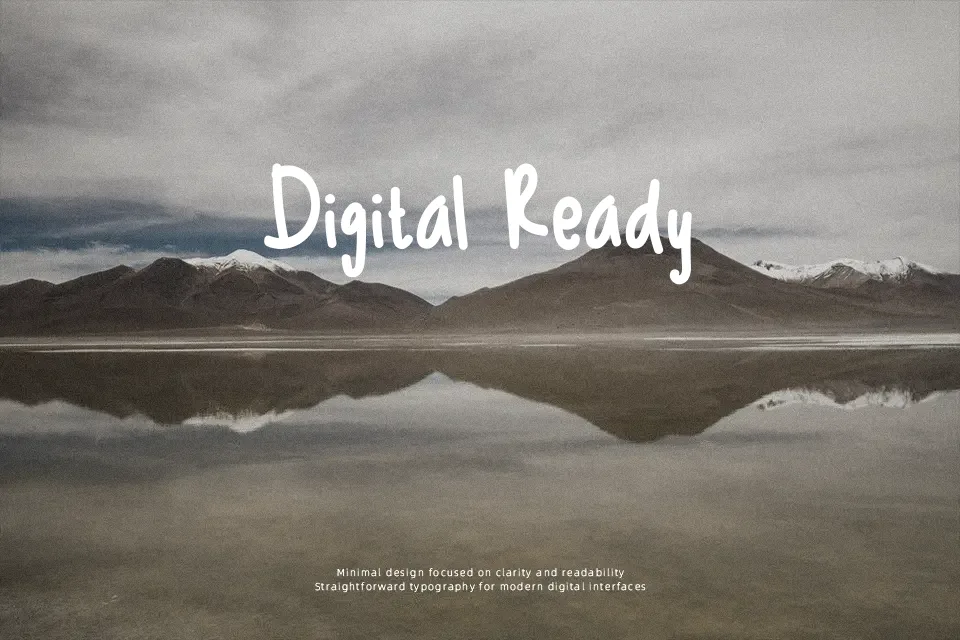
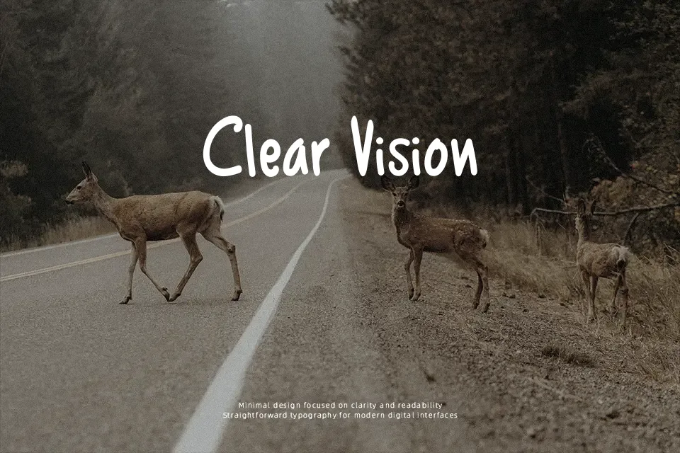
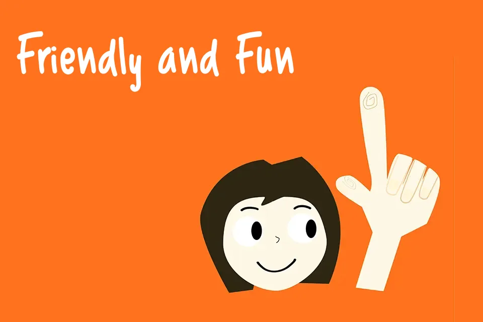
The strokes here are confident but deliberately imperfect — thick, rounded, and slightly bouncy in a way that reads instantly as hand-lettered. Uppercase characters sit tall with strong presence, while lowercase forms feel looser and more relaxed, creating a natural rhythm across short text runs. It suits greeting card headers, youth-oriented product labels, and casual social media content well. That said, the 70-character glyph set is a real constraint — missing accented characters limit multilingual applications, and the irregular baseline makes it unsuitable for anything requiring visual precision. For display use at larger sizes it performs solidly; shrink it down past 14pt and the charm starts to dissolve into noise.
Best For:- Greeting card headlines and short cover text
– Children’s book chapter titles or packaging labels
– Social media quote graphics and story headers
– Casual restaurant or café signage
Not Ideal For:- Body text or long-form reading at small sizes
– Corporate branding or professional business documents
– Multilingual designs requiring accented or extended Latin characters
– Formal editorial layouts where baseline consistency matters
Perfect for headline, invitation, and kids, with a creative and comic style.
License
Gallery