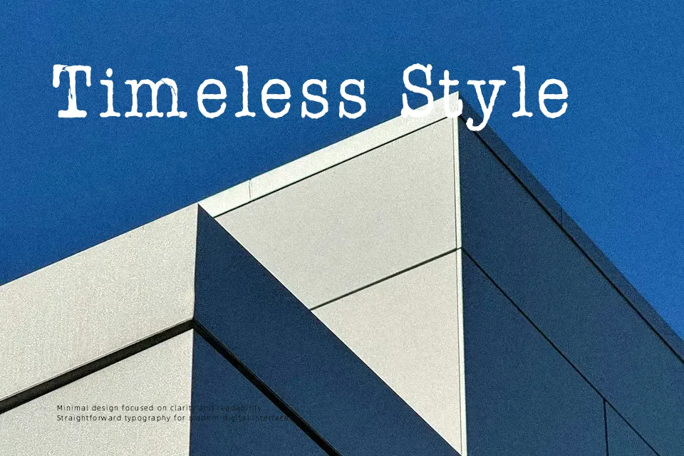
AFL Font Pespaye Nonmetric Font
Free for Commercial UseAbout
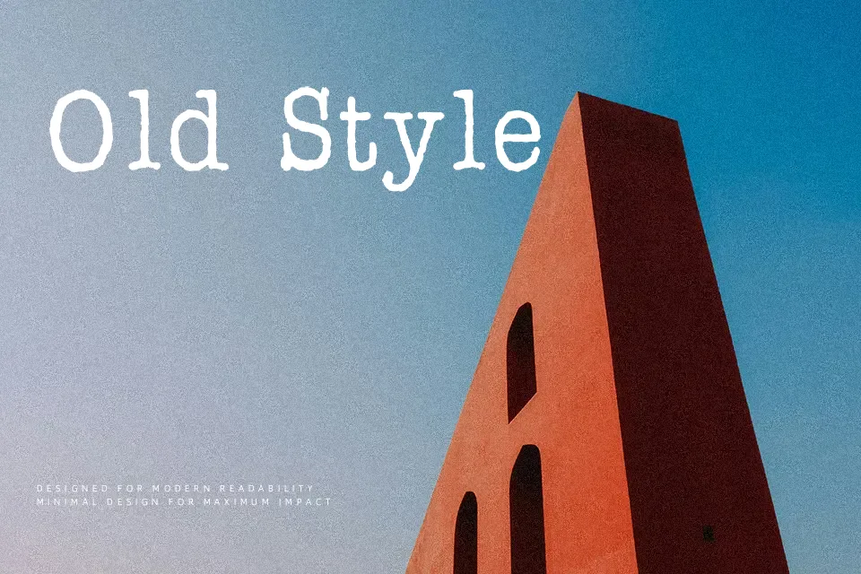
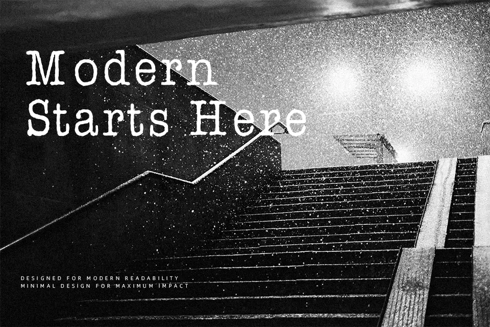
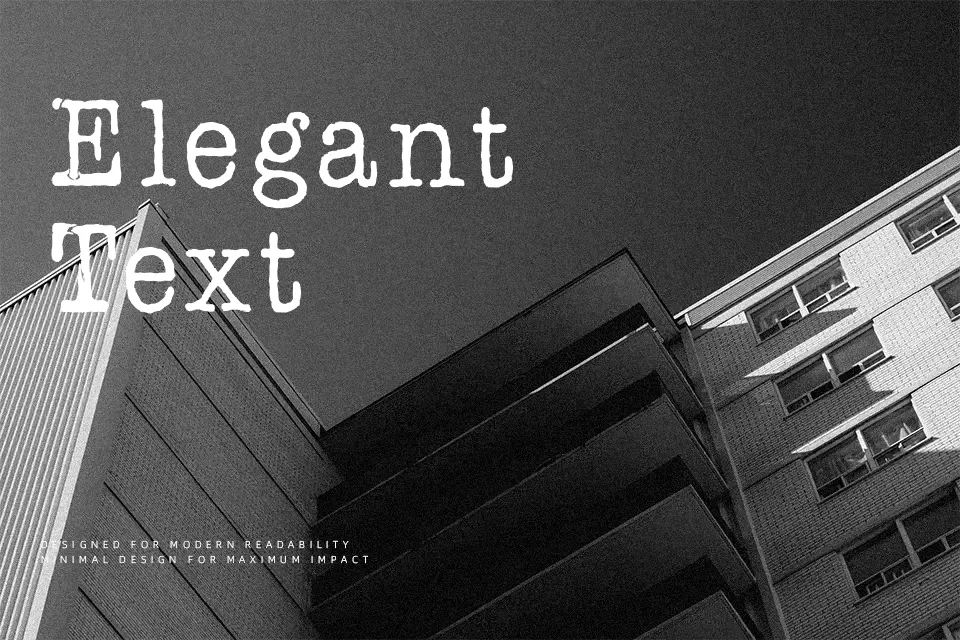
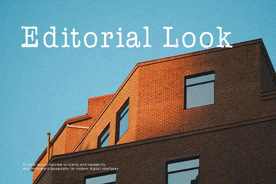
Every character in AFL Font Pespaye Nonmetric carries the ghost of a skipping ink ribbon — slightly uneven strokes, subtle glyph irregularities, and loose nonmetric spacing that refuses to feel mechanical. Classified under the Fancy › Typewriter category, this slab serif-leaning face leans heavily on distressed texture to project a documentary, archival mood — closer to carbon copies than clean print. It suits zine headers, indie book titles, mystery poster type, or lo-fi cassette packaging where the roughness is the point. The spacing inconsistency that makes it evocative in display sizes becomes a genuine problem at body-text scale — legibility drops noticeably below 14pt, and it is poorly suited for any UI or long-form reading context. First released in 2005 by designer Burkay Demirci, it has accumulated over 440,000 downloads, signaling wide adoption rather than novelty. Designers who value analog warmth over refined precision will find it immediately useful.
Best For:- Zine and indie publication covers
– Mystery or thriller poster headlines
– Lo-fi album art and cassette packaging
– Retro editorial headers and protest graphics
Not Ideal For:- Body text or long-form reading at small sizes
– Corporate or professional branding
– UI labels requiring consistent letter spacing
– Formal print documents
Perfect for branding, editorial, and music, with a dark and decorative style.
License
Gallery