Aerobics Font
Free for personal useAbout
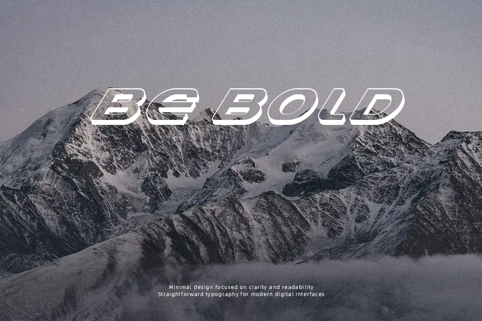
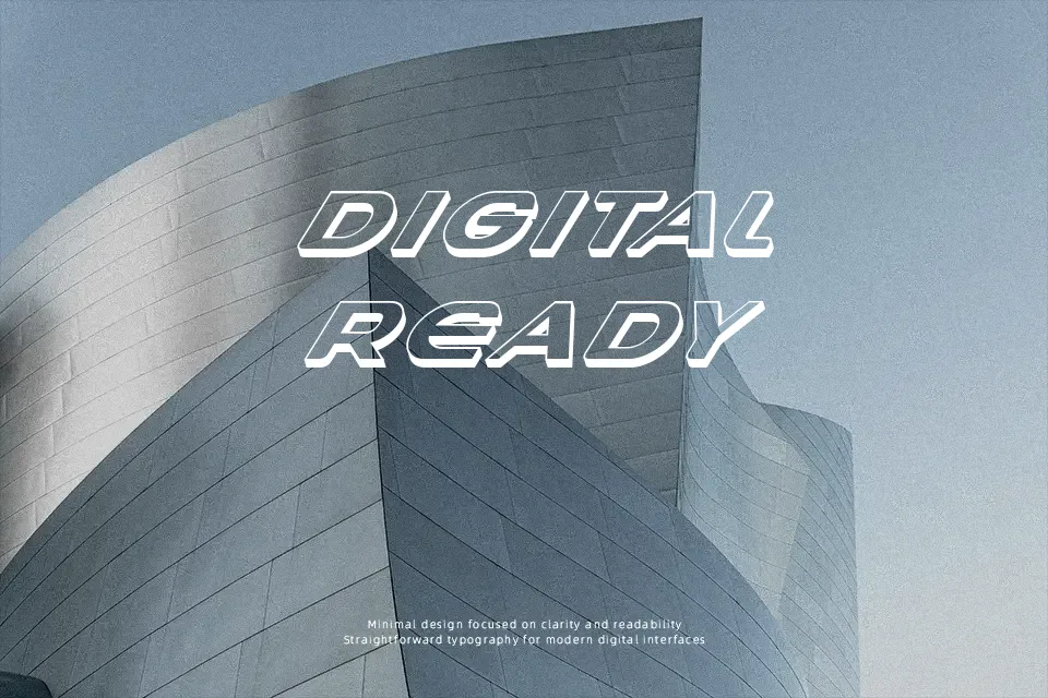
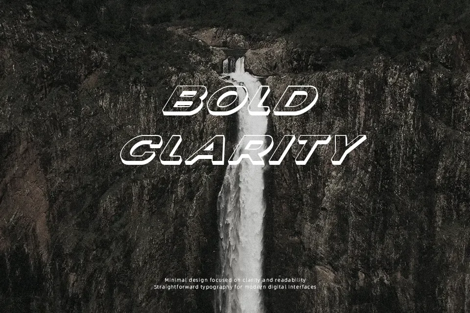
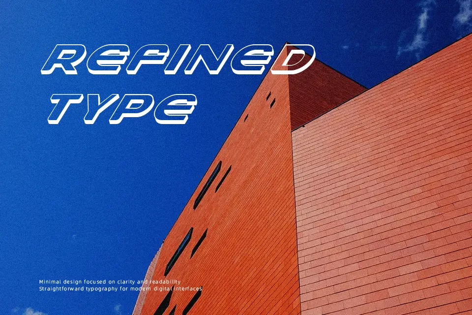
There’s a restless kinetic quality to Aerobics Font — letterforms feel like they’re mid-jump, with exaggerated curves and uneven baseline rhythm that reads as intentional rather than sloppy. The stroke weight is fairly uniform, leaning decorative rather than structural, which gives it a playful retro-fitness vibe reminiscent of 80s aerobics culture. It works well for gym flyers, music event posters, or nostalgia-driven merchandise where the typeface itself carries the energy. That said, the expressive character shapes make it unsuitable for body text or anything requiring extended reading comfort. At small sizes, legibility drops quickly — this one needs space to breathe and show off.
Best For:
– Fitness studio promotional posters
– Retro-themed event flyers and merchandise
– Music album covers with an 80s aesthetic
– Social media headline graphics for active lifestyle brands
Not Ideal For:
– Body text or multi-line paragraph content
– Corporate or professional branding contexts
– Small-size print applications where legibility is critical
– Multilingual layouts requiring extended character support
Perfect for advertising, headline, and poster, with a bold and decorative style.
License
Gallery