Adriator Font
Free for Commercial UseAbout
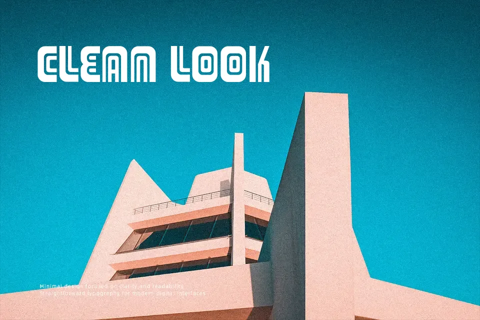
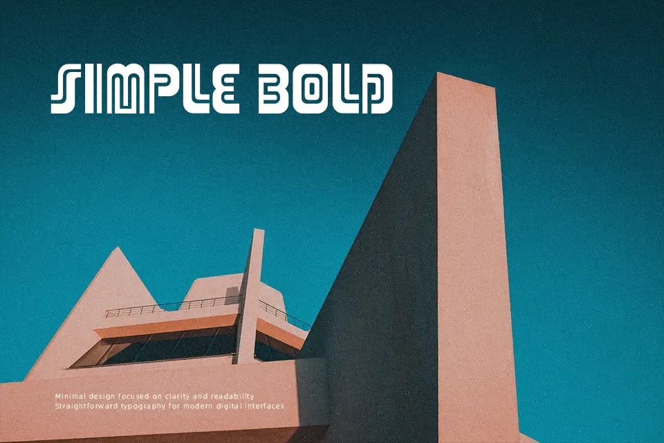
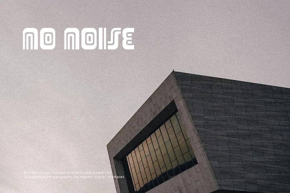
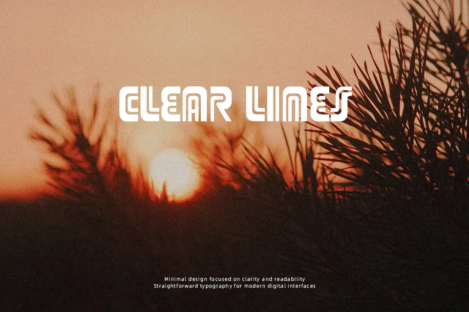
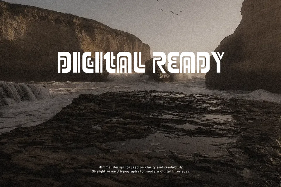
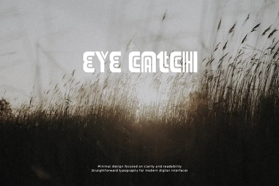
Adriator’s most distinctive trait is its unusual double-stripe construction — each letterform carries parallel internal lines that create a semi-futuristic Art Deco texture unlike standard display fonts. The strokes feel structured yet eccentric, leaning toward decorative rather than neutral. It draws from the visual language of vintage industrial signage, making it a reasonable pick for themed poster headlines, music event graphics, or retro brand identities that need an off-beat edge. That said, its ornamental striping makes it unsuitable for body text or any context where readability at small sizes matters. It also resists pairing easily — drop it into a clean minimal layout and it will clash. Works best when the design fully commits to the retro-quirky direction rather than using it as a subtle accent.
Best For:- Retro-themed event poster headlines
– Music festival or concert branding
– Art Deco-inspired packaging titles
– Vintage game or film title cards
Not Ideal For:- Body text or long-form reading
– Corporate or professional documents
– Small-size UI labels or captions
– Minimal or clean modern layouts
Perfect for branding, film, and headline, with a dynamic and decorative style.
License
Gallery