Abandon Font
Free for personal useAbout
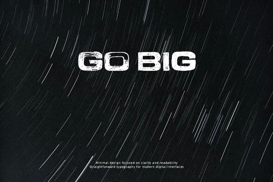
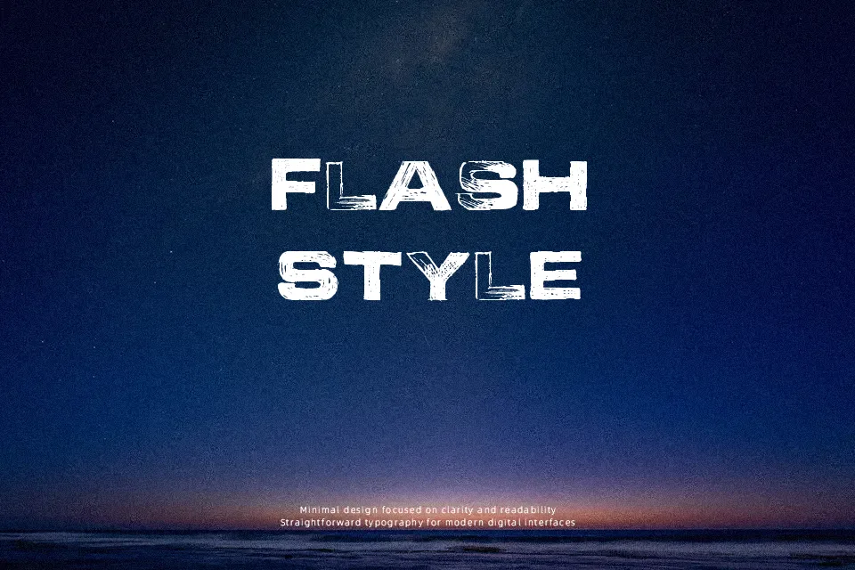
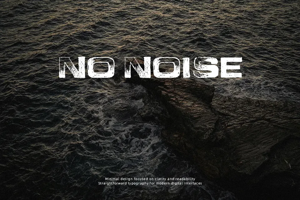
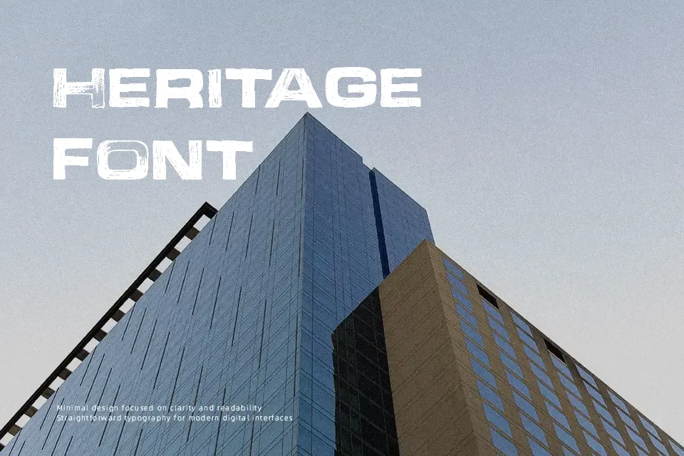
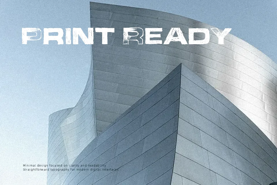
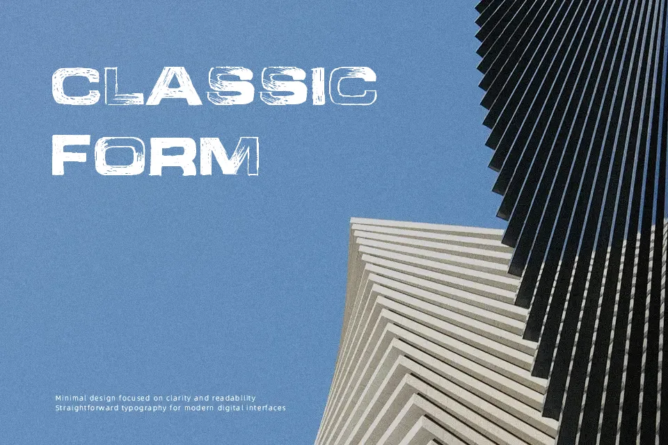
Abandon leans hard into irregularity — its letterforms show deliberate stroke roughness, uneven baselines, and a hand-crafted texture that resists refinement. The overall impression is confrontational and expressive, sitting somewhere between graffiti lettering and distressed handwriting. It performs well in short headline bursts where that gritty, worn-down energy is the whole point: think underground event flyers, DIY zine covers, or streetwear drop graphics. That said, its intentional roughness becomes a liability at smaller sizes, where letterforms lose legibility quickly. It’s also a poor fit for anything requiring brand polish or institutional credibility — the distressed character reads as chaotic rather than edgy in those contexts. Use it sparingly and large.
Best For:
– Punk or underground music event posters
– Streetwear and skate brand headline graphics
– DIY zine or alternative editorial headers
– Band merchandise and concert flyer titles
Not Ideal For:
– Body text or extended reading passages
– Corporate or professional branding materials
– Small print applications where legibility is critical
– Formal invitations or elegant design contexts
Perfect for advertising, headline, and logo, with a bold and display style.
License
Gallery