A Morris Line Font
Free for personal useAbout
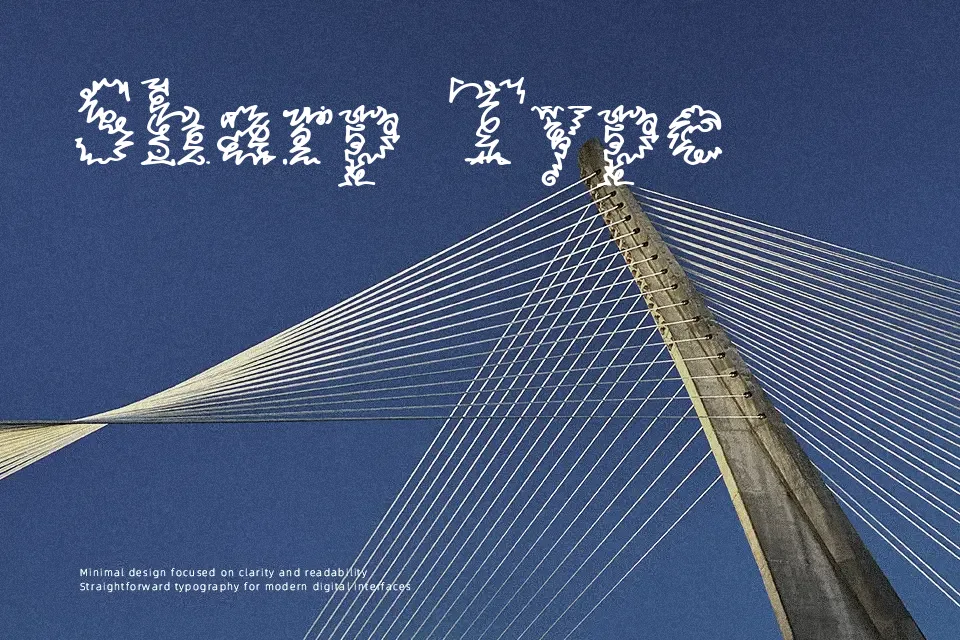
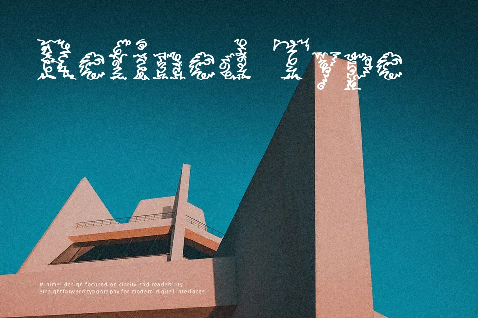
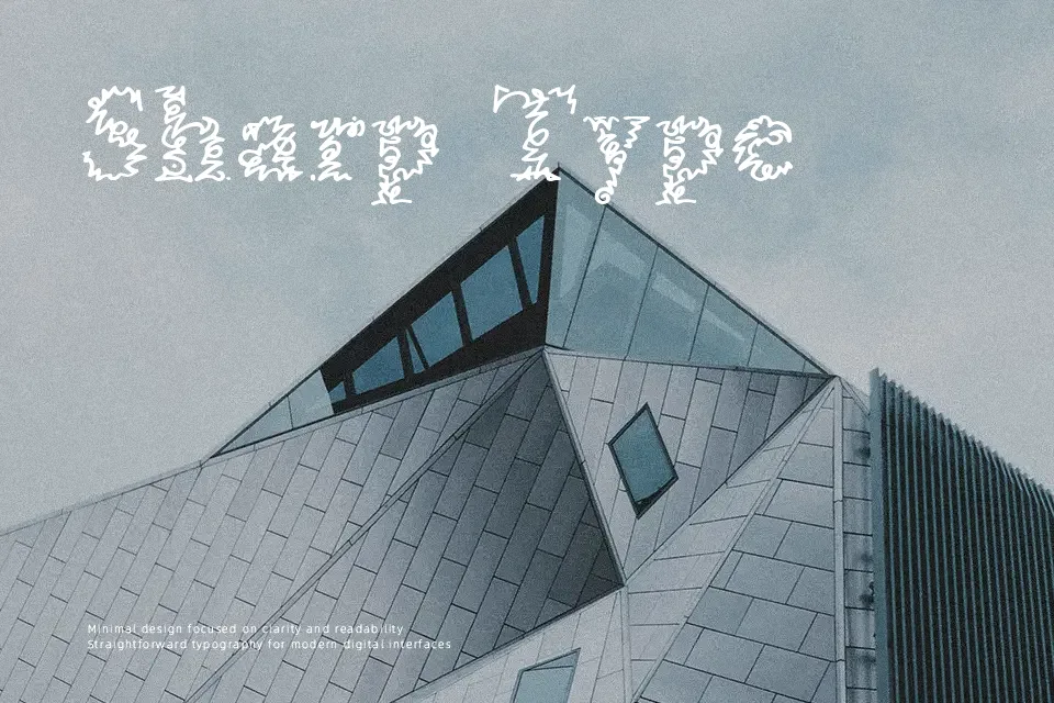
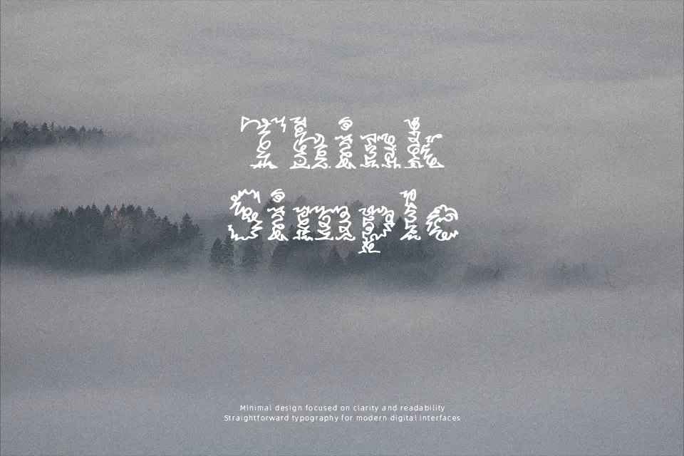
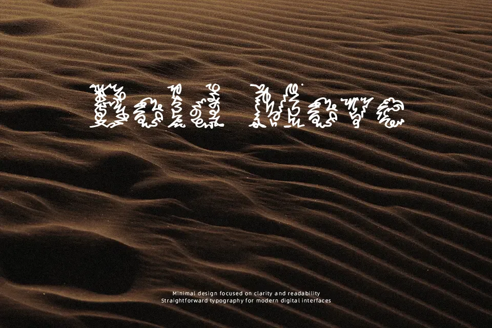
The strokes in A Morris Line Font have an unmistakably hand-traced quality — open, uneven in weight, and deliberately rough along the edges. That rawness gives it a crafted, pre-digital charm that works surprisingly well on packaging that wants to feel handmade, or editorial layouts channeling early 20th-century print aesthetics. Spacing is loose enough to breathe at display sizes, but that same looseness becomes a liability in tight compositions. Realistically, this font earns its place on a label or a short headline, not a navigation bar or a body paragraph. If you’re working on something that needs to feel like it was hand-lettered for a general store sign or a vintage poster, the tone lands well. Push it into corporate or UI contexts and it reads as mismatched.
Best For:
– vintage packaging and product labels
– editorial section headers with a handcrafted theme
– retro poster lettering at large display sizes
– artisan brand identity mood boards
Not Ideal For:
– body text or anything set below 18pt
– digital UI elements requiring consistent stroke weight
– formal or professional documents
– multilingual layouts requiring extended character support
Perfect for branding, editorial, and headline, with a artistic and decorative style.
License
Gallery