A Bit Empty Font
Free for Commercial UseAbout
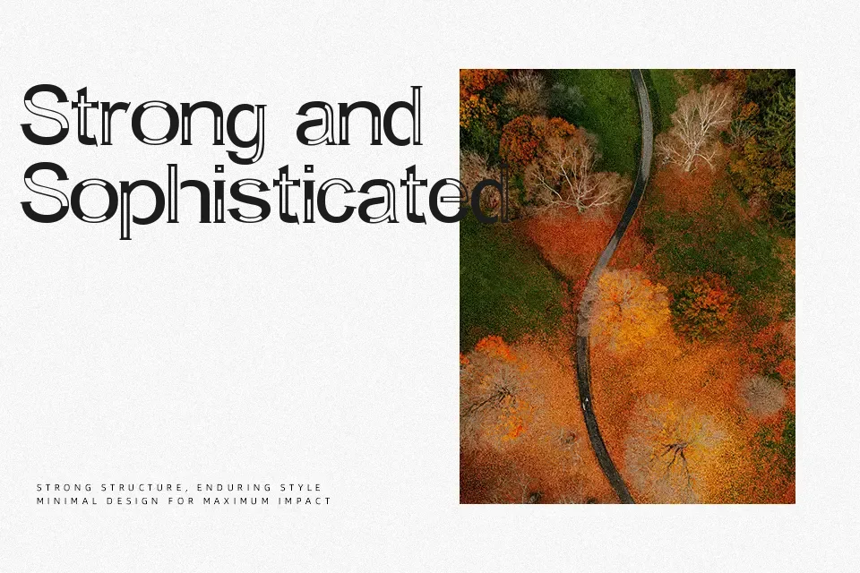
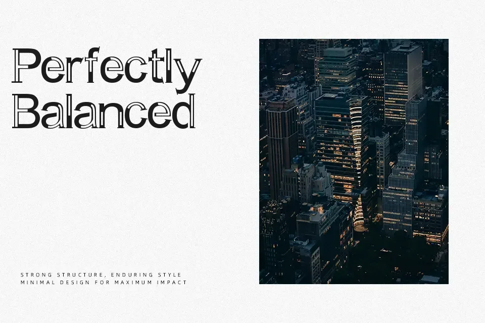
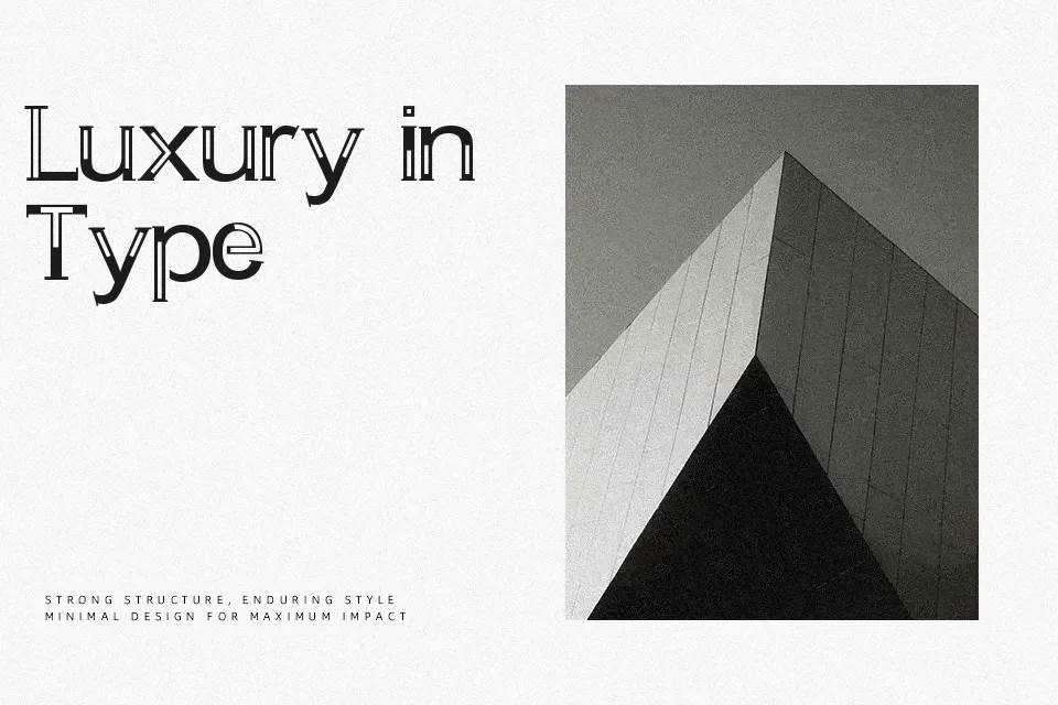
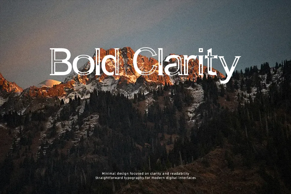
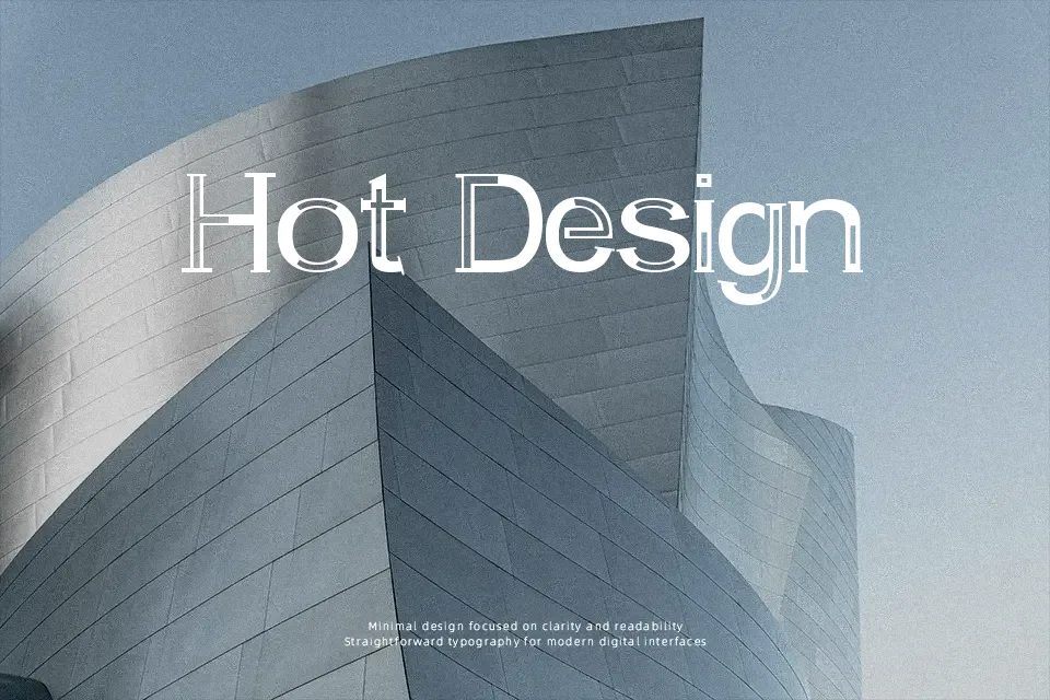
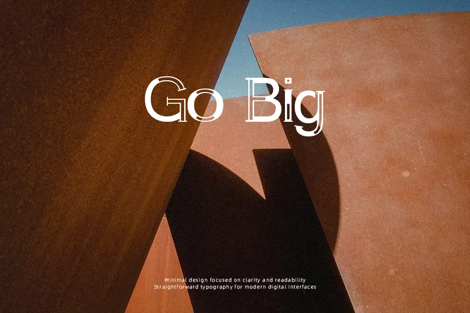
There’s something deliberately unsettled about A Bit Empty — its slab serif letterforms carry a slightly offset, layered quality that reads as low-key quirky rather than polished or refined. Strokes are medium-weight with semi-expanded width, giving each character a grounded presence that stops short of feeling heavy. It works well for music event posters, underground zine headers, or vintage-adjacent branding where a touch of visual tension adds character. That said, the decorative nature of this font limits its usefulness at small sizes — fine details collapse below 18pt, making it a poor fit for body copy or dense informational layouts. Best deployed in short bursts at large scale.
Best For:- Indie music poster headlines
– Zine and editorial section headers
– Retro-styled event flyer titles
– Underground brand logo treatments
Not Ideal For:- Body text or long-form paragraphs
– Corporate or formal business materials
– Small-size applications (UI labels, captions)
– High-legibility signage systems
Perfect for branding, editorial, and headline, with a creative and decorative style.
License
Gallery