A Abrasion Font
Free for personal useAbout
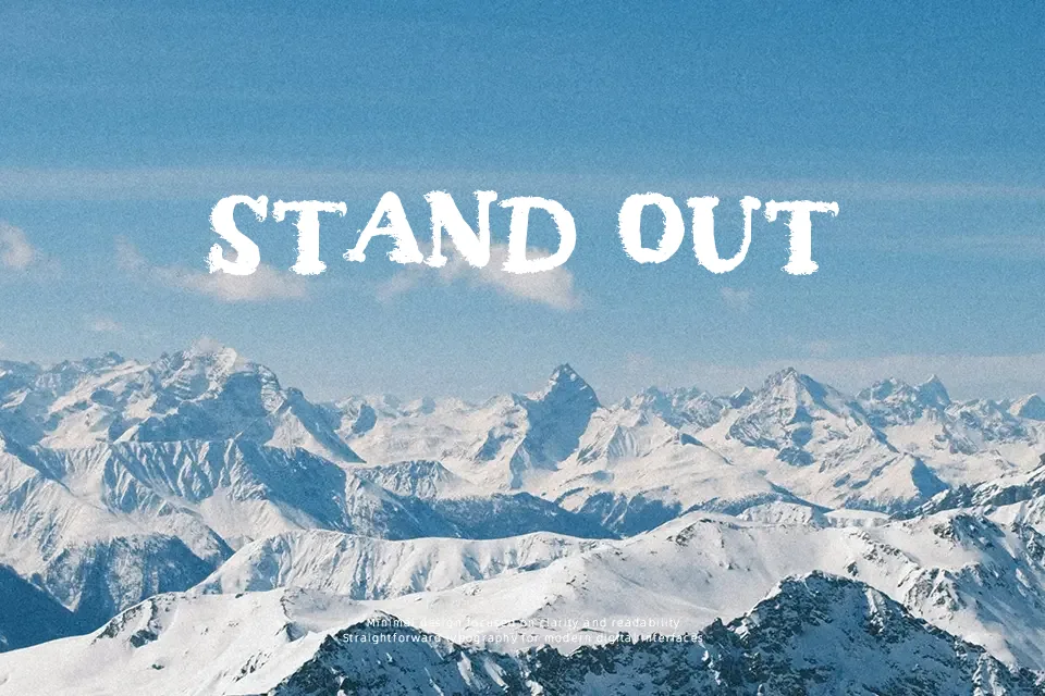
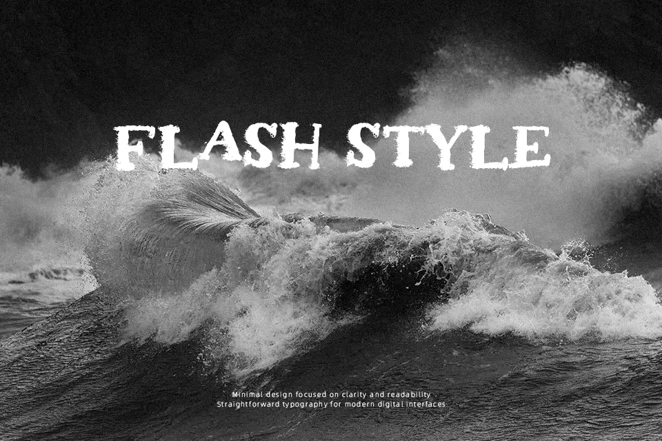
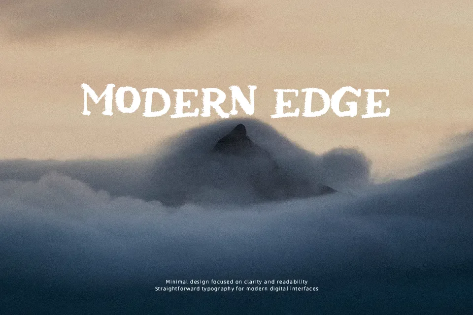
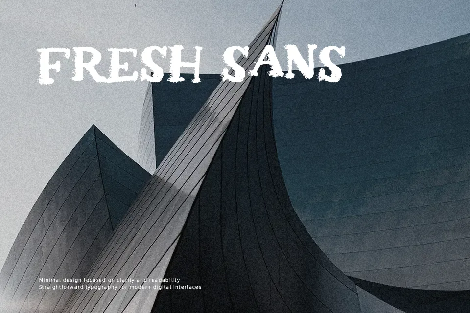
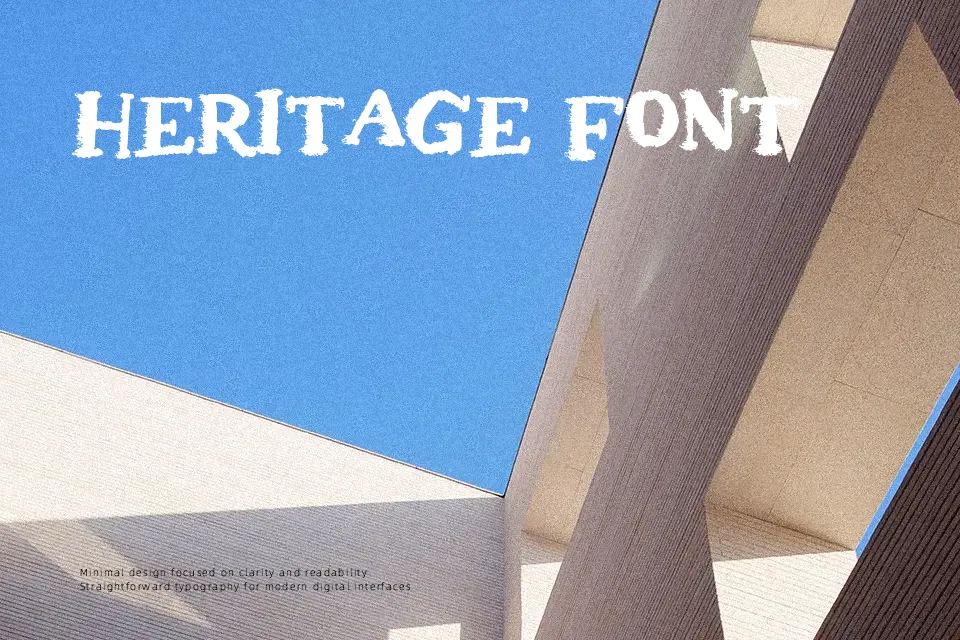
The strokes feel deliberately worn — uneven edges, textured surfaces, and visible degradation give each character a lived-in roughness that reads immediately as gritty and raw. Uppercase letters dominate with strong visual weight, while the erosion effect disrupts clean outlines just enough to feel organic rather than programmatic. This kind of treatment suits horror event posters, streetwear labels, band album covers, or any headline that needs a beat-up edge. That said, the heavy distortion becomes a liability at small sizes — legibility drops sharply below 24pt, and it should never touch body copy. Works best when the design has breathing room and the font can carry the visual tone on its own.
Best For:- Horror or underground event poster headlines
– Streetwear and band merchandise labels
– Music album title treatments
– Urban branding and graffiti-adjacent logo work
Not Ideal For:- Body text or any extended reading context
– Corporate or professional business documents
– Small-size usage (below 24pt)
– Clean, minimal, or luxury brand identities
Perfect for advertising, branding, and logo, with a bold and display style.
License
Gallery