60s Stripe Font
Free for personal useAbout
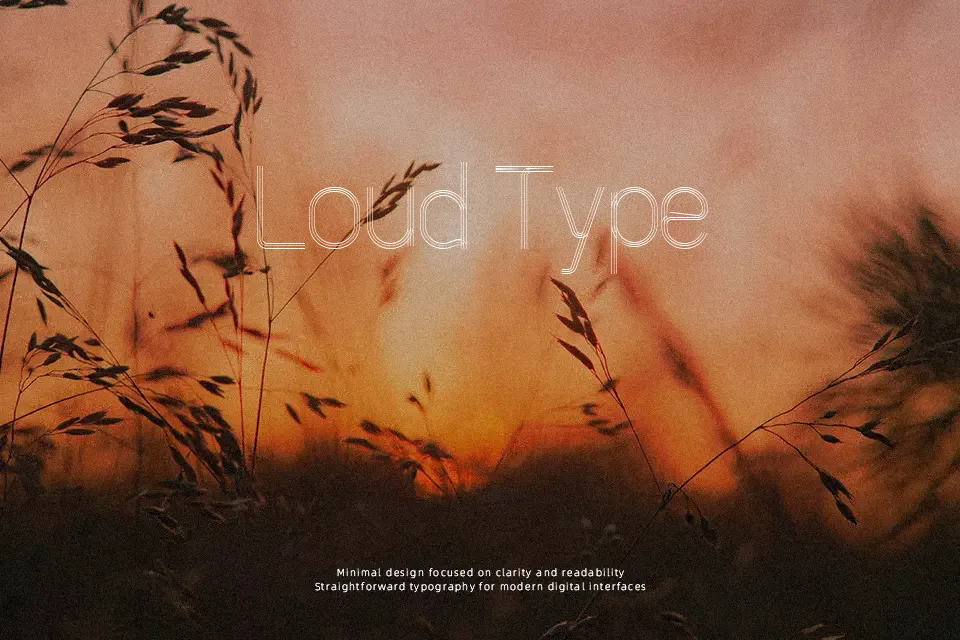
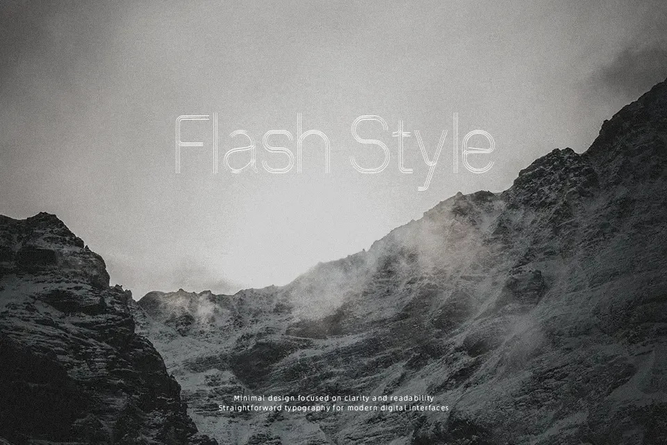
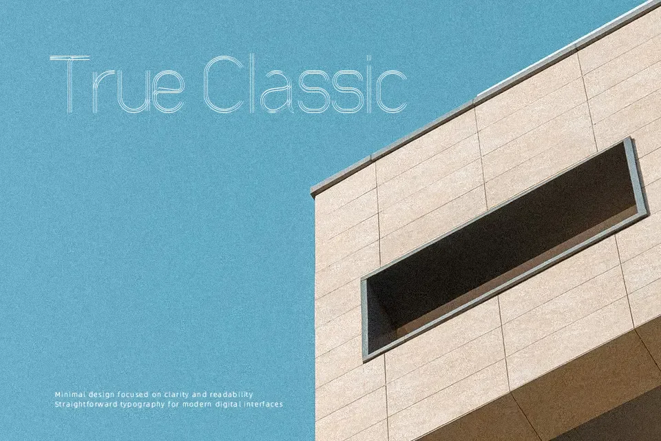
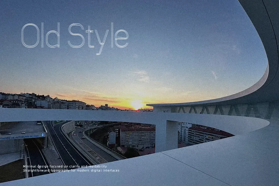
Every letterform in 60s Stripe Font carries thick, blocky construction with embedded horizontal striping — a visual shorthand for the psychedelic-era print style that dominated concert posters and magazine covers of the 1960s. The stripes run consistently through each glyph, giving the typeface a textured, almost screen-printed feel that reads as deliberately retro rather than accidentally dated. It suits headline-scale use comfortably: album cover mockups, retro event flyers, and vintage-themed packaging all benefit from its confident weight. That said, the striped interior detail disappears fast at smaller sizes, making it genuinely unsuitable for anything below 36pt. If your layout demands readability under pressure — tight columns, dense labeling, or small print — this font will fight you.
Best For:
– Retro music event posters and concert flyer headlines
– Vintage-themed apparel or merchandise graphics
– 1960s-inspired packaging and label design
– Nostalgic social media visuals and throwback campaign headers
Not Ideal For:
– Small-size text where stripe detail becomes noise
– Corporate or professional documents requiring clean legibility
– Body text or any extended reading context
– Multilingual layouts requiring broad character support
Perfect for advertising, branding, and headline, with a bold and decorative style.
License
Gallery