3 Font
Free for Commercial UseAbout
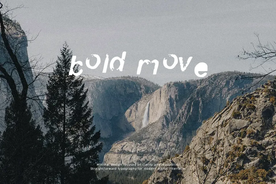
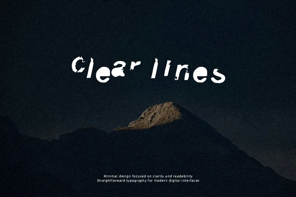
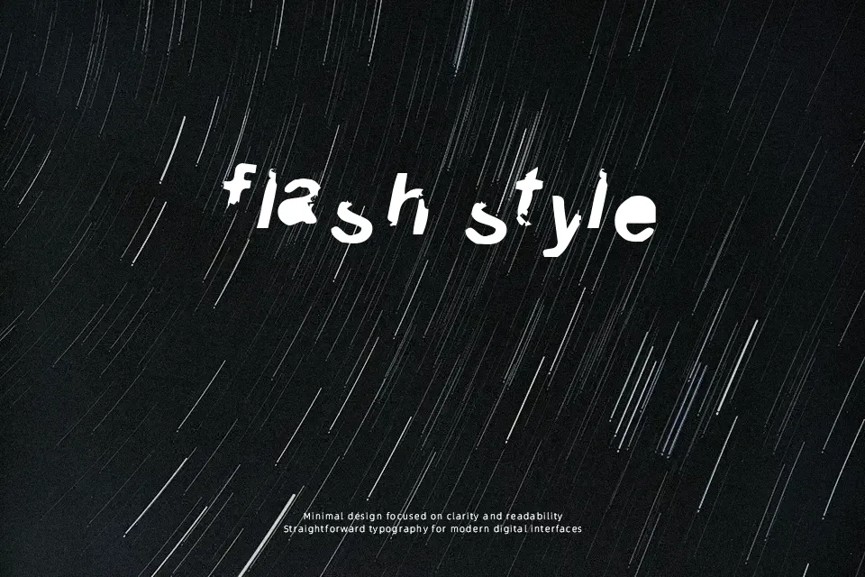
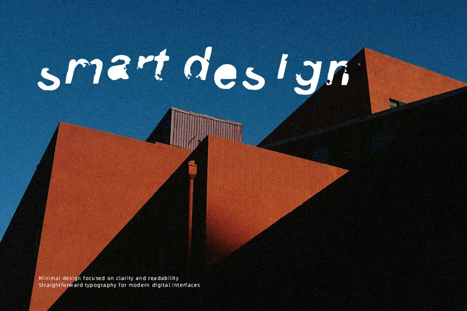
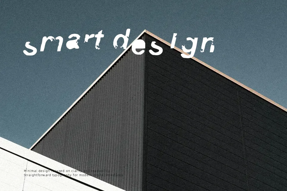
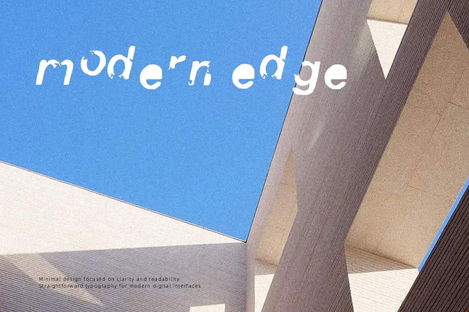
3 Font immediately reads as a highly distressed display typeface, with heavy strokes that appear shattered and fragmented across each character. The letterforms are constructed from thick, angular pieces, creating strong visual contrast between filled areas and gaps along the stems and curves. Spacing feels relatively tight, so words form dense clusters of broken shapes rather than airy lines of text. Proportions lean toward squarish and compact forms, which reinforces its loud, graphic impact at larger sizes. The design maintains legibility in short headlines and single words, but continuous reading quickly becomes tiring as the fractured outlines disrupt smooth eye movement. This makes it effective for attention-grabbing titles or labels, while less suited to body copy or small captions where clarity is critical.
Best For:
grunge-style poster headlines
album or mixtape cover titles
experimental logo wordmarks
festival or event graphic accents
Not Ideal For:
long paragraph text
formal corporate documents
small interface labels
technical manuals or reports
Perfect for advertising, headline, and logo, with a bold and decorative style.
License
Gallery