208 Font
Free for Commercial UseAbout
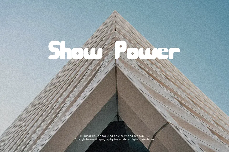
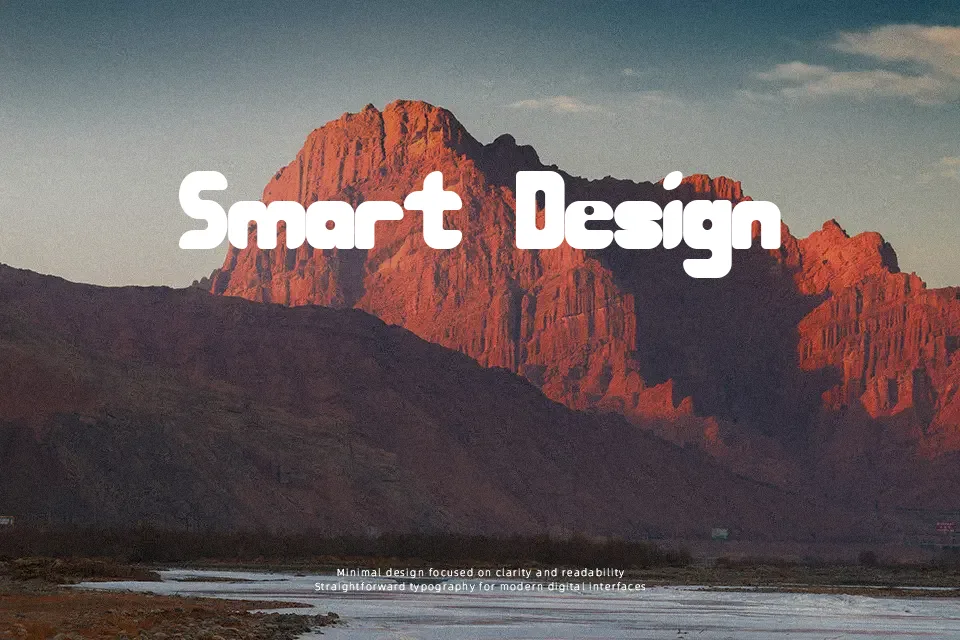
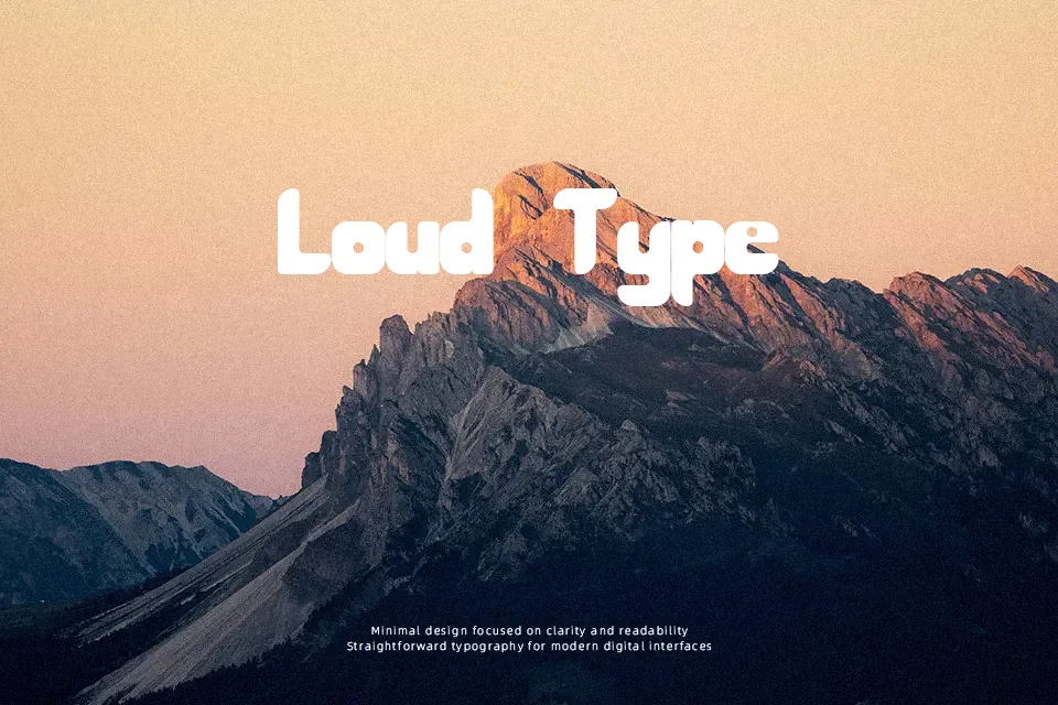
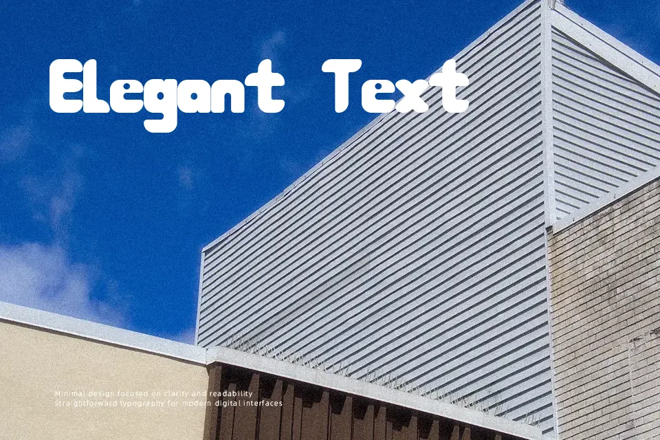
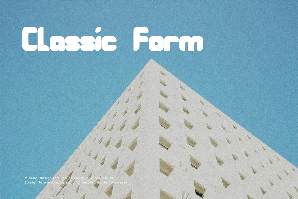
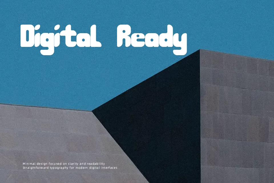
The letterforms in 208 carry a confident retro groove — thick strokes with rounded, bouncy terminals that give each character a sense of motion. Spacing is loose and expressive, leaning more into visual energy than typographic precision. This makes it a reasonable pick for music-themed headers, vintage-inspired packaging labels, or poster titles where a 70s aesthetic is deliberately invoked. That said, the quirky stroke irregularities that give it character also make it a poor fit for anything requiring clear readability at small sizes or in dense text settings. Think of it as a decorative accent font — strong in a single headline, strained when overused.
Best For:- Music event and concert poster headlines
– Retro-themed streetwear or apparel graphics
– Social media visual headers with a groovy or vintage feel
– Indie brand packaging that leans into 70s nostalgia
Not Ideal For:- Body text or long-form reading
– Corporate or professional branding materials
– Small-size UI labels or navigation text
– Any context requiring clean typographic neutrality
Perfect for branding, music, and packaging, with a bold and decorative style.
License
Gallery