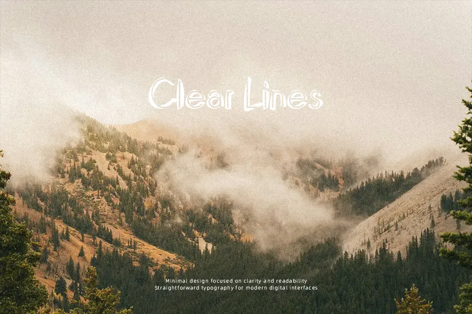
Domino Font
Free for personal useAbout
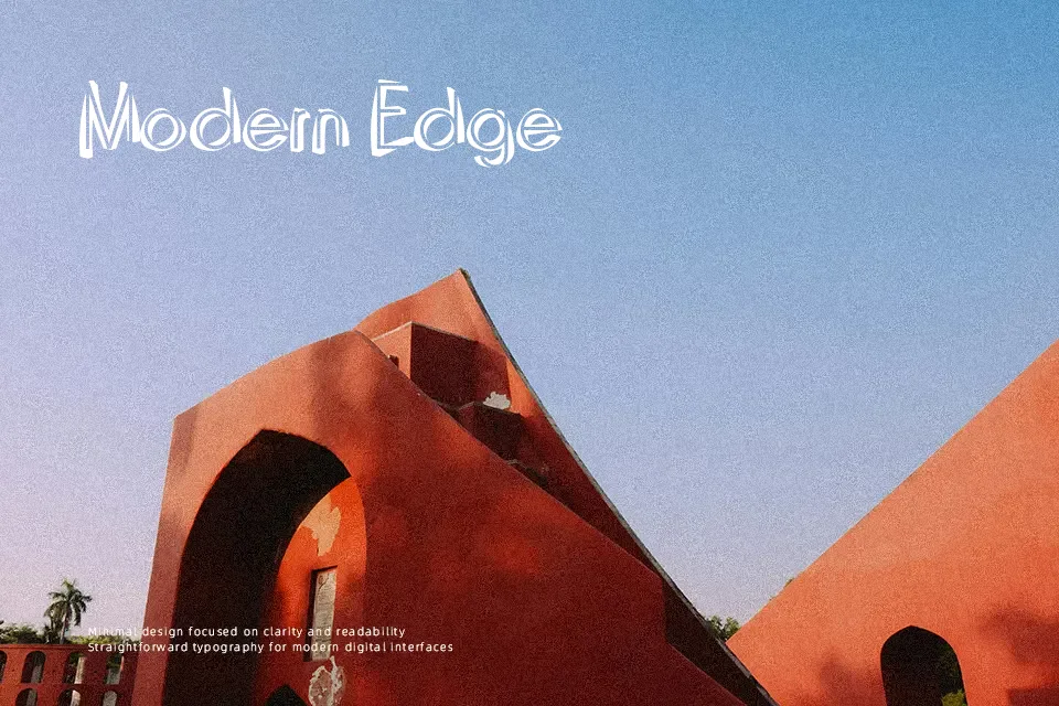
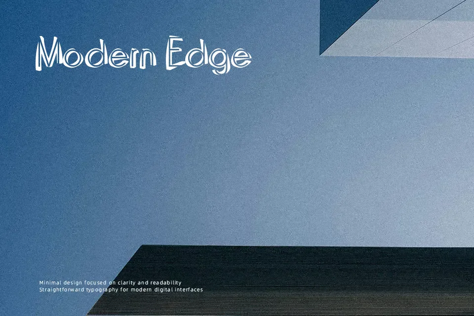
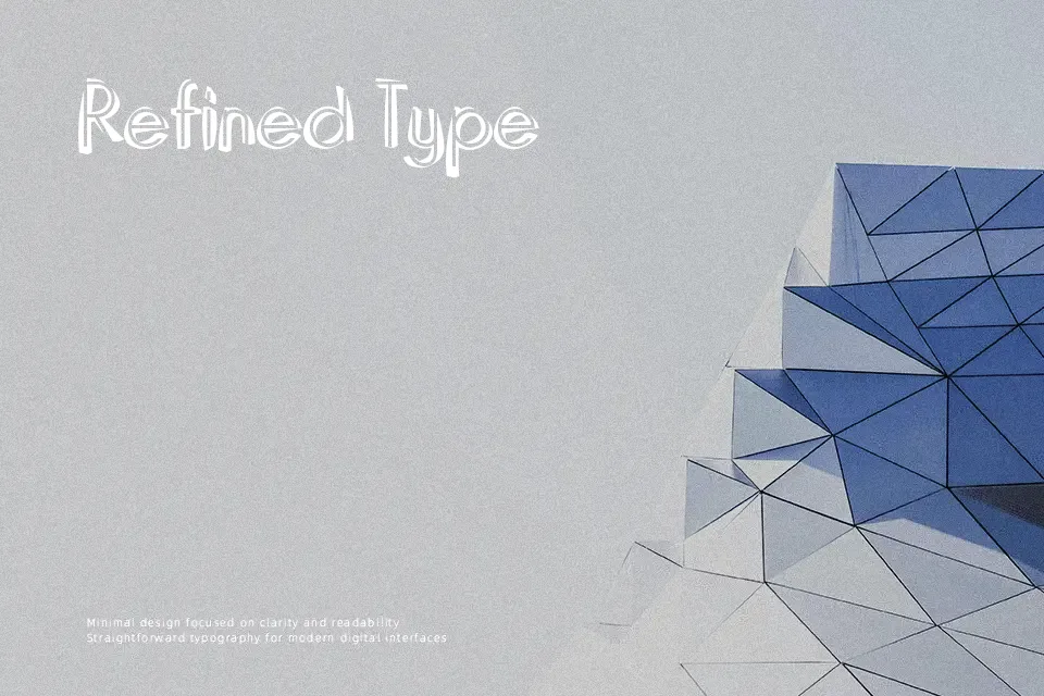
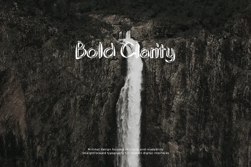
Domino Font leans into a narrow, outlined display style with uneven curves, tall verticals, and a hand-cut feel that keeps it from looking polished or corporate. The letters have enough eccentricity to carry a title on their own, especially in short words, stacked headings, or oversized initials. I would use it for retro nightlife flyers, novelty drink labels, escape room graphics, or chapter openers that need some visual drama without going full horror. It starts to struggle in body copy, dense packaging text, or clean digital interfaces, where the thin internal spaces and quirky construction make reading slower than it should be.
Best For:
retro nightlife posters, themed drink menus, album titles, novelty packaging
Not Ideal For:
body copy, small app labels, dense legal text, restrained corporate branding
Perfect for headline, music, and packaging, with a artistic and condensed style.
License
Gallery