DK Pardesi Font
Free for personal useAbout
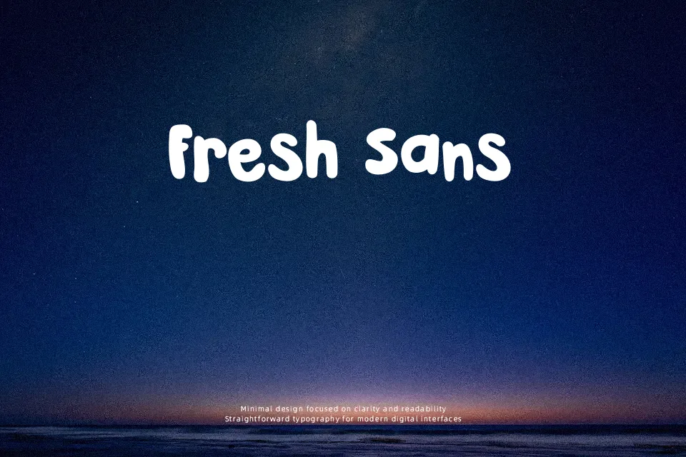
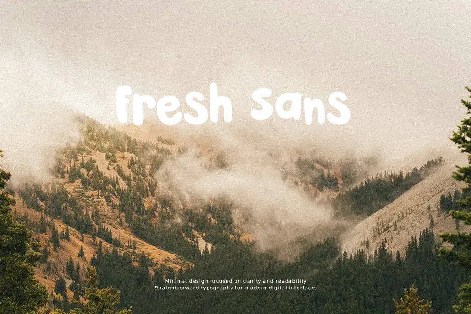
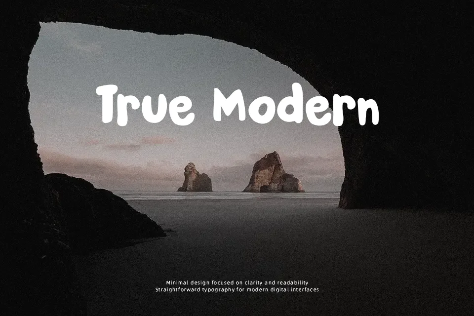
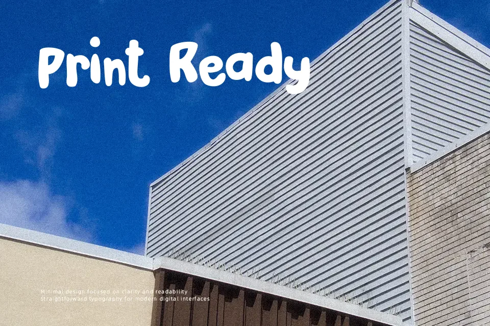
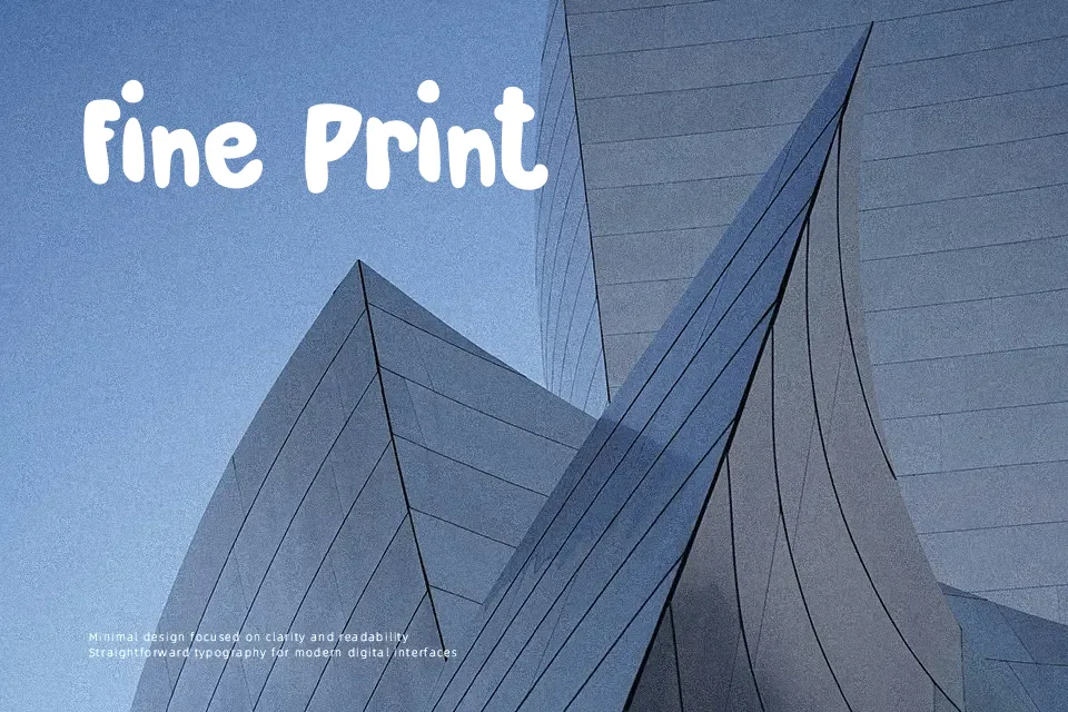
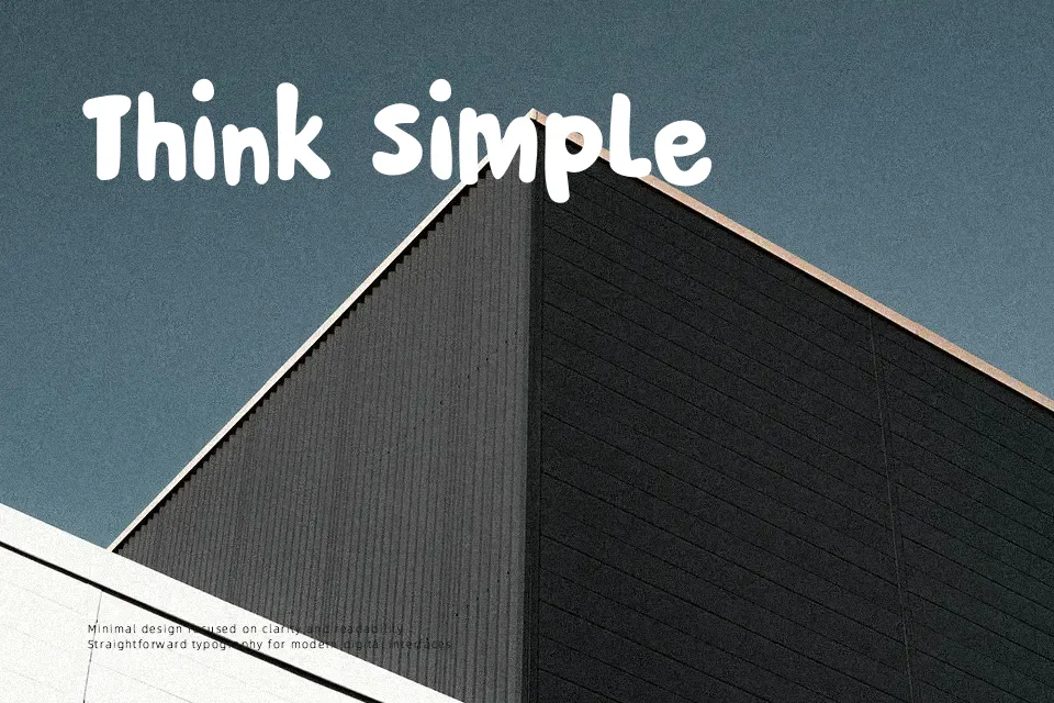
DK Pardesi Font has a thick, rounded build with compact spacing, blunt terminals, and a slightly uneven cartoon rhythm that keeps it lively without looking messy. The letterforms feel hand-drawn but controlled, which gives it a friendly decorative voice rather than a rough comic look. It reads best when you want a headline to feel cheerful, loud, and a little quirky, such as snack packaging, children’s event posters, or playful social graphics. It holds attention well in short words. For longer copy, though, the heavy structure starts to crowd itself, so it is less convincing in body text, polished corporate work, or interfaces that need a cleaner tone.
Best For:
kids posters,playful packaging,short headlines,party invitations
Not Ideal For:
body text,formal branding,dense UI labels,long editorial copy
Perfect for headline, invitation, and kids, with a bold and cartoon style.
License
Gallery