DK Kunstschau Font
Free for personal useAbout
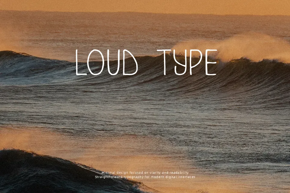
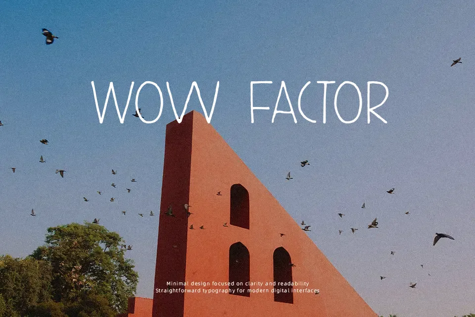
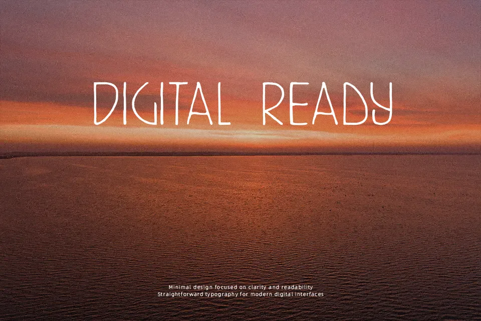
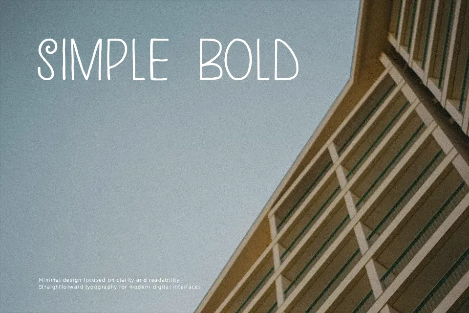
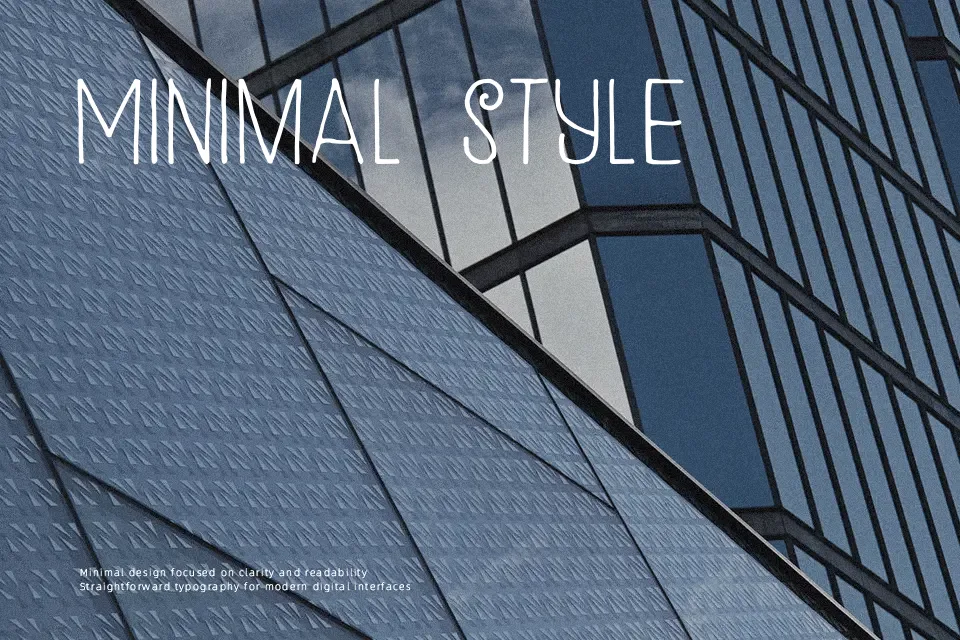
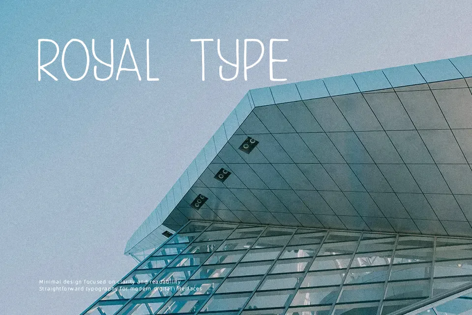
DK Kunstschau uses very light strokes, tall narrow proportions, and loose, hand-drawn spacing to create a decorative display look with a vintage art-poster flavor. It works best when you want a headline to feel artistic rather than polished, especially on gallery flyers, themed packaging, or editorial openers where the letterforms can stay large and airy. I would avoid it for body copy, small mobile graphics, or anything that depends on quick readability, because the thin lines and quirky rhythm start to feel fragile under tight spacing.
Best For: exhibition posters,art-themed packaging,editorial title pages,album cover lettering
Not Ideal For: body paragraphs,small app text,dense menus,formal corporate documents
Perfect for editorial, headline, and packaging, with a artistic and decorative style.
License
Gallery