DK Innuendo Font
Free for personal useAbout
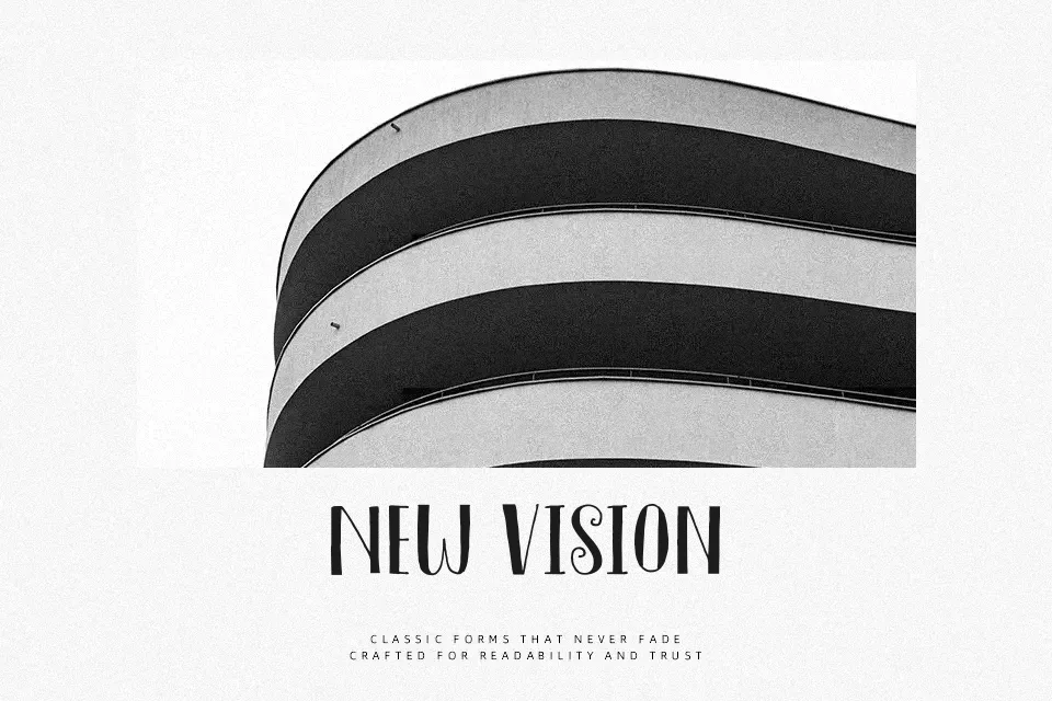
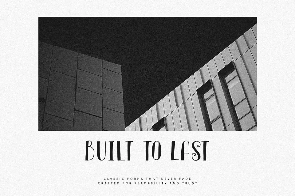
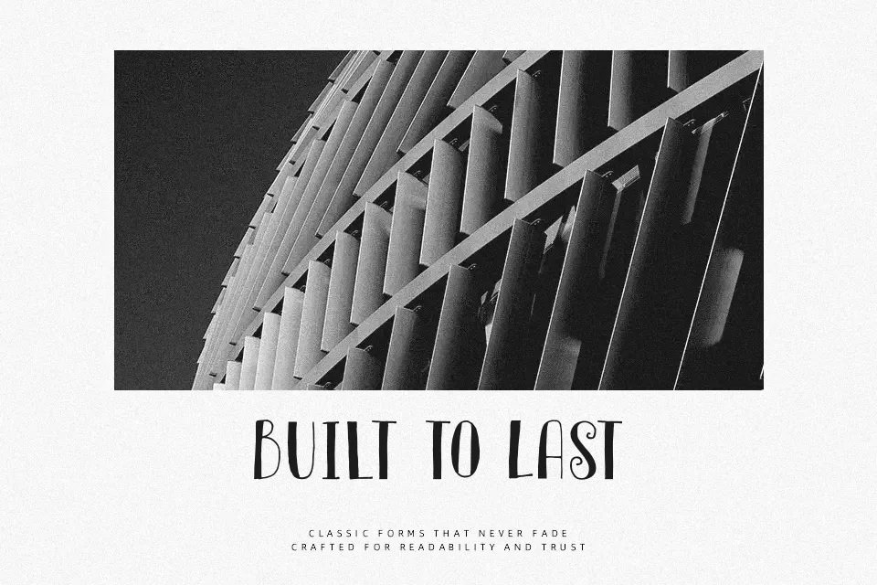
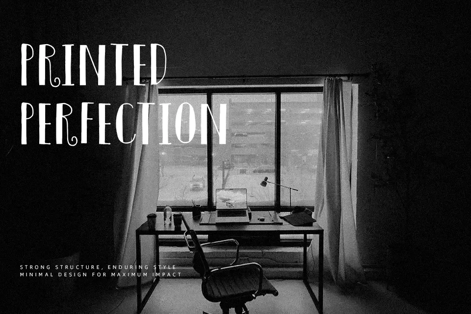
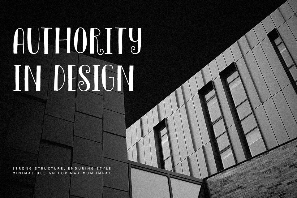
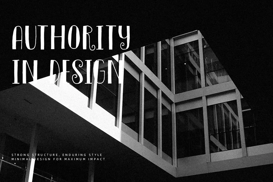
DK Innuendo leans into a Didone-style serif look, with thick vertical strokes, hairline connectors, sharp serifs, close-set capitals, and a mostly upright structure that gives headlines a polished, slightly theatrical rhythm. The forms feel narrow and formal rather than friendly, so it earns its place on fashion covers, boutique packaging, wedding stationery, book jackets, and logo work where contrast needs to carry the composition. I would avoid it for body copy, interface labels, or dense posters because the thin strokes start to fade once the size drops and the elegance turns brittle.
dafont
Best For: fashion mastheads, perfume packaging, formal invitations, dramatic book titles
Not Ideal For: body copy, app interfaces, small captions, dense data layouts
Perfect for editorial, fashion, and headline, with a classic and decorative style.
License
Gallery