DK Hokitika Font
Free for personal useAbout
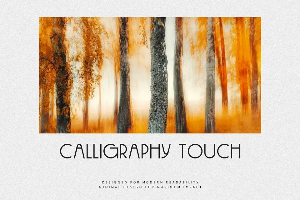
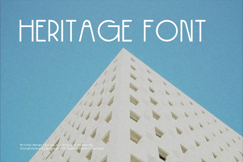
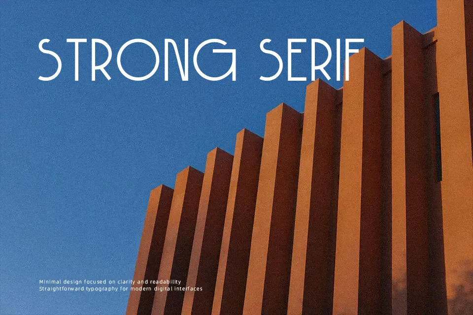
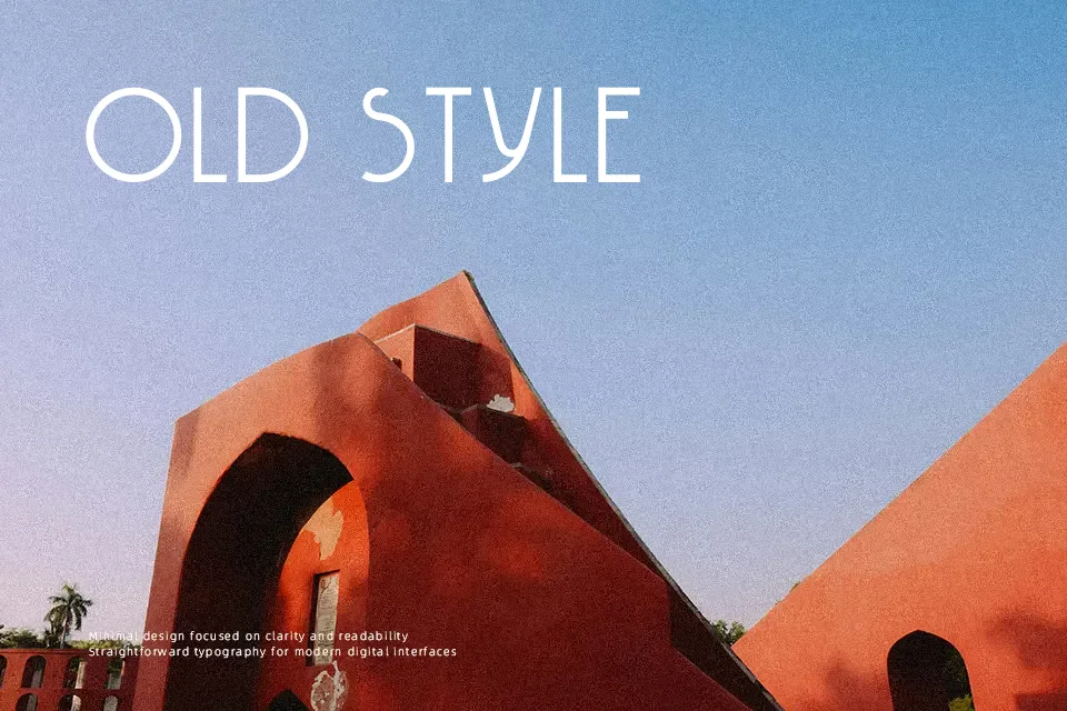
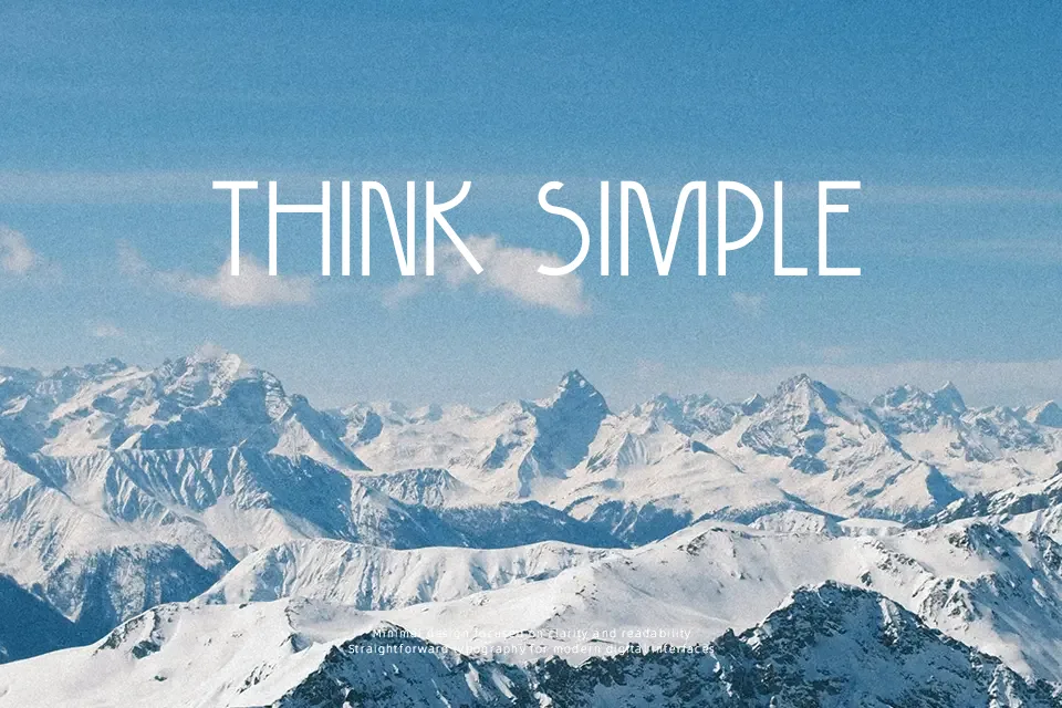
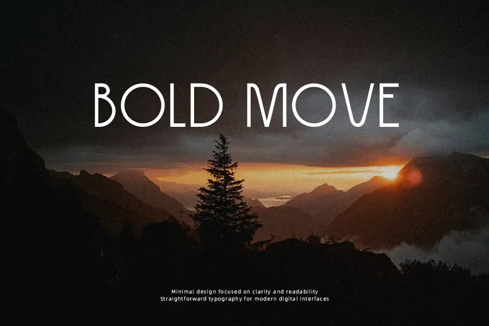
DK Hokitika is built from slim, mostly monoline uppercase forms with generous vertical proportions, rounded bowls, and a distinctly Art Deco rhythm. The spacing feels open enough to keep the letters elegant, while the narrow structure gives headlines a compact, poster-like presence. I would use it on speakeasy menus, hotel event signage, book covers set around the 1920s, or packaging that needs a refined retro accent without looking too ornate. It starts to lose its appeal in body copy, small labels, or busy interfaces, where the tall forms and display focus can feel stiff rather than readable.
Best For:
Art Deco posters, cocktail bar menus, boutique product packaging, event signage
Not Ideal For:
Body copy, small UI labels, dense legal text, long multilingual layouts
Perfect for branding, headline, and packaging, with a artistic and condensed style.
License
Gallery