DK Bergelmir Font
Free for personal useAbout
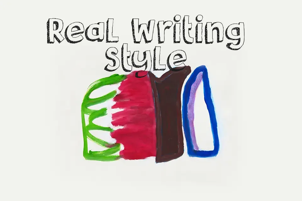
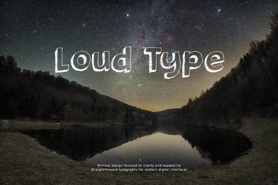
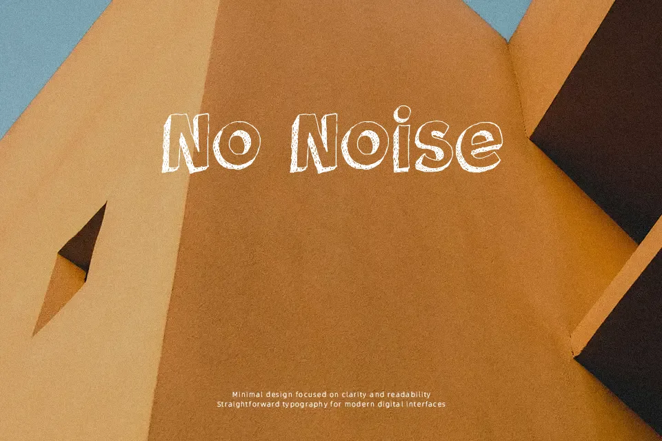
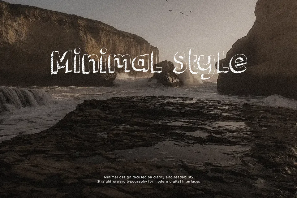
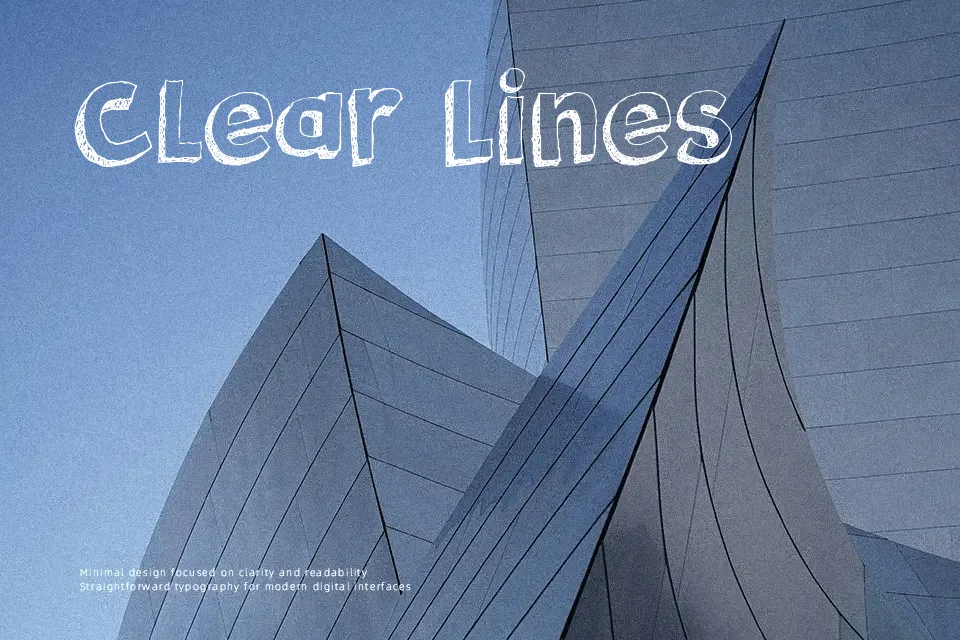
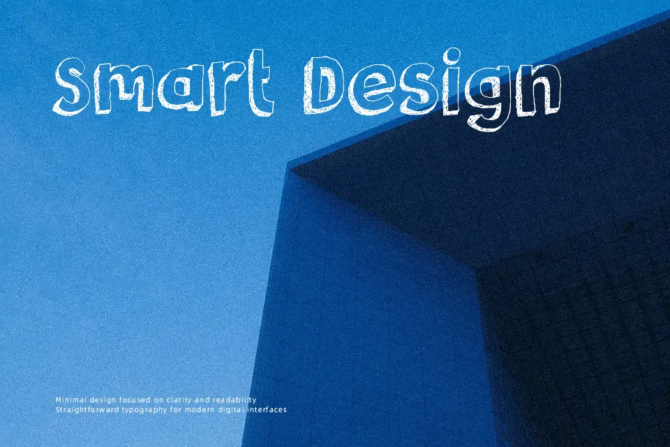
The letters are chunky and upright, drawn with uneven hollow strokes, rough inner texture, and slightly loose spacing that keeps the wordshape lively instead of rigid. It feels casual, decorative, and a little vintage, closer to hand-inked signage or comic display lettering than to a polished brand face. In practice, I would reserve it for cereal-box style packaging, classroom posters, themed party signage, or title art for kids-oriented graphics, where the distressed outline adds charm without needing fine detail. For small captions, body copy, or restrained corporate layouts, it gets busy fast and loses its appeal.
Best For:
comic-style headlines, children’s event posters, playful product packaging, novelty signage
Not Ideal For:
body copy, restrained corporate branding, compact UI labels, small captions
Perfect for headline, kids, and packaging, with a bold and cartoon style.
License
Gallery