New Glitch Font
Free for personal useAbout
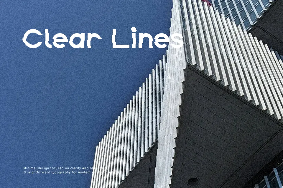
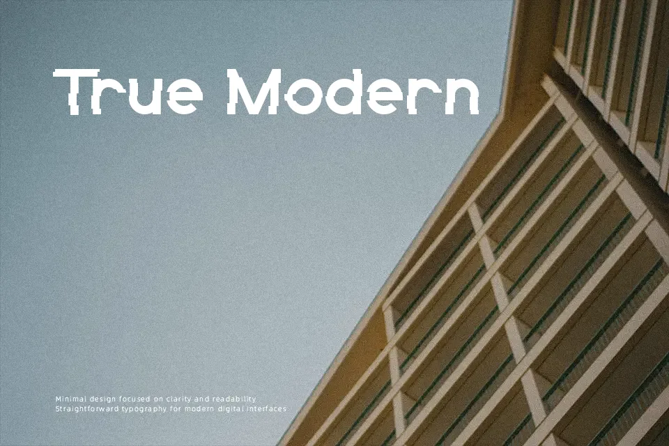
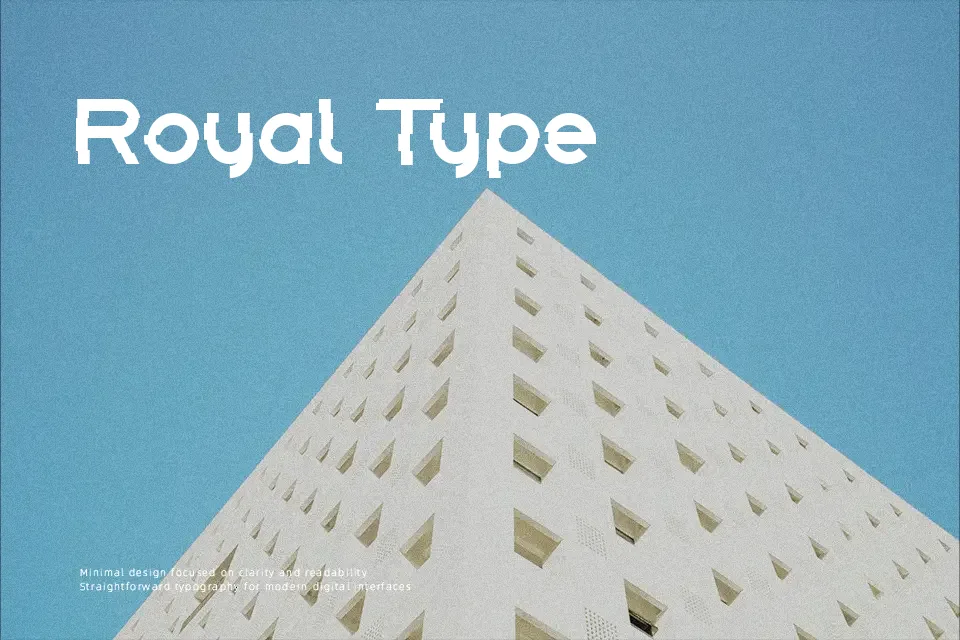
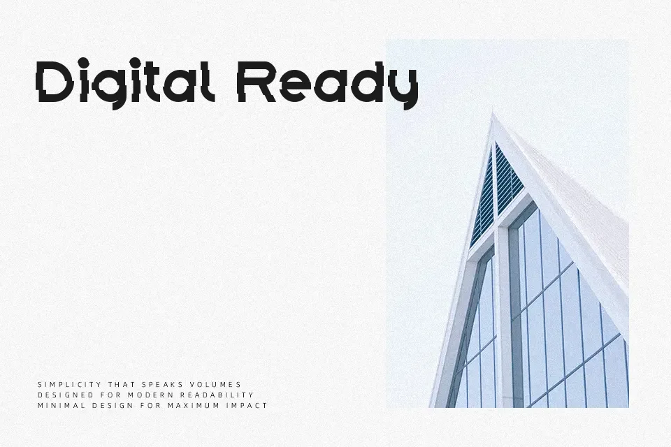
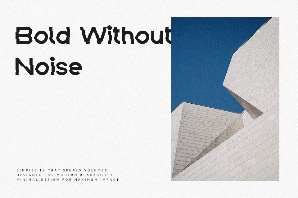
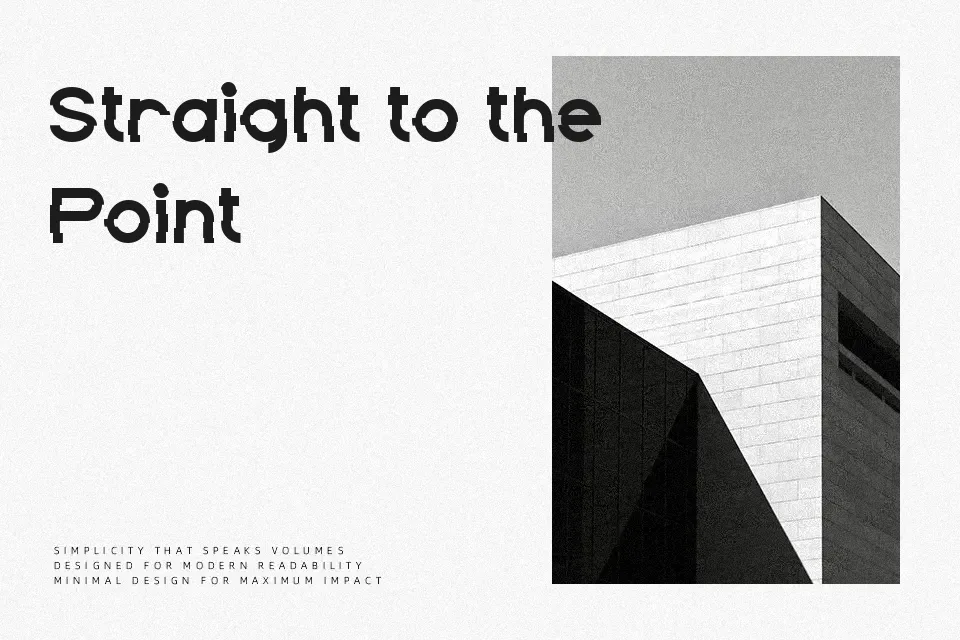
At first glance, this display face pushes a heavy, blocky structure that is then fractured by horizontal and vertical breaks, giving the letters a clear glitch and distortion effect. Strokes stay thick and mostly uniform, so shapes remain solid even as outlines appear offset or doubled. Spacing leans compact, which strengthens the dense, digital texture in headlines but would feel crowded in longer text lines. Uppercase forms are consistent in width and rhythm, helping words lock together visually, while the jagged cuts introduce enough noise that small sizes lose clarity quickly. It works well when you need a loud, techy title, though the aggressive distortion makes it a poor choice for body copy or fine print.
Best For:
gaming or tech poster titles,stream graphics and overlay headlines,music or festival event banners,album or mixtape cover wordmarks
Not Ideal For:
long paragraph text,formal documents or reports,small interface labels,dense data tables
Perfect for gaming, headline, and logo, with a bold and decorative style.
License
Gallery