Nevermine Font
Free for personal useAbout
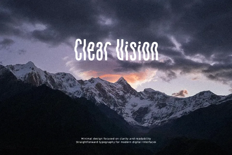
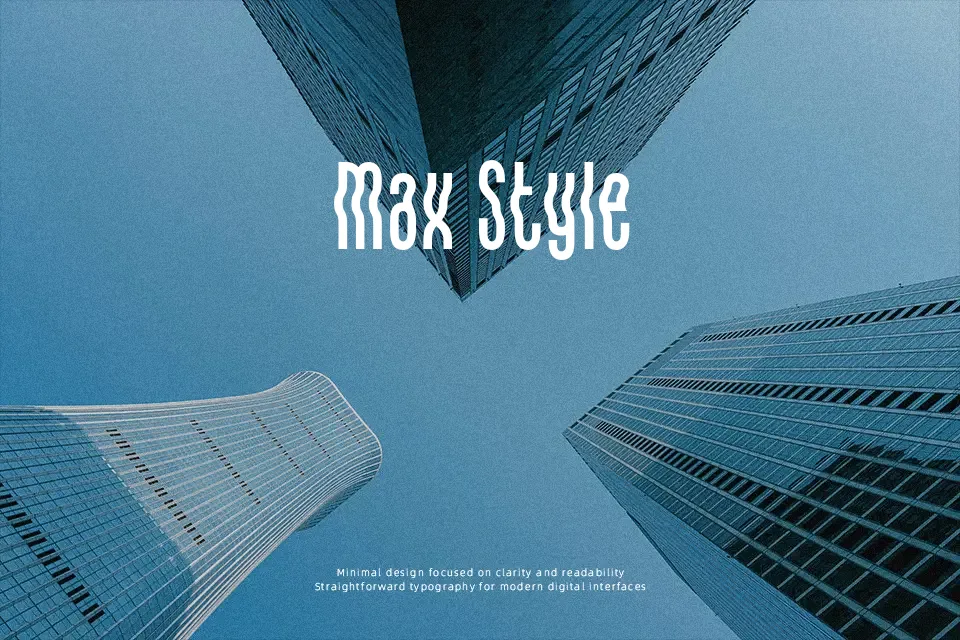
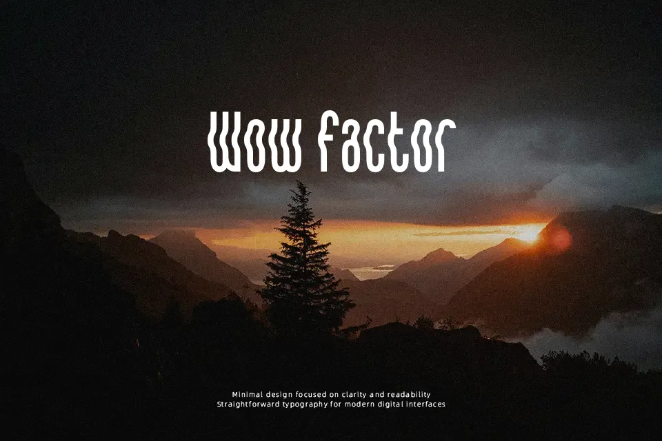
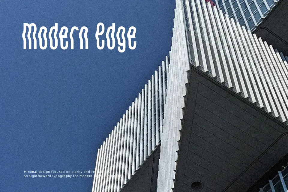
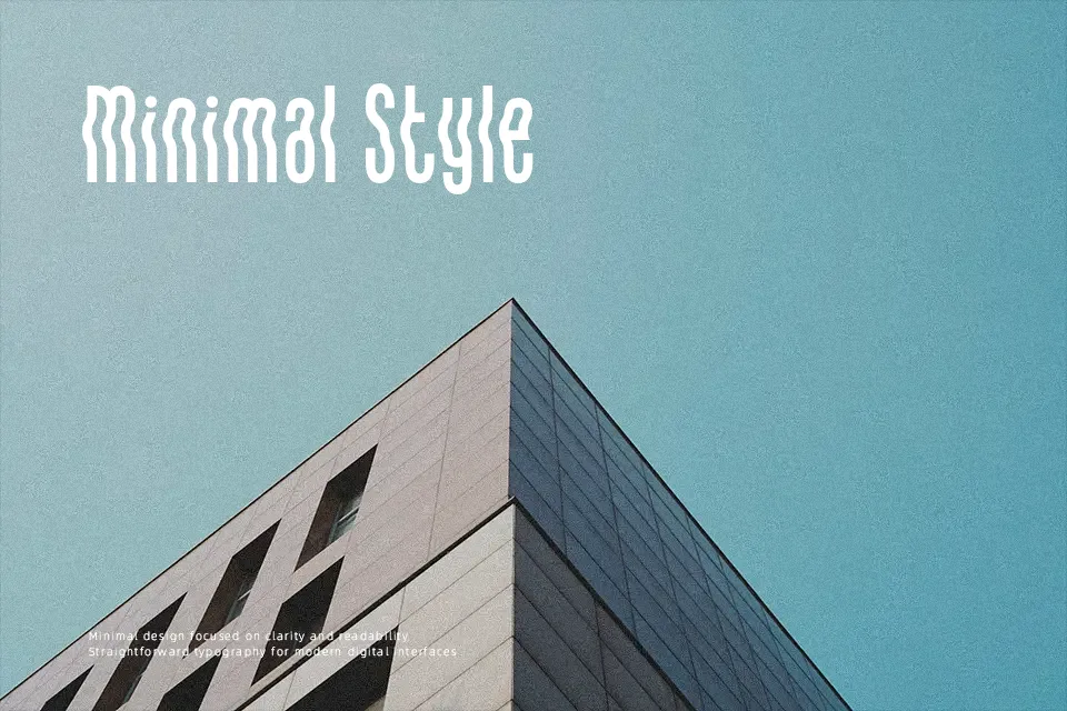
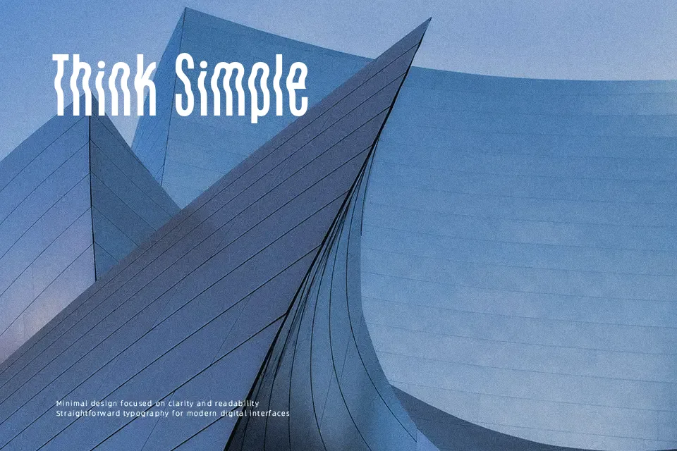
Letterforms in this typeface are heavily distorted, with broken segments, sharp angles, and compressed shapes that push it firmly into decorative display territory. Strokes appear thick and largely uniform, creating dense, high-contrast silhouettes that emphasize impact over subtlety. Characters are tightly spaced, which heightens the sense of tension and makes longer lines feel visually crowded, especially at smaller sizes. The overall structure suits short words and uppercase-heavy settings, where the raw, rough construction supports loud titles and graphic compositions. It performs best in large headlines or logotypes that embrace its aggressive personality, while extended reading quickly becomes tiring. Designers who need a gritty, compressed look for bold statements will find it useful, but it is not a comfortable choice for continuous text.
Best For:
music festival posters,
album or mixtape covers,
streetwear or extreme sports branding,
event banners with short, bold titles
Not Ideal For:
long paragraph text,
formal business documents,
small interface labels,
dense technical or academic content
Perfect for branding, headline, and logo, with a bold and condensed style.
License
Gallery