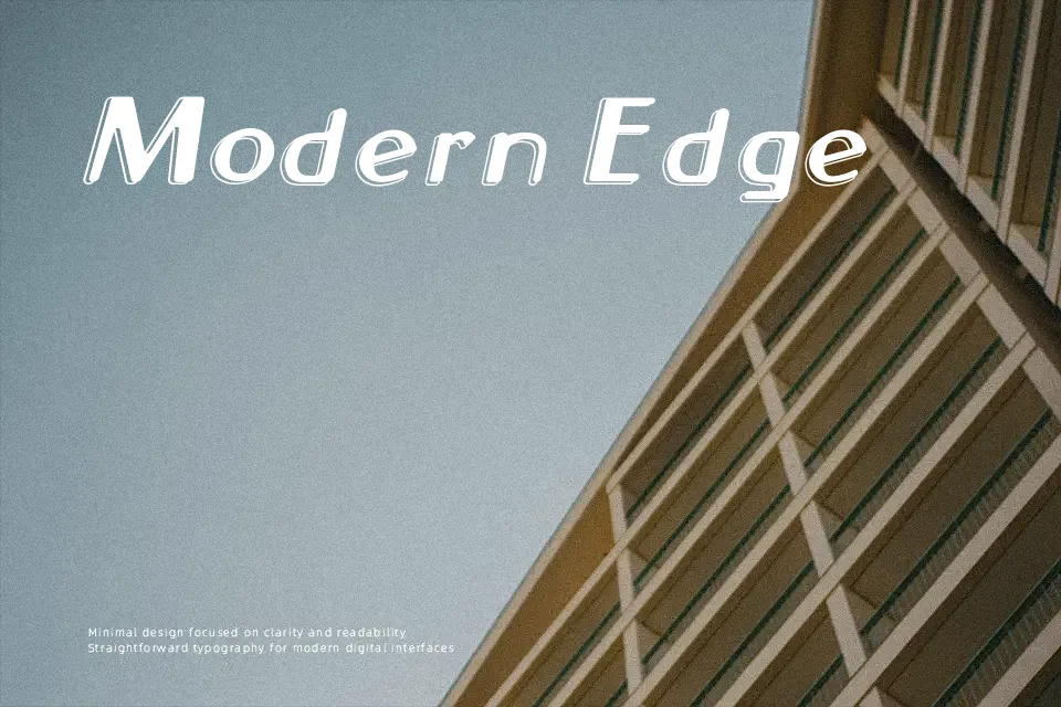
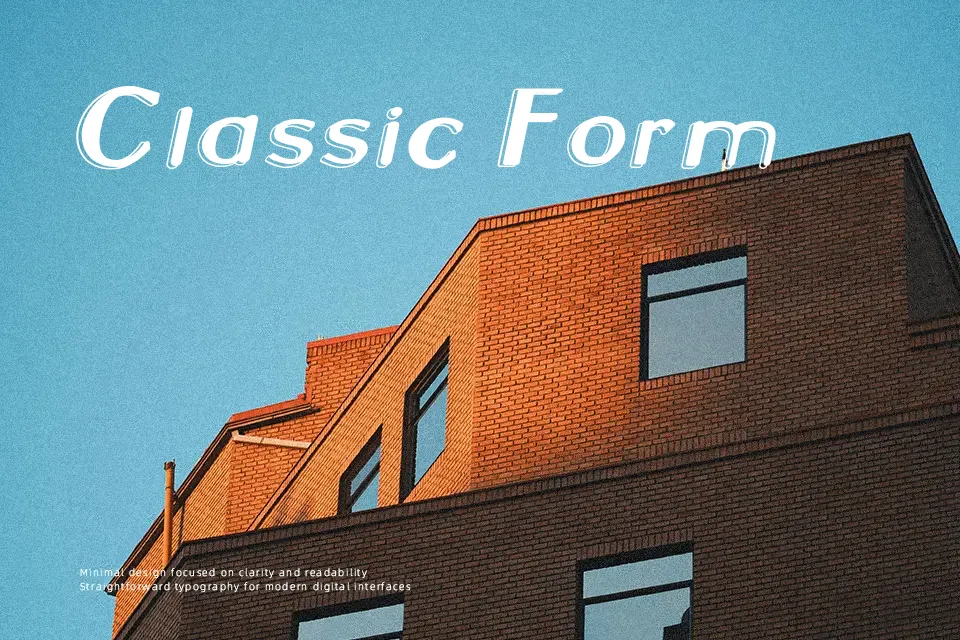
Neon 2 News Font
Free for personal useAbout
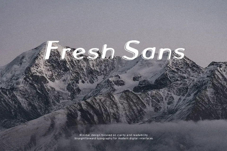
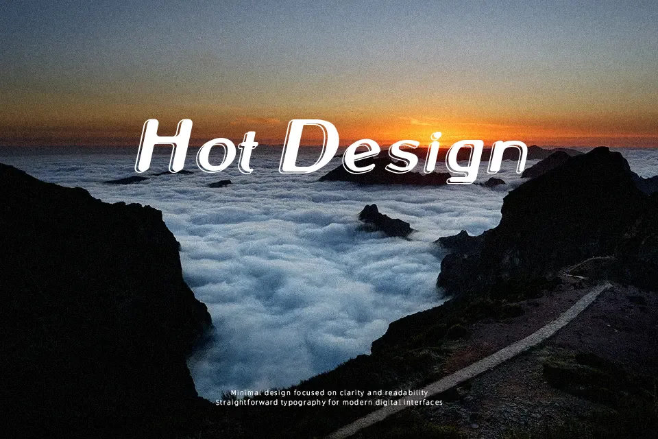
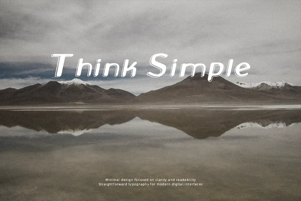
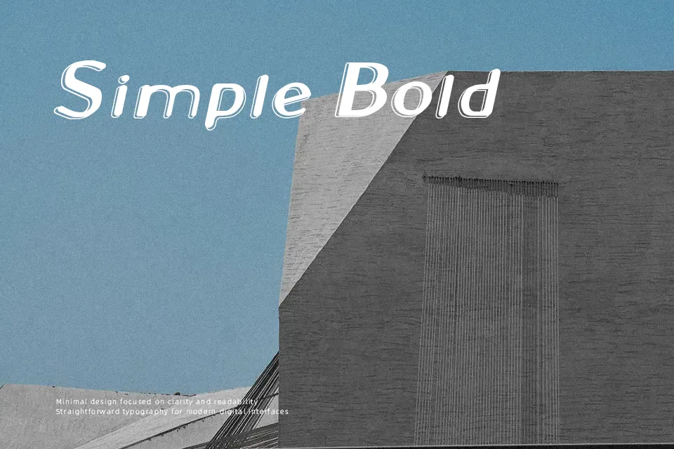
Thick, tubular strokes with a hollow center give this display face a clear neon-tube appearance, with smooth curves and consistent rounded corners shaping each letter. The characters sit at fairly even widths, and the spacing keeps words readable when used at larger sizes, especially in short headlines or titles. Stroke contrast remains minimal, so the glowing outline effect feels uniform across the alphabet. At small sizes the internal gaps start to close in, which can reduce clarity in longer text blocks. It works best where a few words need to stand out, and the decorative construction is better treated as a visual accent than as continuous reading text.
Best For:
event poster titles,club or bar signage graphics,social media announcement cards,music or nightlife-themed cover art
Not Ideal For:
long paragraph text,small interface labels,formal corporate reports,dense instructional manuals
Perfect for advertising, headline, and logo, with a bold and decorative style.
License
Gallery