3rd Man Font
Free for Commercial UseAbout
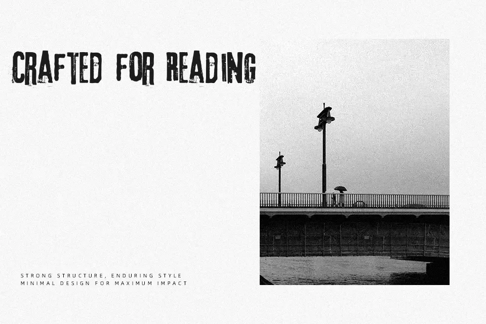
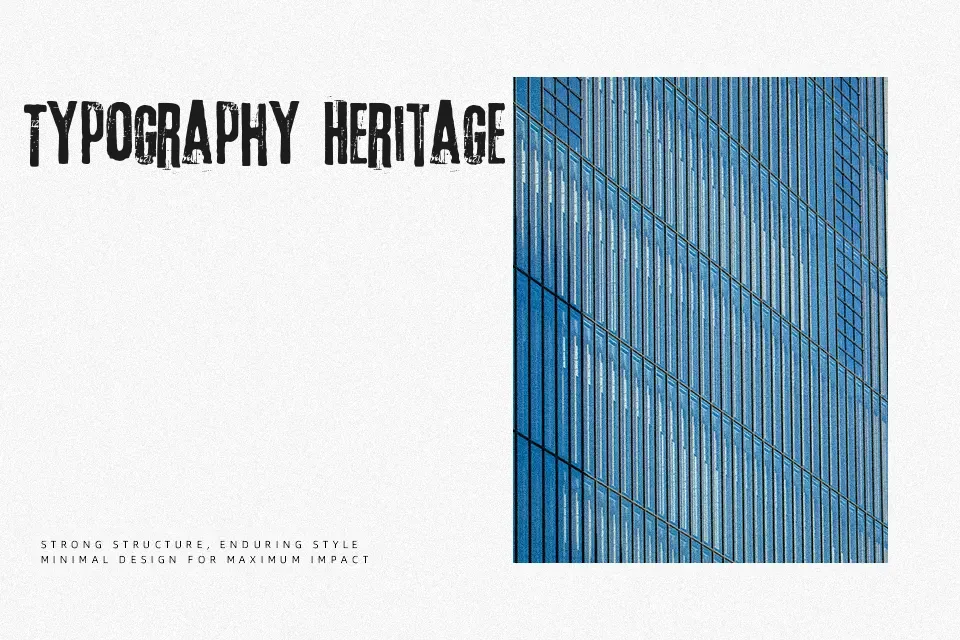
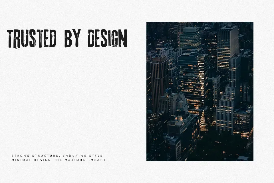
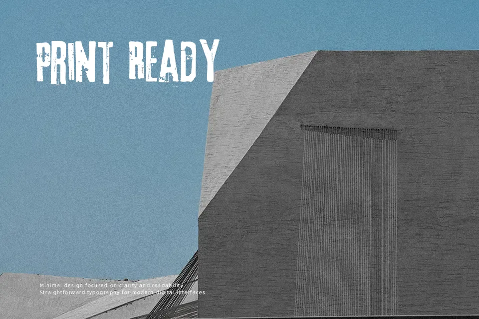
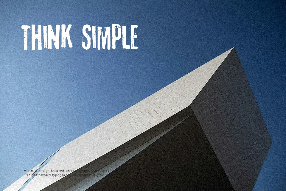
There’s a deliberate roughness to 3rd Man — its letterforms carry visible erosion, uneven stroke edges, and an overall texture that reads more like a printed relic than a clean digital typeface. It sits in the Grotesk family structurally, but the destroy treatment gives it a character closer to aged print or stencil work. This makes it genuinely useful for music event flyers, retro-themed packaging, and film-inspired title cards. However, it struggles at small sizes — the distress details collapse into visual noise below roughly 18pt, making it unsuitable for body copy or any setting that requires sustained legibility. It works best when used sparingly, as a single dominant headline element rather than repeated across layouts.
Best For:
– Vintage poster and concert flyer headlines
– Band or music album branding
– Film-inspired editorial title cards
– Retro-themed packaging headers
Not Ideal For:
– Body text or extended reading copy
– Small-size applications (below 18pt)
– Corporate or professional business materials
– Clean, minimal UI design
Perfect for branding, film, and headline, with a dark and decorative style.
License
Gallery