KrooKed Font
Free for personal useAbout
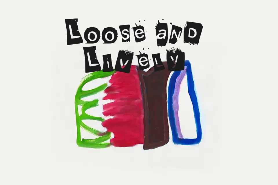
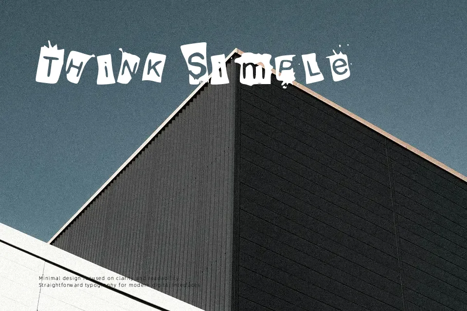
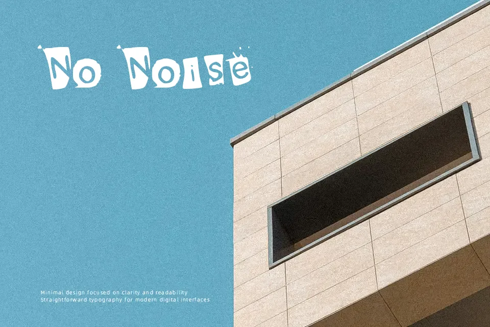
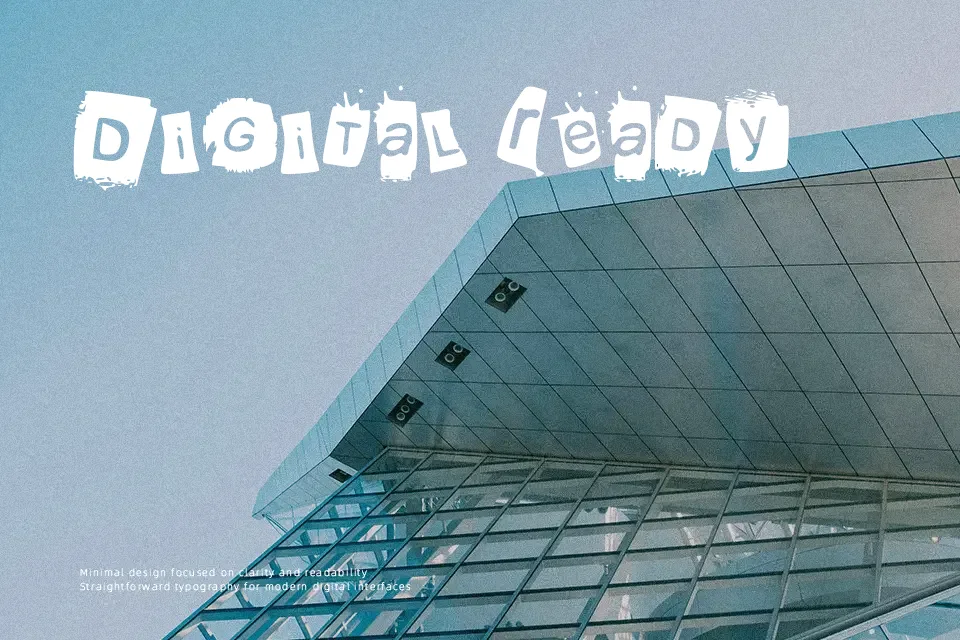
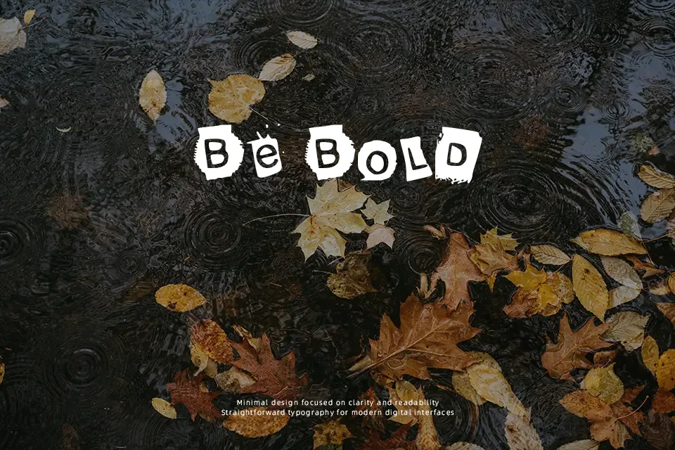
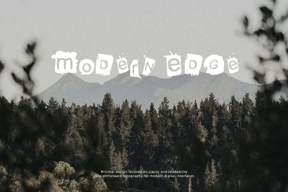
Irregular strokes and off-balance letterforms define KrooKed Font, giving it a deliberately distorted, hand-drawn appearance. The spacing feels loose and slightly unpredictable, reinforcing its casual, rebellious tone. It leans toward a graffiti-inspired display style, making it suitable for skate culture visuals, edgy posters, or informal branding where personality matters more than precision. It performs best at larger sizes where its quirks are visible and expressive. However, the uneven structure quickly becomes tiring in longer text and can reduce readability in tight layouts. Use it when you want visual attitude, but avoid it in clean or professional contexts.
Best For:
skateboard brand graphics
street-style posters
edgy social media visuals
Not Ideal For:
long paragraph text
corporate presentations
formal branding systems
Perfect for branding, logo, and poster, with a artistic and decorative style.
License
Gallery