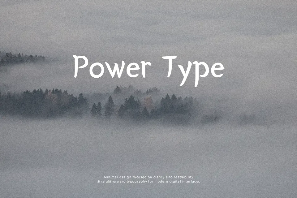
Yeon Sung Font
Free for Commercial UseAbout
Yeon Sung combines a loose handwritten rhythm with structured, serif‑like terminals, so letters feel informal but not sloppy. Strokes are medium weight with open counters and generous spacing, which keeps mixed Korean and Latin text readable at larger sizes. The overall impression is casual and a bit playful, more like a neat marker note than a formal print face. It works well for display lines on posters, café menus, thumbnails, or social graphics where personality matters more than typographic neutrality. For dense body copy, strict corporate layouts, or highly technical interfaces, its irregular forms can feel distracting and reduce scanning speed.
Best For:
casual korean-latin headlines
playful poster titles and signage
friendly café or restaurant branding
social media graphics with handwritten feel
Not Ideal For:
long-form body text or documentation
formal corporate reports or legal content
tight UI layouts requiring strict alignment
highly technical diagrams or data tables
Perfect for branding, headline, and poster, with a creative and display style.
License
Gallery