Vesper Libre Font
Free for Commercial UseAbout
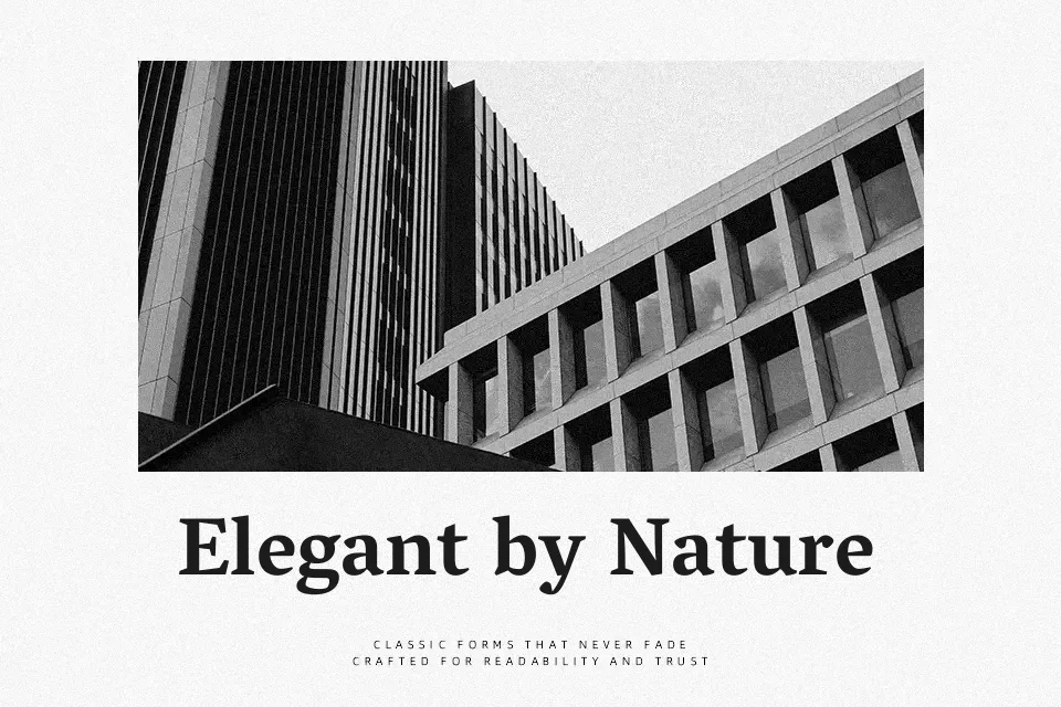
Vesper Libre combines strong vertical stress, moderate contrast, and open counters, so text blocks feel grounded but not stiff on both desktop and mobile. Sturdy serifs and a slightly compact texture help paragraphs hold together, which works nicely for essays, opinion pieces, and knowledge bases where readers stay on the page. It leans clearly toward a serious, bookish voice, so it supports brands that want authority more than trendiness. I would reach for it when typography should stay in the background and quietly support content, not when a layout relies on expressive display lettering or ultra-minimal UI.
Best For:
Long-form editorials and articles
Content-heavy blogs and documentation
Serious brand or cultural websites needing readable text
Not Ideal For:
Highly decorative or experimental display graphics
Ultra-minimal tech UI where serifs feel visually heavy
Playful kids or entertainment branding
Perfect for body text, branding, and editorial, with a classic and serif style.
License
Gallery