Noto Serif KR Font
Free for Commercial UseAbout
Noto Serif KR is a modulated serif family designed around Hangul and Hanja, with balanced strokes, moderate contrast, and calm spacing that stays readable even at smaller sizes. Across its seven weights from ExtraLight to Black, it moves smoothly from restrained body text to more assertive headings without feeling showy. The overall tone leans formal and **serious**, so it works particularly well in books, news-style layouts, editorial websites, and app interfaces that prioritize clarity over personality. If you want something highly decorative, playful, or condensed for loud display work, this family can feel too reserved and structurally rigid.
Best For:
Long-form Korean editorial and book typography
News, magazine, and documentation websites with CJK support
App and UI text needing consistent Korean and Latin coverage
Brand systems that favor restrained, text-heavy layouts
Not Ideal For:
Playful kids graphics or highly expressive lettering
Ultra-condensed posters where space is extremely tight
Heavily ornamental logos that rely on unique letterforms
Grunge or distressed visual styles
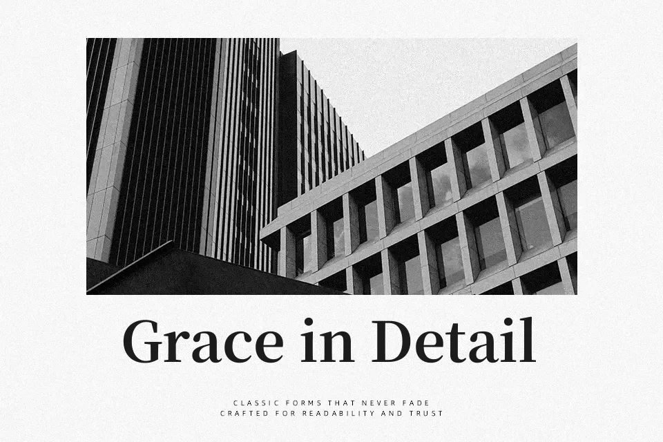
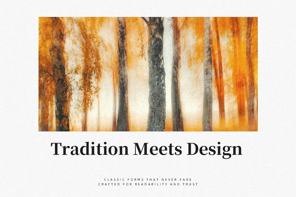
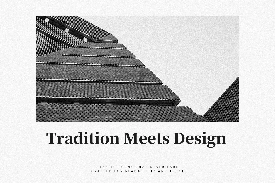
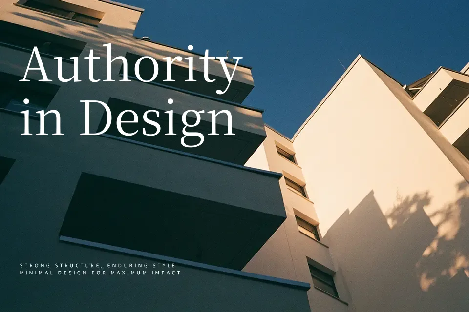
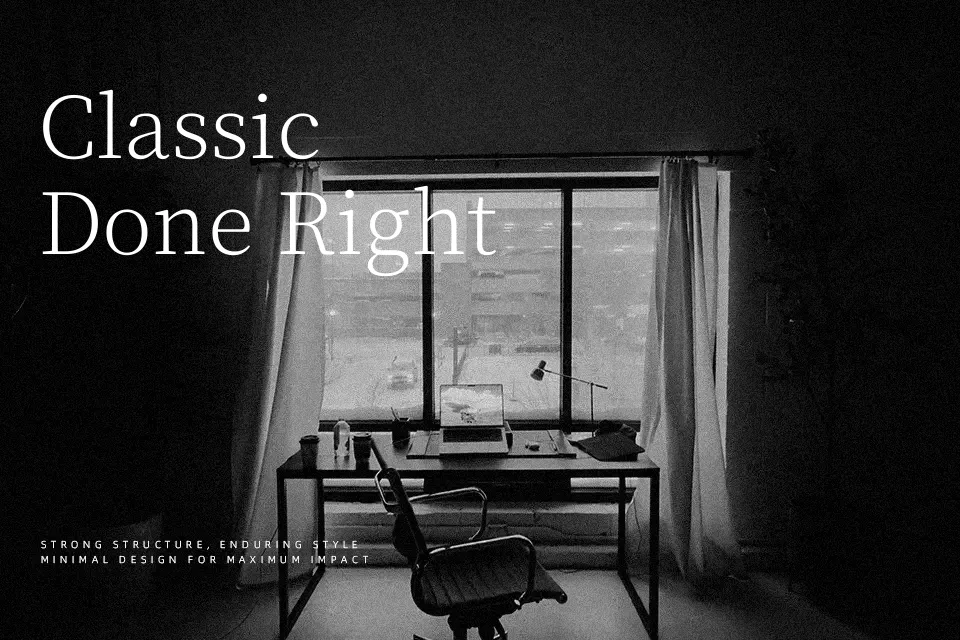
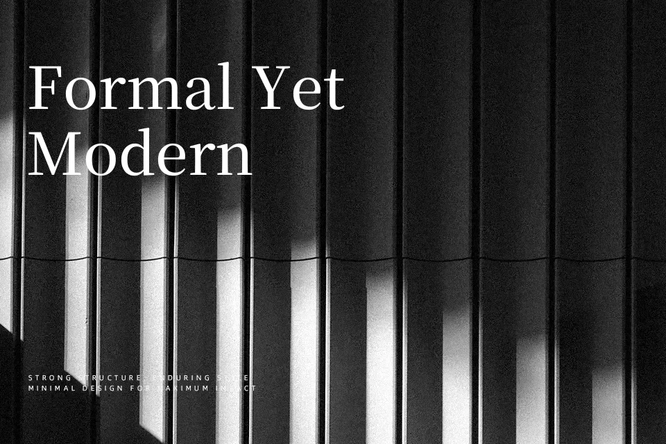
Perfect for body text, editorial, and headline, with a classic and serif style.
License
Gallery