Noto Serif HK Font
Free for Commercial UseAbout
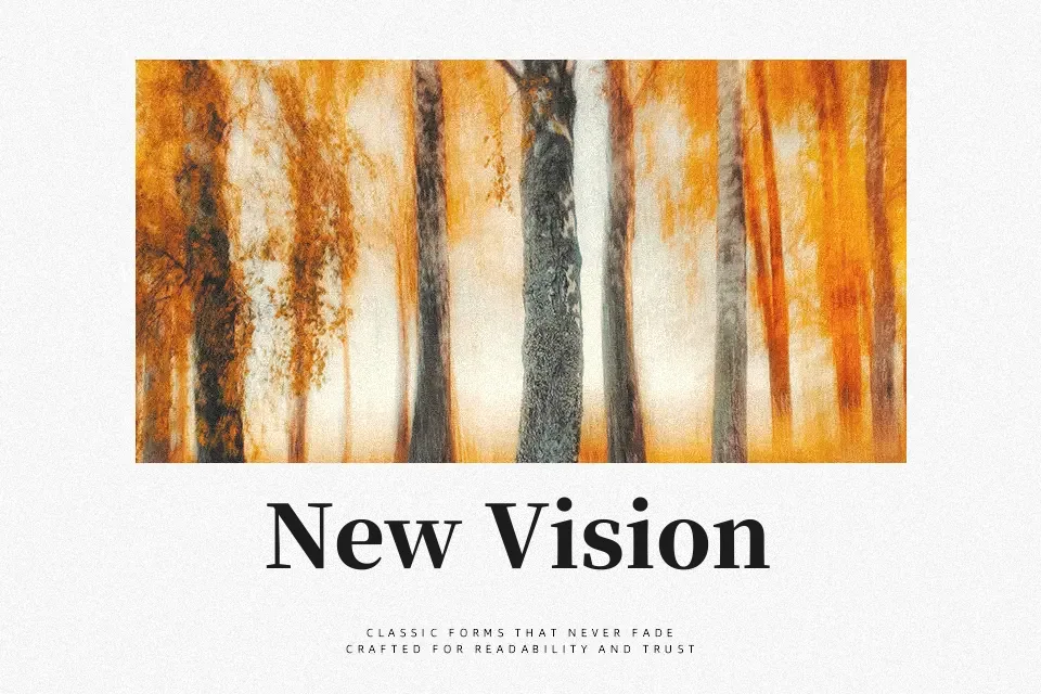
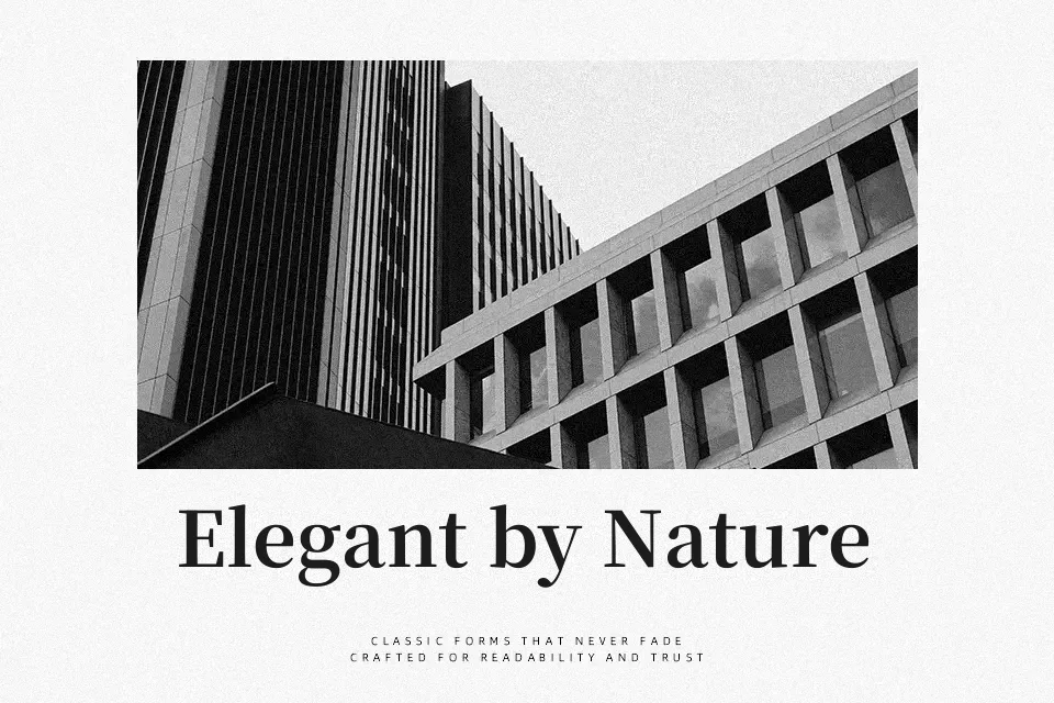
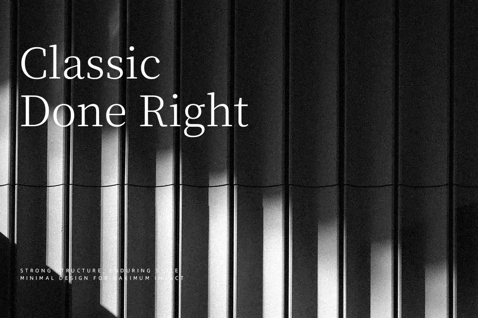
Noto Serif HK combines modulated strokes, clear structure, and measured contrast to keep dense Traditional Chinese text legible while still feeling refined on screen and in print. Its serif details are firm but not fussy, so paragraphs hold together nicely and headings still carry some presence without shouting. In practice, it works well for long-form Chinese content, documentation, and mixed-language articles where Latin and Han characters must look cohesive. I would reach for it when typography needs to feel serious and trustworthy rather than showy. If you are designing highly expressive posters or playful kids’ graphics, this family can feel a bit too restrained.
Best For:
Traditional Chinese editorial layouts
Hong Kong-focused apps and websites
Bilingual Chinese–Latin body text
Serious institutional reports
Not Ideal For:
Playful kids’ graphics
Edgy experimental posters
Heavy display-only logotypes
Highly decorative branding systems
Perfect for body text, branding, and editorial, with a classic and serif style.
License
Gallery