Taprom Font
Free for Commercial UseAbout
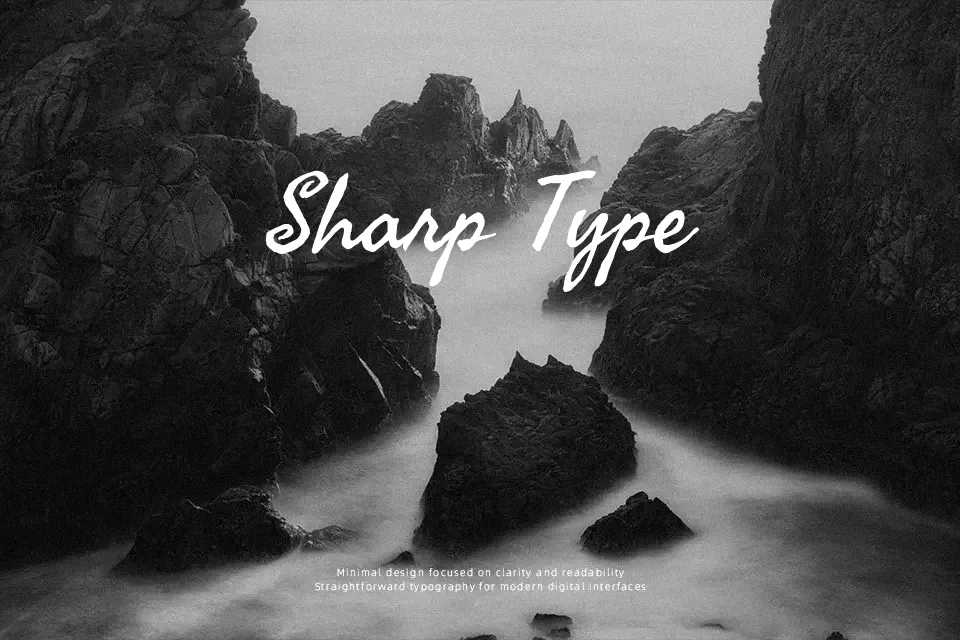
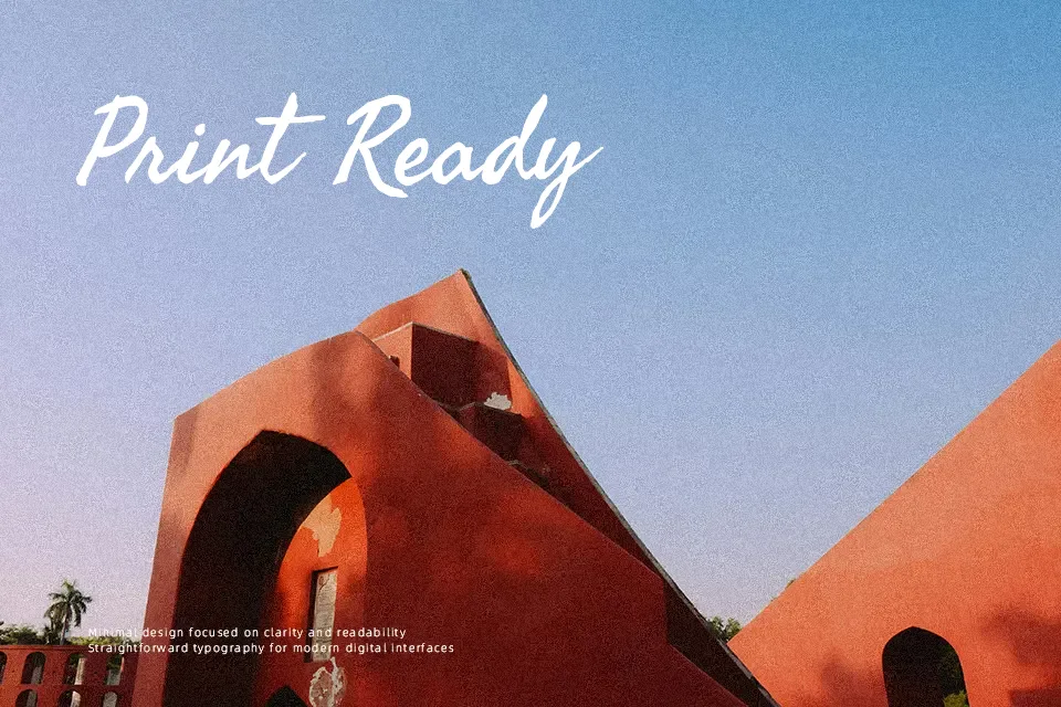
Taprom combines the rhythm of Khmer handwriting with an uneven, slightly rough stroke that feels drawn rather than engineered, so text carries a distinct human presence. Its proportions stay readable at moderate sizes, but the dense curves and textured forms shine most in short lines, pull quotes, and title work where character is more important than strict neutrality. Designers reach for Taprom when they want to signal Cambodian or Southeast Asian context, or simply add a handcrafted, cultural note to menus, posters, or editorial sidebars. It tends to be less convincing for strict corporate systems or tiny UI labels, where its irregular rhythm can feel busy or imprecise.
Best For:
Khmer and bilingual cultural posters
Restaurant menus with Southeast Asian themes
Editorial sidebars, pull quotes, and short feature titles
Event branding that needs a handwritten, regional accent
Not Ideal For:
Formal corporate branding systems and reports
Small UI labels or dense data tables
Long, text‑heavy book interiors
Minimal tech or startup dashboards needing a very clean tone
Perfect for branding, editorial, and headline, with a artistic and display style.
License
Gallery