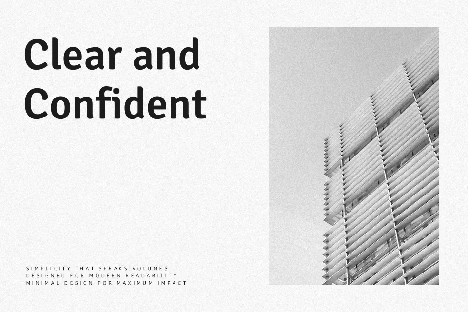
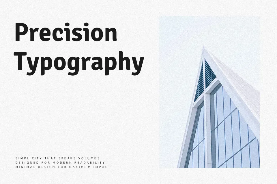
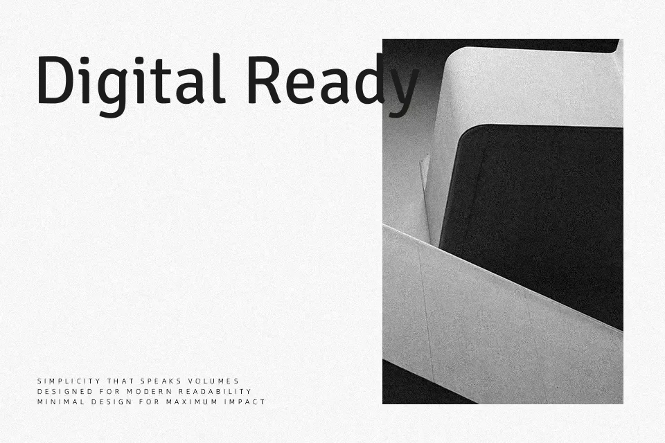
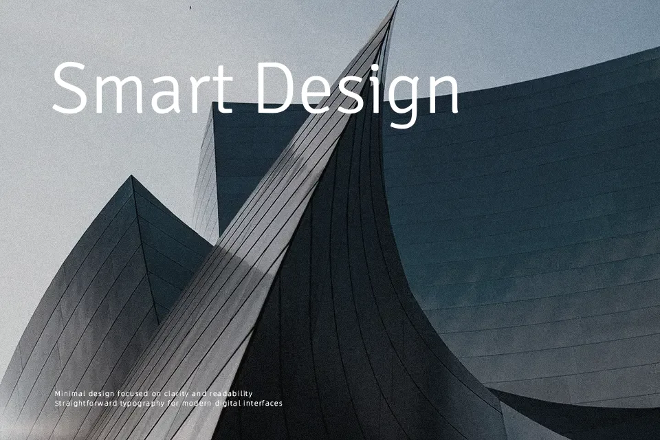
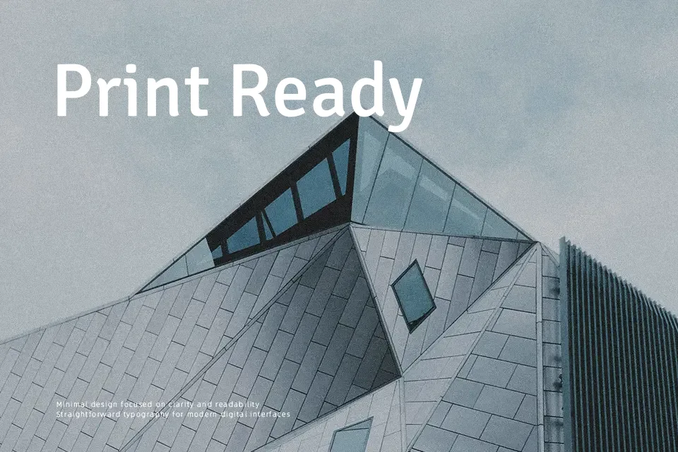
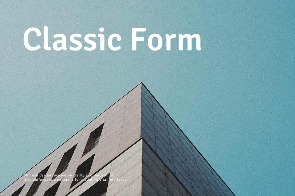
Signika Negative Font
Free for Commercial UseAbout
Signika Negative takes the friendly structure of Signika and subtly thins the strokes to counter the way reverse text tends to look heavier, so light text on dark panels stays crisp instead of muddy. The tall x‑height, open counters, and moderate width give it a calm, utilitarian feel rather than a flashy display voice, which works well in wayfinding, transport maps, and interface labels where you need fast scanning at a glance. I reach for it when a project relies heavily on dark themes or color‑blocked navigation; in more traditional long-form reading or highly expressive branding, its even texture and neutrality can feel a bit too restrained.
Best For:
Dark-theme UI labels and menus,Wayfinding and transport signage,Data-heavy dashboards and infographics,In-product notifications on dark backgrounds
Not Ideal For:
Expressive logo wordmarks,Highly decorative editorial titles,Very long print paragraphs,Handcrafted or vintage-inspired branding
Perfect for advertising, body text, and headline, with a calm and sans serif style.
License
Gallery