Schibsted Grotesk Font
Free for Commercial UseAbout
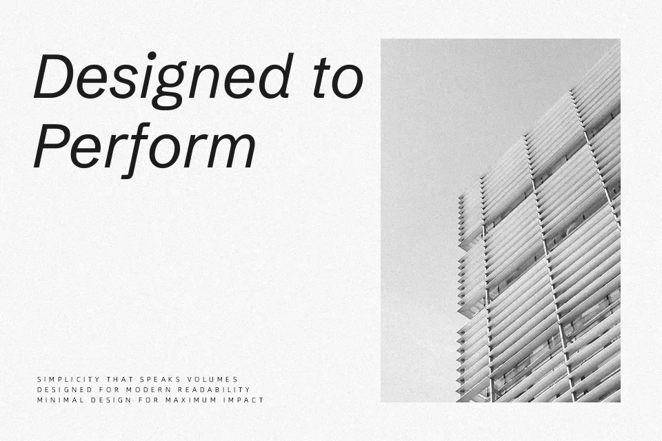
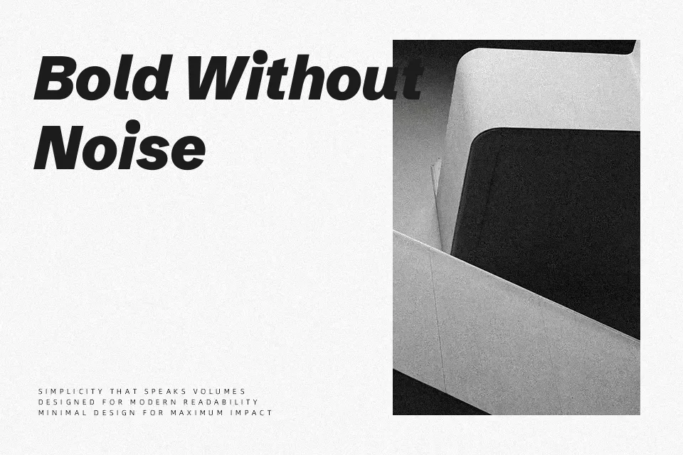
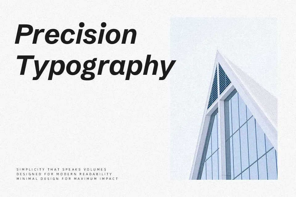
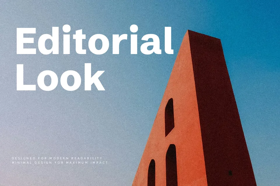
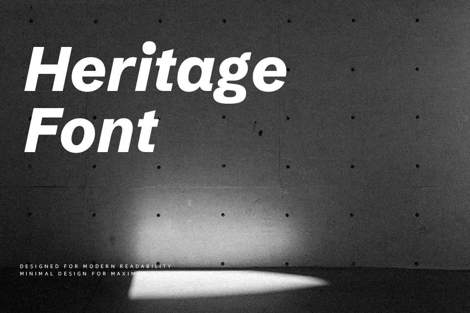
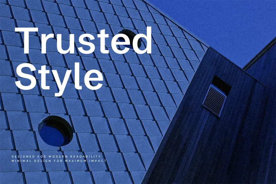
Schibsted Grotesk is a digital-first sans serif with sturdy strokes, generous counters, and even spacing that holds up on both high-density dashboards and content-heavy pages. Its structure leans rational and geometric without becoming stiff, so headings feel confident while paragraphs remain readable at small sizes. The family spans multiple weights with true italics, which makes hierarchy easy to build across UI components, design systems, and responsive editorial layouts. It works especially well when you need one type family to cover both interface labels and narrative copy, but it can feel too utilitarian for projects that call for expressive, highly decorative typography. If you like contemporary grotesks such as other UI-focused sans serifs, this family sits in the same space but pushes slightly more toward clarity than character.
Best For:
Interface copy and product dashboards in modern apps
News, blog, and knowledge-base layouts that mix titles and long text
Brand systems that need a single family for web, app, and basic print use
Not Ideal For:
Highly expressive branding that relies on distinctive display letterforms
Ornate, decorative titles for fashion, luxury, or experimental posters
Projects that require non-Latin scripts beyond the covered Latin-based languages
Perfect for body text, editorial, and headline, with a clean and geometric style.
License
Gallery