Scada Font
Free for Commercial UseAbout
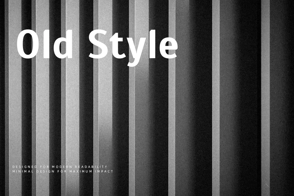
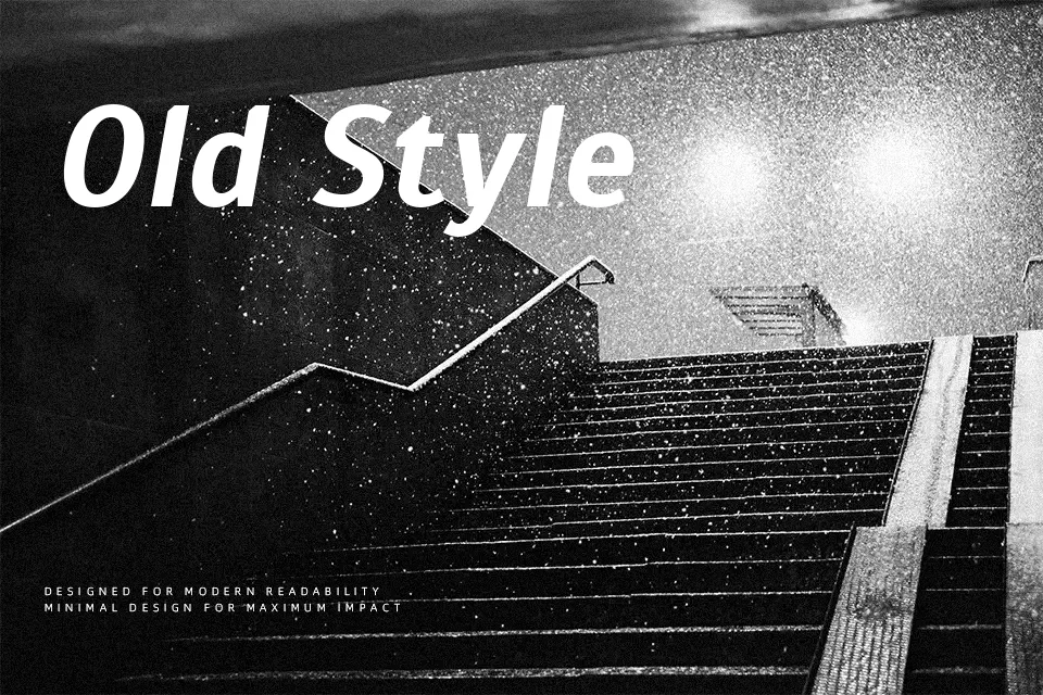
Scada combines straightforward sans serif construction with a subtle humanist touch: moderately open apertures, balanced x‑height, and strokes that feel steady rather than mechanical. On screen, it stays legible at smaller sizes, while in print it delivers a restrained, contemporary voice that does not compete with imagery. I like using it for bilingual layouts in Latin and Cyrillic because the character set feels consistent and dependable. Where it can fall short is in highly expressive branding or ultra-luxury work, where you may want something either more distinctive or more refined in its detailing.
Best For:
User interfaces and dashboards that need calm, readable labels
Brand systems for practical products or services
Editorial layouts and reports with mixed Latin and Cyrillic content
Not Ideal For:
High-fashion or ultra-luxury branding that needs a sharper personality
Loud display headlines where dramatic shapes are required
Highly decorative, character-driven logo wordmarks
Perfect for body text, branding, and editorial, with a calm and sans serif style.
License
Gallery