Rubik Storm Font
Free for Commercial UseAbout
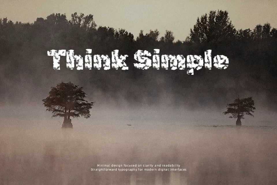
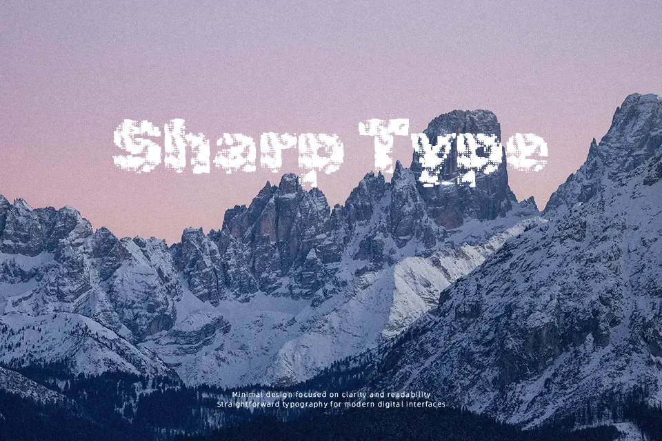
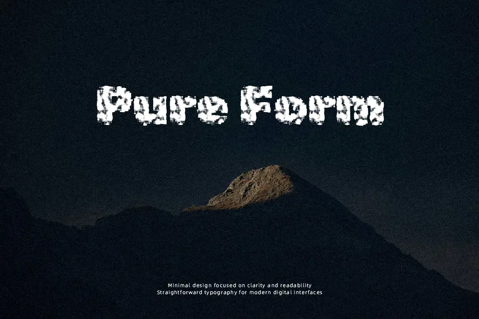
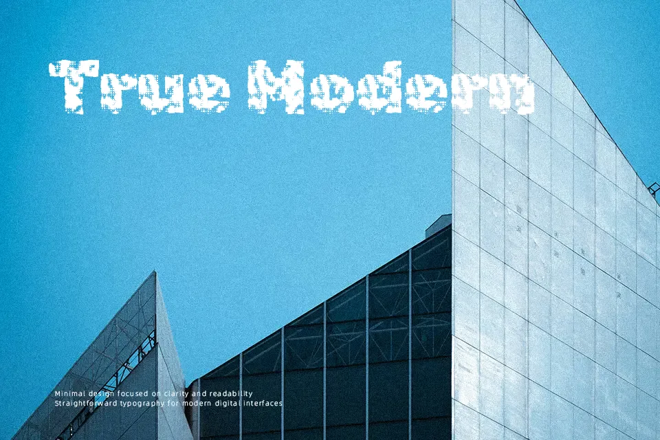
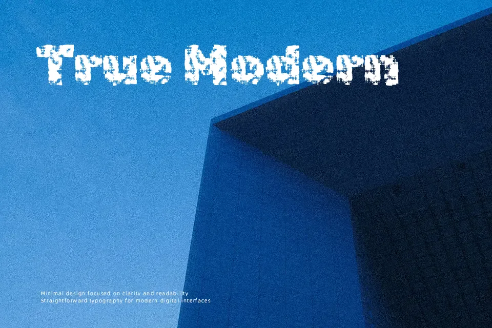
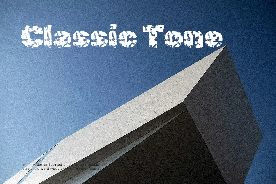
Rubik Storm takes the clean skeleton of the Rubik family and distorts it into a noisy, windswept display face, with fractured outlines, broken curves, and irregular counters that feel almost glitchy on screen. The single regular weight reads best at larger sizes, where its jittery edges and dense forms turn short words and numbers into graphic elements rather than neutral text. It works well for music covers, tech‑driven posters, stream overlays, and bold product names that can tolerate reduced legibility in exchange for character. For long paragraphs, small UI labels, or corporate documents, its harsh texture quickly becomes tiring, so it is better used as an accent alongside a calmer companion font.
Best For:
experimental headlines and titles in posters or key visuals
music, gaming, or tech-branded wordmarks with a rough digital edge
social media graphics or thumbnails that need loud, high-impact type
Not Ideal For:
body text, captions, or long-form reading
formal corporate presentations or traditional editorial layouts
minimal, soft, or highly restrained brand systems
Perfect for branding, gaming, and headline, with a artistic and decorative style.
License
Gallery