Racing Sans One Font
Free for Commercial UseAbout
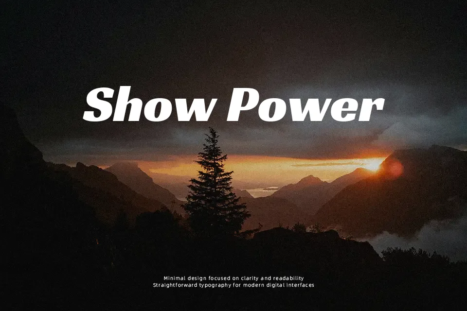
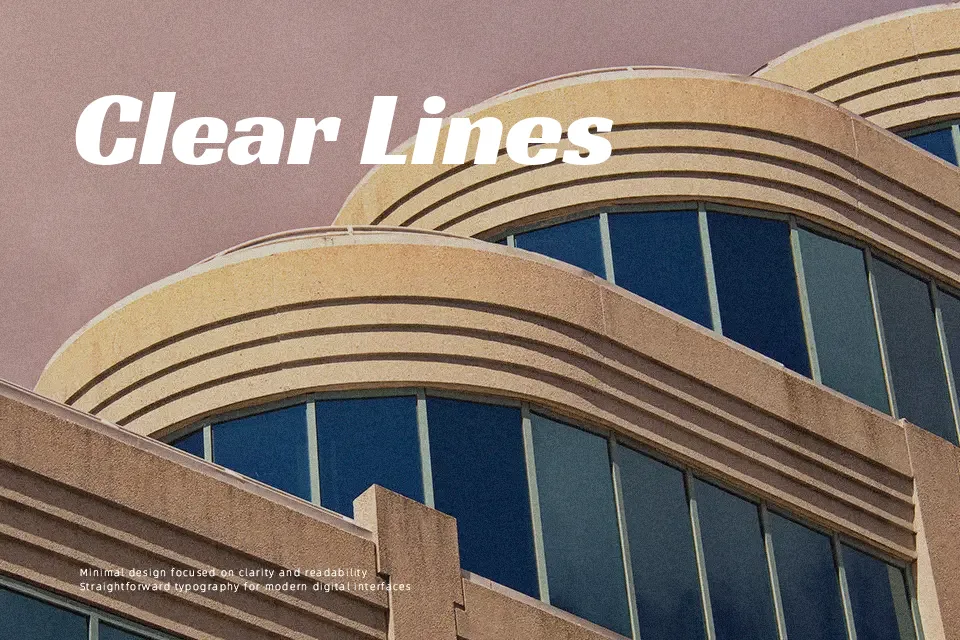
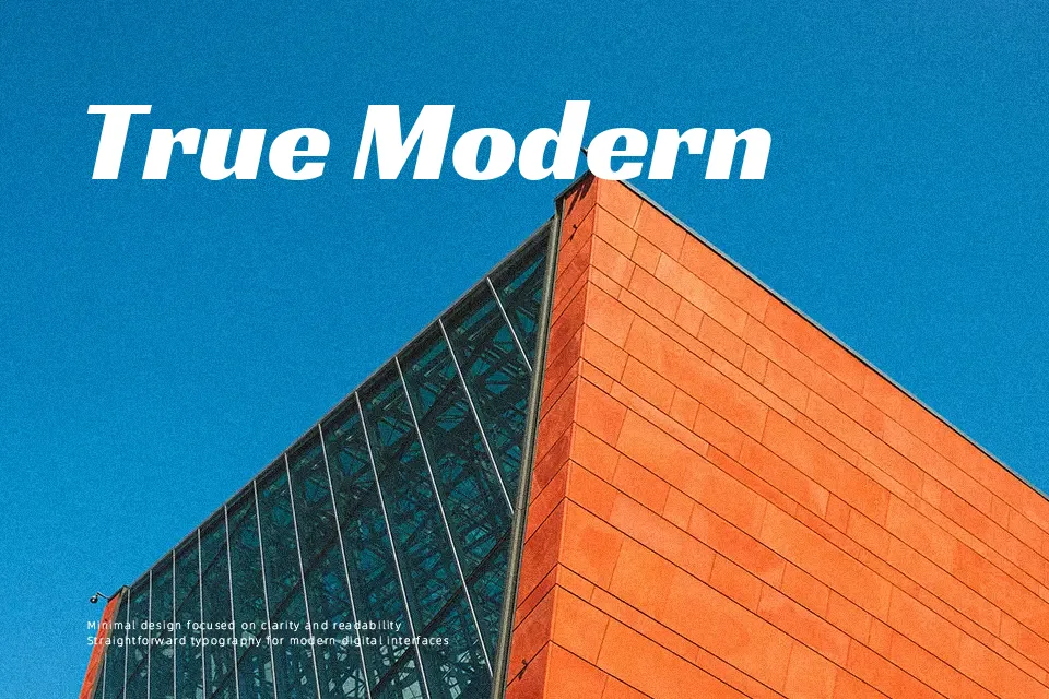
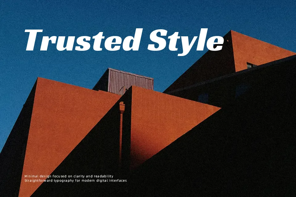
Racing Sans One combines thick verticals with slim joins and rounded terminals, creating a lively, almost hand-painted feel within a structured sans serif skeleton. Strokes have strong contrast and compact spacing, so lines feel dense and punchy rather than airy. On screen, it reads confidently at larger sizes, but in long paragraphs the high contrast can become tiring, so it works better as a display companion than a text workhorse. I reach for it when a project needs a touch of vintage speed—racing teams, sports events, dynamic banners—while avoiding it for minimalist brands or interfaces that demand completely neutral typography.
Best For:
Motorsport or racing event posters
Sports or energy drink branding
Bold web or app hero headlines
Vintage-inspired advertising graphics
Not Ideal For:
Dense body text or long articles
Very formal corporate reports
Ultra-minimalist or neutral branding
Tiny UI labels and system text
Perfect for advertising, branding, and headline, with a bold and display style.
License
Gallery