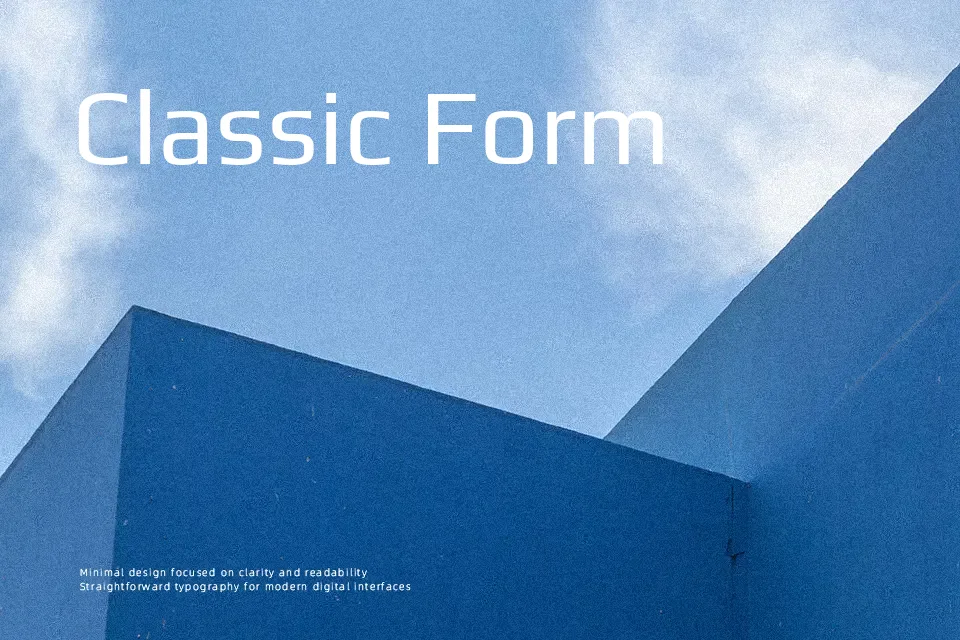
Play Font
Free for Commercial UseAbout
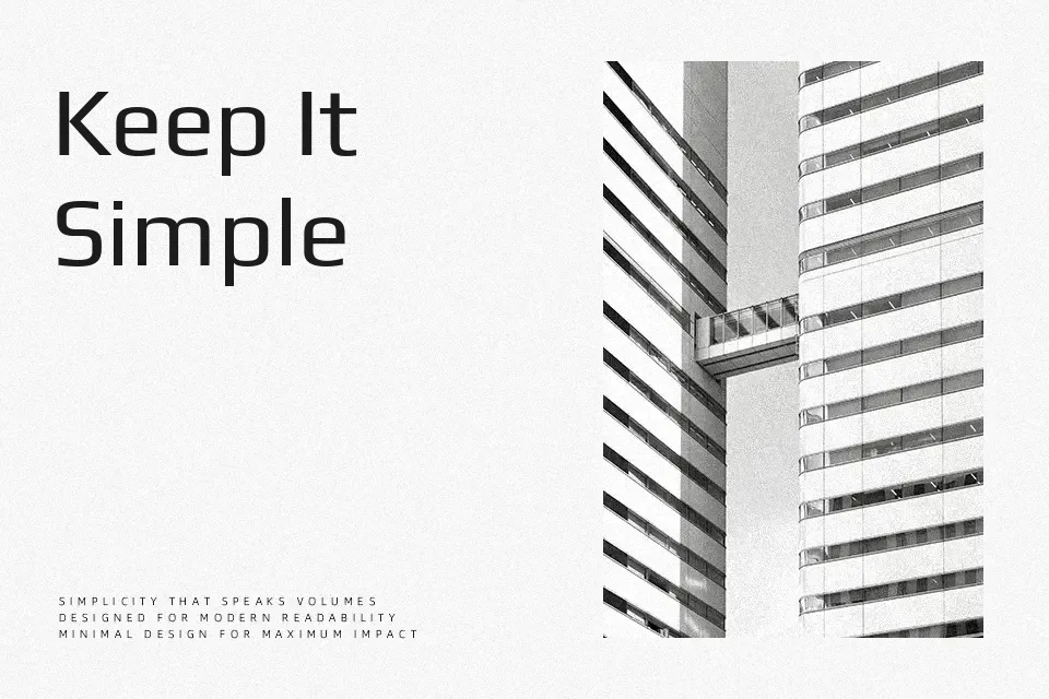
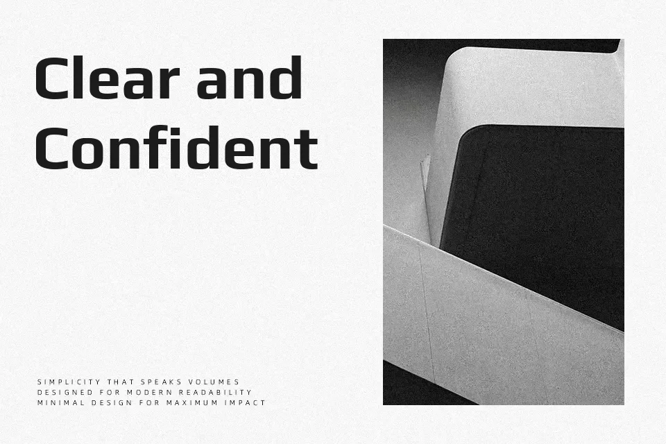
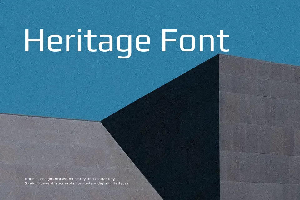
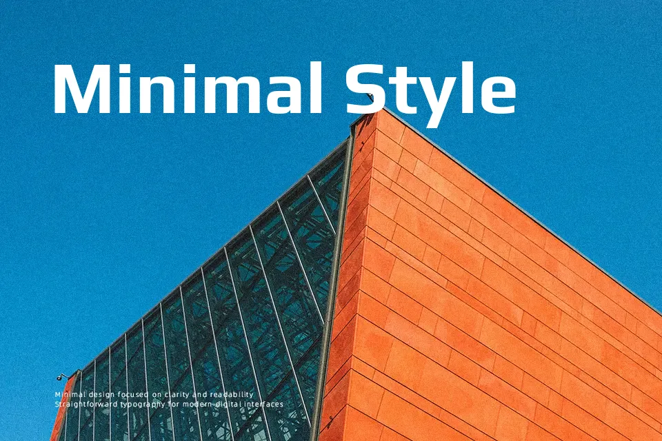
Play is a low-contrast sans serif with rounded corners, wide counters, and generous spacing, so text looks airy rather than cramped even at smaller sizes. Its structure leans toward geometric, but the softened joints keep it from feeling cold or mechanical, which helps interface labels, charts, and short paragraphs stay legible. This family works especially well in product dashboards, slide decks, app UI, and technology-focused branding where you want a modern tone without shouting. It can feel a bit plain in long editorial layouts or expressive posters that need stronger personality, so pairing it with a more characterful display face often yields better results.
Best For:
UI labels and dashboards
Technology or SaaS landing pages
Presentation slides and data visuals
Clean branding systems needing a neutral sans
Not Ideal For:
Expressive editorial or magazine layouts
Highly decorative posters or event graphics
Very long printed novels or dense book text
Perfect for body text, branding, and headline, with a calm and geometric style.
License
Gallery