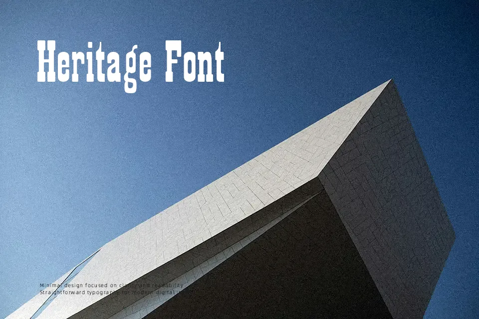
Playbill Font
Free for personal useAbout
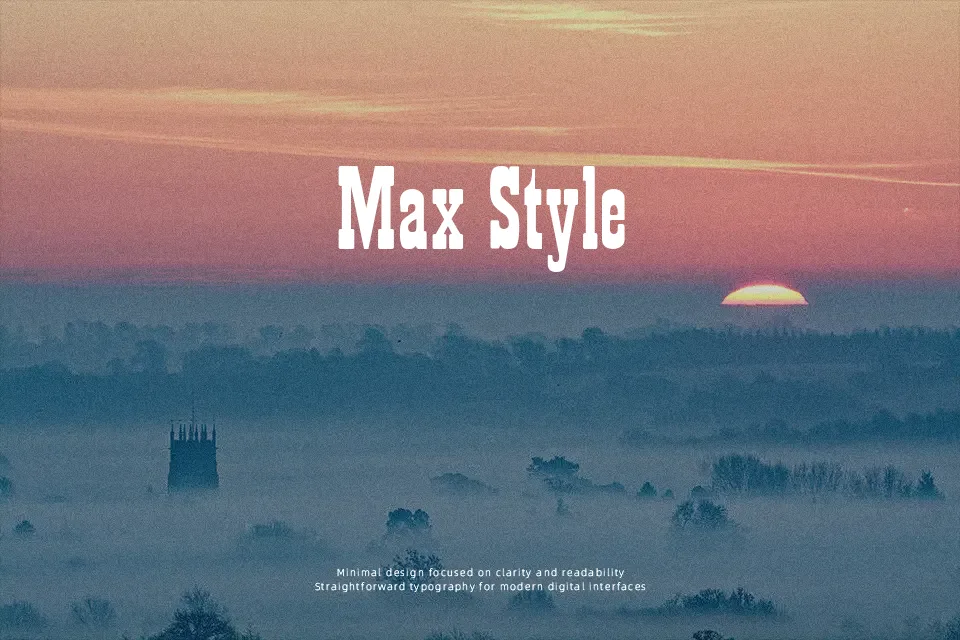
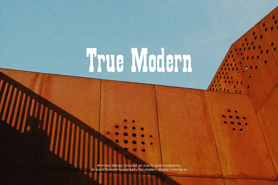
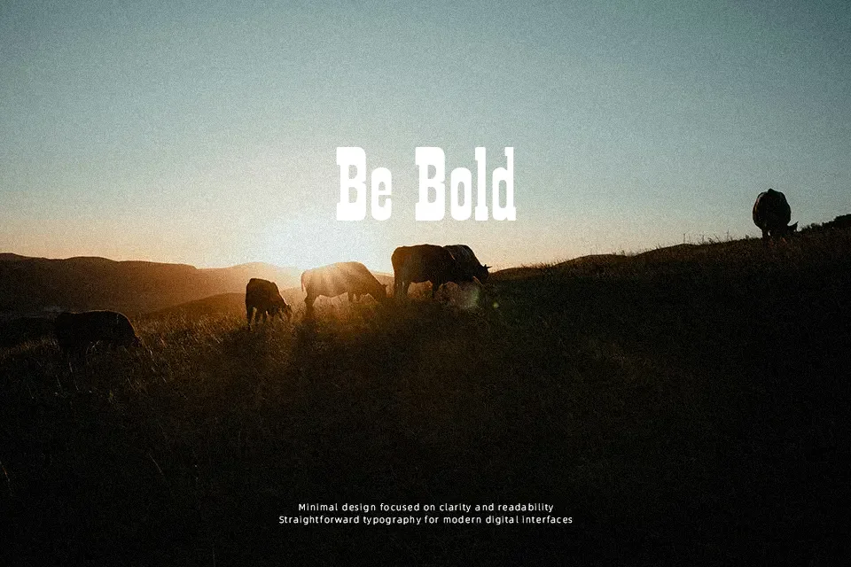
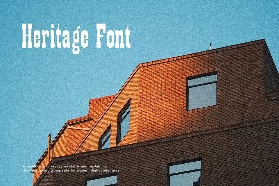
Examining Playbill reveals a typeface steeped in theatrical history, defined by its extreme vertical condensation and pronounced slab serifs. Designed by Robert Harling in 1938, it deliberately echoes the woodblock lettering used on 19th-century theater posters, delivering a striking “Wild West” or classic Broadway aesthetic. The severe contrast—very thick vertical stems paired with heavy, squared-off serifs—gives words an imposing, immediate presence. This makes it an incredibly powerful tool for designing large-scale event flyers, dramatic storefront signage, or vintage-themed product labels. However, its extremely tight letter spacing and unusual proportions render it functionally useless for body copy. Any attempt to use Playbill for paragraphs, website navigation, or subtle corporate branding will result in a chaotic, illegible mess. It is a pure display face that requires massive size to function effectively.
Best For:
vintage theater poster designs
western-themed restaurant branding
large-scale advertisement headlines
Not Ideal For:
long-form editorial body text
modern tech startup logos
mobile application menus
Perfect for advertising, branding, and headline, with a bold and display style.
License
Gallery