Aurora Font
Free for personal useAbout
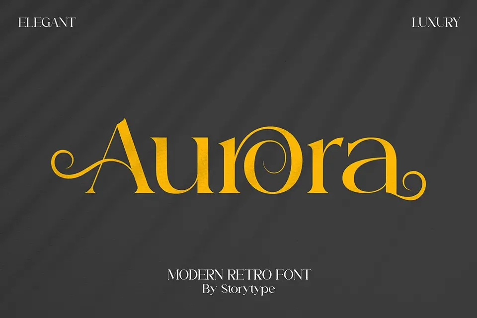
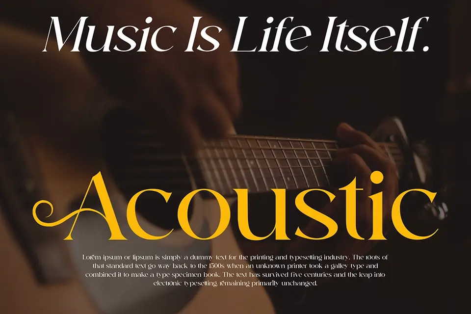
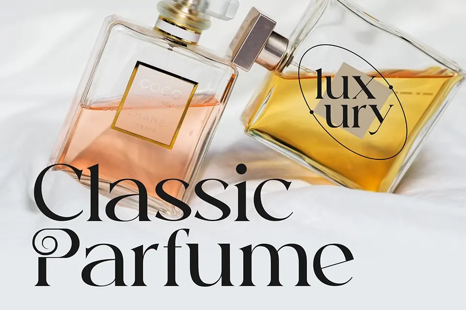
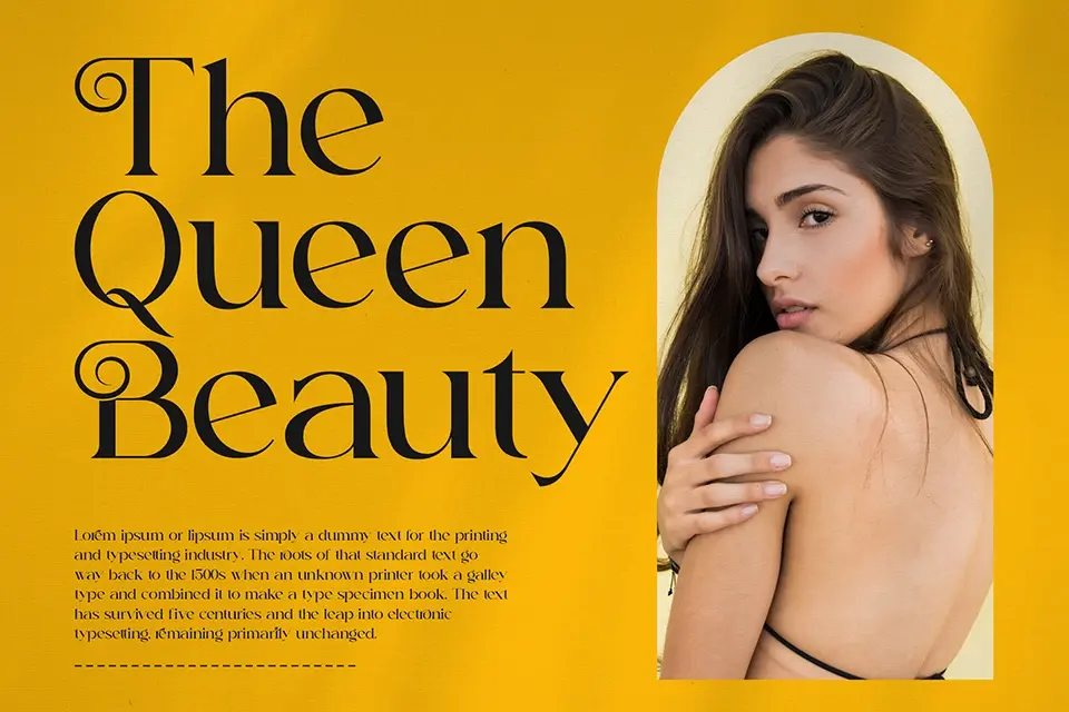
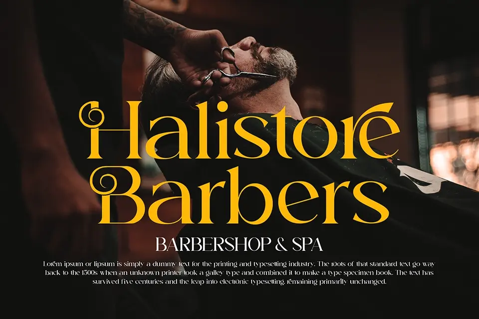
Large headline settings are where Aurora starts to make sense. The letters carry thick strokes, noticeable contrast, and a decorative retro structure that gives words a strong storefront feel. Spacing is fairly open for a display face, so short titles stay readable while still looking expressive. It works well on café branding, product packaging, and event posters where atmosphere matters as much as the message. The tradeoff is flexibility: once the text gets smaller or longer, the ornamental details begin to feel heavy. In my view, Aurora performs best when used sparingly as a visual hook, not when you need clean reading across paragraphs or interface labels.
Best For:
vintage logo headlines
product packaging titles
event poster text
café menu covers
Not Ideal For:
long paragraph text
small mobile labels
formal business documents
dense website navigation
Perfect for branding, headline, and logo, with a bold and decorative style.
License
Gallery