Offside Font
Free for Commercial UseAbout
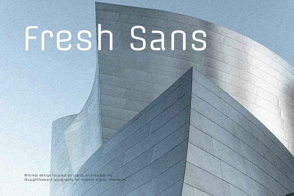
Offside combines a simple structure with a monoline stroke, so letters feel steady and even rather than fussy. Its proportions lean slightly condensed, with open counters and relaxed spacing that keep text legible on screens and at modest sizes. Visually it carries a subtle athletic flavor, so it works nicely for scores, team graphics, bold labels, and UI elements that need a sporty edge without shouting. I find it strongest in short text, navigation, and medium‑size headings; for dense long reading or very formal branding, its casual, geometric tone can feel a bit too informal.
Best For:
Sports-themed headlines and scores on web or apps
Clean, modern UI labels and navigation text
Posters or banners that need a subtle athletic flavor
Readable short paragraphs on digital interfaces
Not Ideal For:
Long-form print body copy or books
Highly traditional or luxury brand identities
Very small legal text or dense multi-language layouts
Perfect for body text, headline, and poster, with a classic and sans serif style.
License
Gallery