Nova Cut Font
Free for personal useAbout
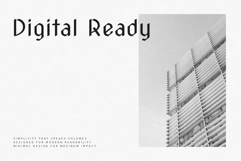
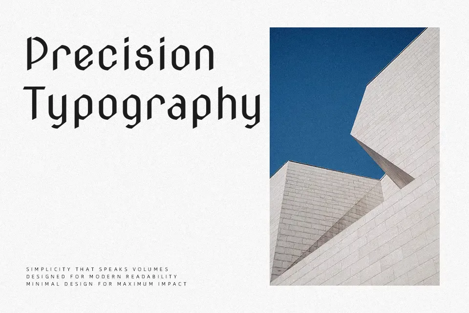
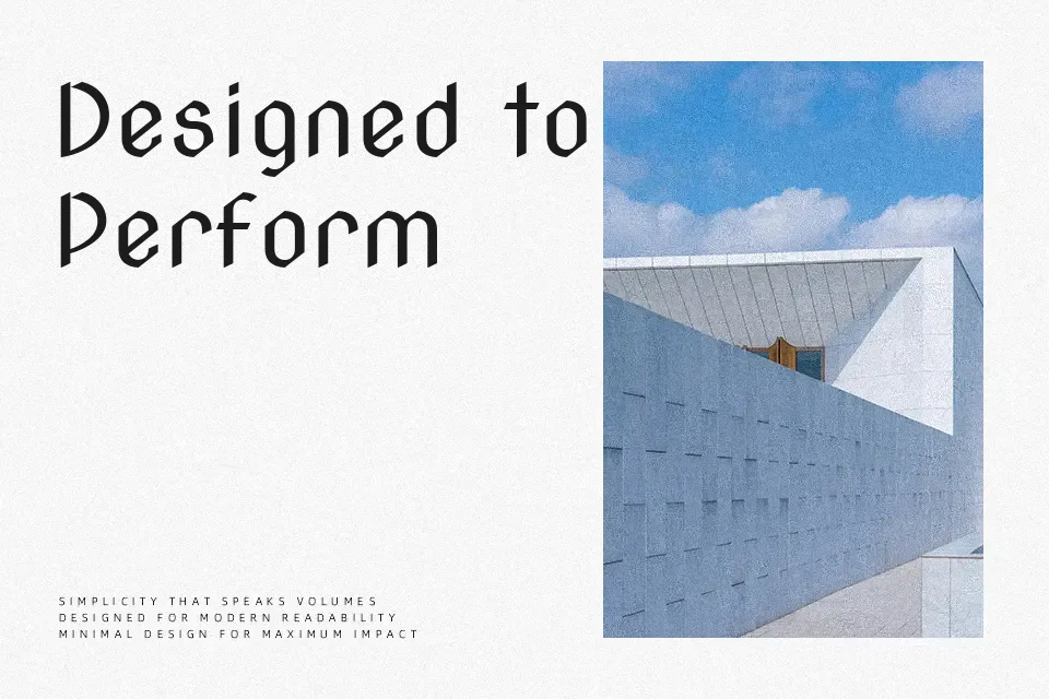
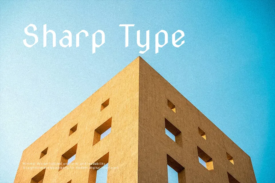
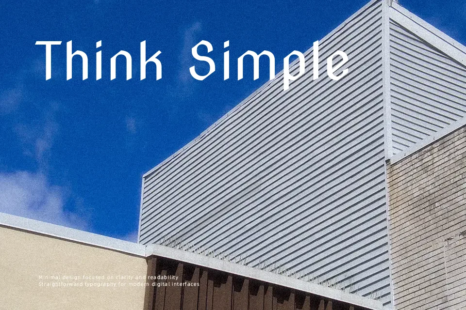
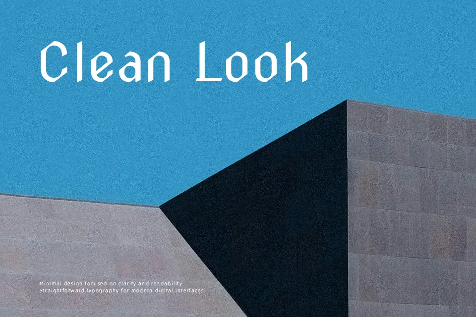
Nova Cut comes from letterforms originally carved into stone, so its shapes feel stiff, geometric, and a bit brutal in the best way. The strokes are mostly even in weight, but the diagonals and notched corners add a chiseled rhythm that reads clearly at display sizes. Spacing is tight and compact, which helps headlines lock together but can feel too dense for long paragraphs. Overall it behaves like a modern display sans serif with a retro twist, somewhere between futuristic signage and vintage engraved lettering. It works nicely for posters, music covers, gaming titles, or edgy brand marks that need a distinctive wordmark, but it is not a good option for text-heavy layouts or small UI labels where legibility and softness matter more than attitude.
Best For:
edgy poster headlines
music or gaming titles
bold branding wordmarks
experimental editorial layouts
Not Ideal For:
long body copy in print or web
small UI labels or app menus
formal corporate reports
warm, friendly brand identities
Perfect for branding, gaming, and headline, with a bold and display style.
License
Gallery