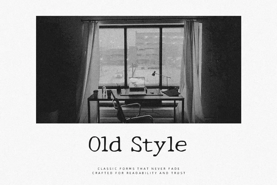
New Tegomin Font
Free for Commercial UseAbout
New Tegomin is a Japanese Mincho serif drawn on a 5mm square grid, so strokes feel steady and well-aligned while still carrying a slight hand-drawn tremor. Vertical strokes are firm, horizontal lines are a bit rough, and the curves have tiny irregularities that keep it from feeling too mechanical. Overall it reads as warm, slightly rugged, and traditional rather than glossy or ultra-modern. It works well when you need Japanese and Latin to coexist in titles, posters, or packaging where character matters more than neutrality. For dense body copy or corporate-style documents, the texture can feel busy and may tire the eye over long reading.
Best For:
headline,display Japanese text
characterful branding with Japanese
poster titles with mixed scripts
Not Ideal For:
long paragraphs
formal corporate documents
minimalist UI text
Perfect for branding, headline, and logo, with a artistic and display style.
License
Gallery