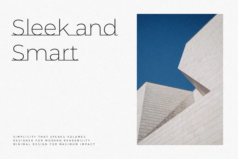
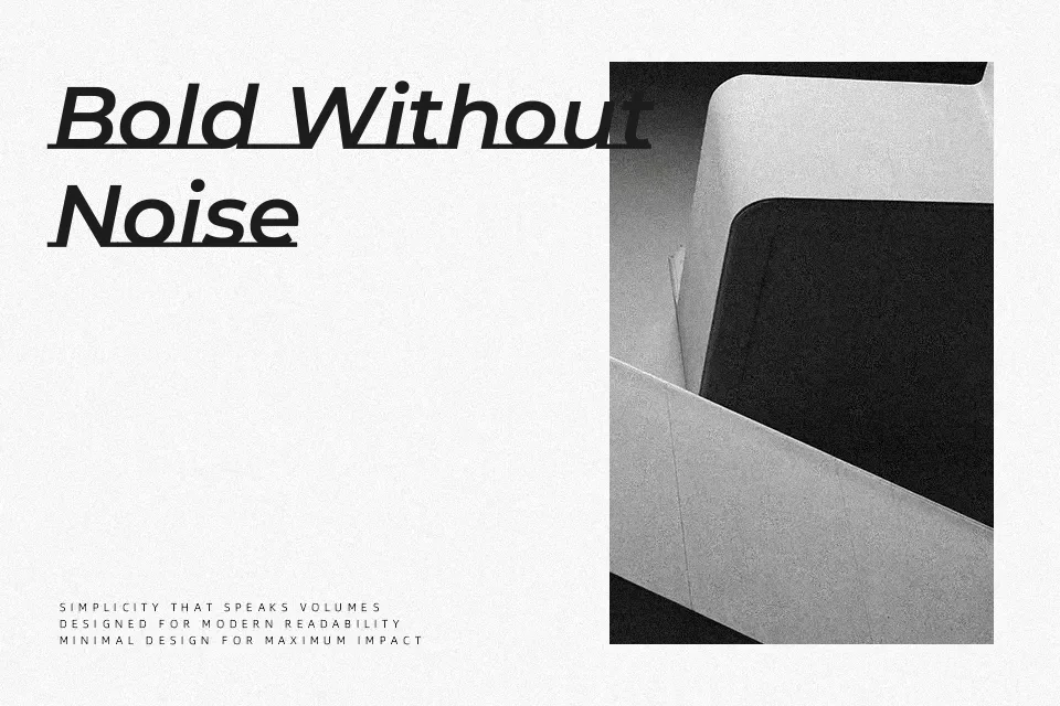
Montserrat Underline Font
Free for Commercial UseAbout
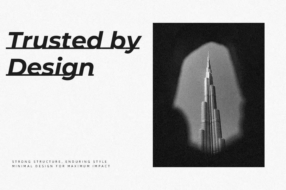
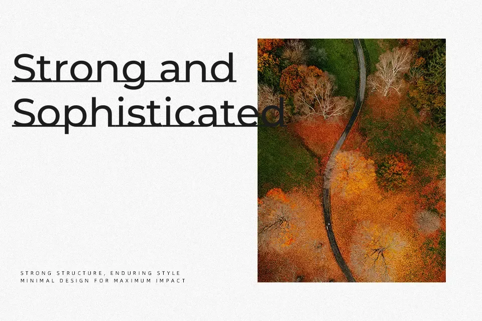
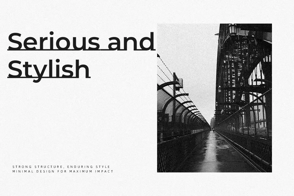
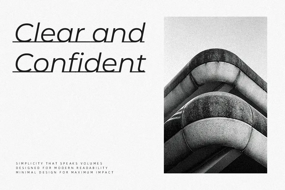
Montserrat Subrayada, the underlined sister of the Montserrat family designed by Julieta Ulanovsky, isn’t simply a font with underline styling applied — the line is structurally embedded into the letterforms themselves, creating a sense of deliberate, constructed precision. It ships with an all-caps character set in regular and bold weights, carrying uniform stroke widths, tight spacing, and the same geometric clarity the broader Montserrat family is known for. That structural rigidity is both its strength and its constraint. Short-form display copy — architecture firm wordmarks, gallery signage, cultural event posters — absorbs the style well. However, its caps-only format disqualifies it from any text-heavy layout requiring lowercase. Compared to standard Montserrat, Subrayada reads as more assertive and architectural rather than neutral or versatile.
Best For:
– architectural and design studio branding
– exhibition and museum signage
– short editorial headline treatments
– cultural event poster titles
Not Ideal For:
– body text or multi-line paragraphs
– mixed-case layouts
– casual or playful visual identities
Perfect for branding, editorial, and headline, with a bold and display style.
License
Gallery